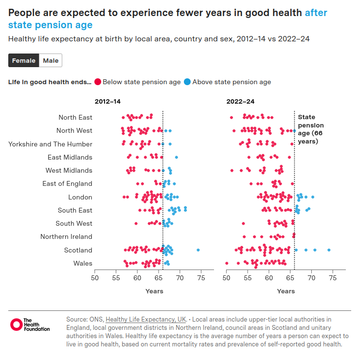
Yesterday an extraordinary thing happened: the news story about the UK’s falling healthy life expectancy led the BBC News for a while, ahead of the King’s visit to the US in the wake of the assassination attempt on Trump’s team and the latest twists in the Mandelson affair. And so it should: over the decade 2012–14 to 2022–24, healthy life expectancy in the UK fell by about 2 years, to 60.7 years for males and 60.9 years for females.
And that is just the average. As we can see from what I felt was the most informative graphic from the Health Foundation’s report, some of the local authority areas have seen precipitous falls over the same period. Merthyr Tydfil has fallen from 57.6 years to 50.1 years. North Lanarkshire has fallen from 58.3 years to 52.3 years. And in England, Sandwell has fallen from 57.7 years to 51.3 years. In the 2012-14 data, only one region had no local authorities with a healthy life expectancy below the state pension age. By 2022-24, most regions have a healthy life expectancy below 66 years.
Healthy Life Expectancy (HLE) is defined as the number of remaining years that an individual can expect to live in “very good” or “good” general health. Rates of “very good” and “good” general health by sex and five-year age band are captured from the following survey general health question on the Annual Population Survey (APS) and in the Census 2011 and Census 2021:
How is your health in general; would you say it was…
Very good?
Good?
Fair?
Bad?
Very bad?
I last wrote about HLE in 2017 in response to John Cridland’s review of the State Pension Age. My view at that time, when healthy life expectancy was plateauing rather than falling like a stone, was that it was time to consider a universal basic income model. Then only the poorest decile was going to be condemned to 18 years of working in poor health until they could claim a state pension. Now the overall averages in some local authorities have moved down to join them, this consideration appears rather more urgent.
In 2014, I was concerned about what happens if the healthy life expectancy doesn’t increase in line with the planned increases to the State Pension Age and, towed along 10 years behind it, Normal Minimum Pension Age (NMPA). Well here we are: 26 of the little local authority blobs are at or below the current NMPA of 55. This nearly doubles to 49 local authorities (assuming the fall in HLE doesn’t continue, which feels like a heroic assumption at the moment) when the NMPA is due to rise to 57 in April 2028.
As the Health Foundation report says:
While healthy life expectancy has declined, life expectancy has remained broadly stable for the UK overall, indicating that the deterioration is not primarily driven by changes in mortality. However, in more deprived areas, life expectancy remains below pre-pandemic levels, suggesting mortality plays a greater role in reducing healthy life expectancy in these areas. Worsening self-reported health remains a key factor throughout the UK, highlighted by a falling proportion of life spent in good health and by wider evidence of declining health among the working-age population.
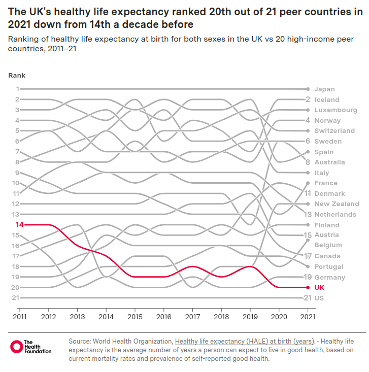
Other countries have not experienced this, illustrated by the UK sliding down the international comparison tables:
In the complete table the UK is sandwiched between Puerto Rico and China, with (from World Bank data) GDP per capita respectively of $39,344 and $13,303, compared to the UK’s GDP per capita of $53,246 (all from 2024).
Andrew Mooney, The Health Foundation’s principal data analyst, said: “The UK has the highest levels of obesity in western Europe and there has been a surge in mental ill health, especially among young people.”
Perhaps, instead of obsessing over GDP growth, we should be focusing on what countries like Iceland, Norway, Australia and New Zealand have been doing in recent years to tackle population health. I think it would make us all feel better.
This review originally appeared in the April issue of Brum Group News, the newsletter of the Birmingham Science Fiction Group and is reproduced here (with light editing) by kind permission
A few years ago the historian Adam Tooze said the following about the times we are living in:
If you’ve been feeling confused and as though everything is impacting on you at the same time, this is not a personal, private experience. This is actually a collective experience.
The word he came up with for this experience was “polycrisis”. It described the interplay of the Covid pandemic, Ukraine war and the energy, cost-of-living and climate crises. To that we could now add Trump 2nd term, war in Gaza and now the Gulf.
I am reviewing this book while I have Covid, which has certainly facilitated the kind of inner focus which I think the book is asking for. Because Slow Gods is polycrisis in the form of space opera, but a curiously interior-monologuey kind of space opera, more psychological than boom-boom.
The premise, as Claire North set out for us at the Birmingham Science Fiction Group last June, is that a binary star system is due to collapse which will obliterate all life within an 83 light-year blast radius. Unusually, the populations in the vicinity are warned of this precisely 100 years in advance by a perfect black sphere moving through space at sub-light-speed and known by everyone as the Slow.
The Slow listens to everything, remembers it and will consider it.
We follow the story through the eyes of Maw, who has been killed and has recovered in such a way as to be very difficult to kill after that. Making Maw an ideal candidate for Pilot, the organic sentient needed in the pilot’s seat of any ship wishing to enter arcspace which lets it travel across the universe faster than light, at huge personal cost. Pilots die frequently and each planetary system has its own way of choosing and rewarding its Pilots. Only Maw appears to be able to act as Pilot again and again, which makes the people around Maw nervous.
The main thing about Maw which makes people nervous is Maw’s relationship with “the darkness” which reaches into any ship in arcspace, in many cases sending people mad. Maw, instead, becomes “curious”, exploiting a changing relationship and perception of matter in the darkness to do monstrous things. But, despite all this, Maw is still required to keep running missions, although usually with a mechanical assistant to keep Maw from getting “dysregulated”.
This unusual set up turns out to be a way of observing the psychology of the polycrisis with some clarity. The United Social Venture is an empire where its subjects acquired debt just from being born (measured in Glint):
Everything the Venture gave us – the air we breathed, the roads we walked down, the schools we learned in – had been sweated for, bled for, and our debts were a marker of the needful labour we would give back in return.
This economic system was referred to as Shine. The Shine were one of the few systems which used prisoners for Pilot work.
One of the joys of the book is the exploration of difference, lots of details about avoiding giving offence when the Xi of Xihanna ask Maw to pilot a ship to Adjumir to bring out historical artefacts and Maw meets Gebre of the Haalo Institute. Maw finds that Normspeak is regarded as a very crude way of communicating and starts, haltingly, to learn Adjumiri (which is at least in part a click language). So begins a very moving love story.
Gender differences between systems are very striking. The Shine have only two genders – “he” and “she” – although the elite also have hé and shé. The most manly and the most feminine.
There are four genders in Xihanna, but they are not regarded as particularly important characteristics of a person and dispensed with once you know someone well. On Adjumir, there are eight, with very few Adjumiris remaining the same gender all their lives. These differences are picked out by the brilliant use of pronouns, a useful technique in a book full of characters. Even mechanicals, who have no particular interest in gender, are referred to as qe/qis as a mark of respect as “they do not wish to be put in the same category as a bowl of soup or a broken chair”.
We join Maw towards the end of the 100 year programme to evacuate the populations of Adjumir and Hadda to relative safety, with 800 million still on the planets and increasingly desperate. The Slow has effectively taken on a role as God through its massive databases, calculation capacity and sheer longevity. It seeks out Maw as it has plans for him. The Slow has been around so long that qe sees everything in the very long run. Which means that the emotional turmoil and intense highs and lows of individual lives are all averaged out to nothing. Qe calculates in terms of galaxy-level populations on the basis of what qe has come to think of as love.
What calculation would the Slow make about our world, with all our nation states and their often tiny differences blown up to justify war aims? Donald Trump certainly has to have the most Shine of any US President for some time.
Slow Gods moves slowly but relentlessly towards a showdown between Maw and Theodosius Rhode, the Executor of the Shine and executioner of his mother. There is much tragedy along the way and the ending is not straightforward but ultimately very satisfying. It’s an uplifting ride.
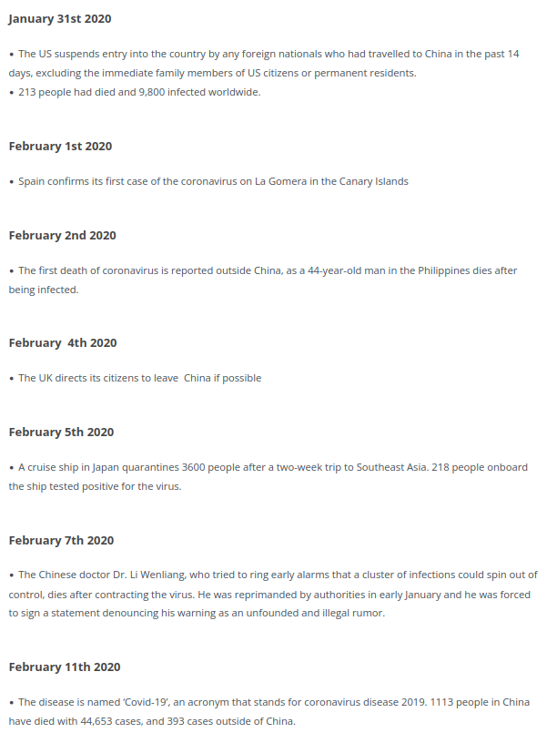
OK I don’t know if this is a remotely helpful post, but it really feels to me like one of those months we will look back on, like March 2020, and wonder what we were thinking. To recap: on 4 March 2020, while Italy were shutting all their schools and a month after the WHO had declared a global health emergency, we were noting that the number of cases in the UK had jumped from 53 to 87 in one day.
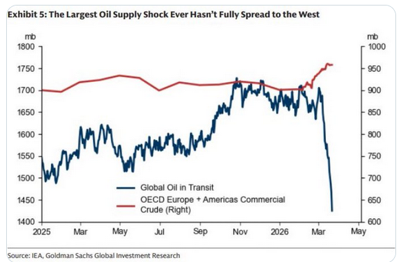
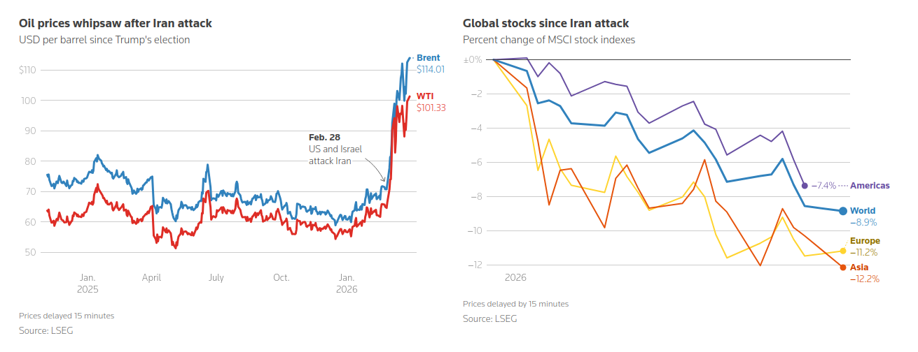
Jump forward to now and the number of tankers with oil on board is in freefall:
Trump is talking about invading Kharg Island and “obliterating” Iran’s energy facilities, and we are sitting in the time lags of international fossil fuel freight waiting to see what will happen. But we already know what is going to happen. Just like the pandemic, we will be taking similar measures to the countries already more affected very soon. The order looks like Asia, followed by Africa, then Europe and only then, ironically, the United States.
So what is going on in Asia right now? Well the Philippines announced a national energy emergency six days ago, setting up an authority to oversee the orderly distribution of fuel, food, medicines, and other essential goods. Sri Lanka has announced a four-day week for all government employees. Egypt is ordering restaurants, cafés and shops to close at 9pm to safeguard dwindling energy reserves. Slovenia has brought in fuel rationing. Moldova’s Parliament has also voted to impose a state of emergency in the country’s energy sector. Australia is offering free public transport. Measures are also being taken in Thailand, Ethiopia, Myanmar, Vietnam, Bangladesh and South Sudan.
On 3 March 2020, the UK Government unveiled their Coronavirus Action Plan, which outlined what the UK had done and what it planned to do next. Paul Cosford, a medical director at Public Health England, said widespread transmission of COVID-19 in the United Kingdom was “highly likely”.
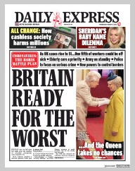
On 4 March 2020, the Daily Express were telling us:
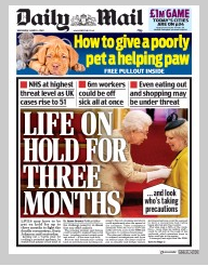
Which we clearly weren’t. Meanwhile the Daily Mail was anticipating future lockdowns and 6 million people being off sick:
The next day we had the first Covid death in the UK. And life was on hold for the next two years.
Our response to the energy crisis seems to be almost entirely focused on
1. The cost-of-living crisis; and
2. The financial markets.
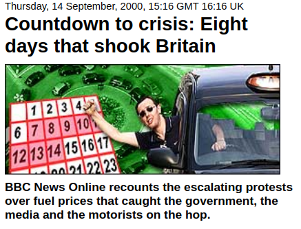
The Education Secretary has said that motorists should fill up as normal as the government is “well prepared” for disruption. The trouble is, many of us still remember September 2000:
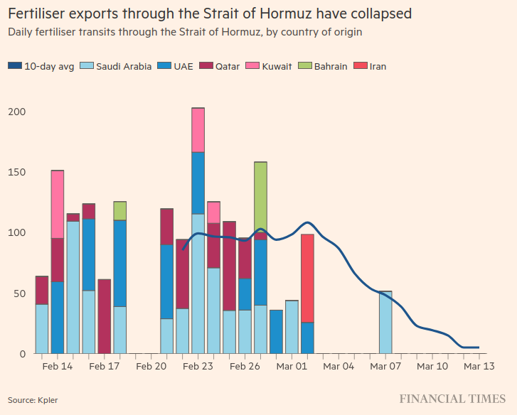
So that would be enough to make us all feel nervous about shortages and queues for everything, having our lives disrupted and out of our control. But the real potential issue is not even being talked about, certainly not by the government. It is a shortage of food. Steve Keen sets out the economics of global food production here. This does not tend to feature prominently in mainstream economic analyses which are energy and food blind for the most part, although the FT did have this graph a couple of weeks ago:
As Steve Keen says:
Survival will depend on grain reserves. China has of the order of 18 months in reserve, which will insulate it from the disruptions of 2026. The USA and India have substantial reserves as well, but some countries—including the UK—have virtually none.
…Famines will ensue, and even countries that have never experienced such events could be forced into food rationing. This includes the UK and Australia, and a patchwork of countries across Europe.
This is what people are nervous about: not being able to get enough food, either because it isn’t available at all or not at a price they can afford. Calling that a cost-of-living crisis is a bit like calling the Black Death a labour market crisis. And it doesn’t stop there. As Steve Keen continues:
Other critical products that normally pass through the Strait of Hormuz include Helium, which is critical to the production of semiconductors, and sulphuric acid, which is critical to numerous production processes. The closure of the Strait cuts off one third of global helium output and about half of global sulphuric acid output.
With critical industrial inputs cut as well, the problems will cascade well past food alone—though that is clearly the most damaging impact. With LNG, petroleum, helium and sulphuric acid production cut, the capacity to undertake repairs to damaged facilities will also be hindered.
The TED War is rather like smashing a spider’s web—and then killing the spider.
The spider certainly looks in a poor state of health at the moment, and parts of the web will take years to fix. This is the crisis we are all inevitably going to be entering in the next few weeks. For who knows how long.
A risk management approach to this crisis would involve communicating a plan to the country that minimised the impulse to hoard resources and protected the most vulnerable from extreme prices, rather than bland reassurances from government ministers. We need this to be in place very quickly now.
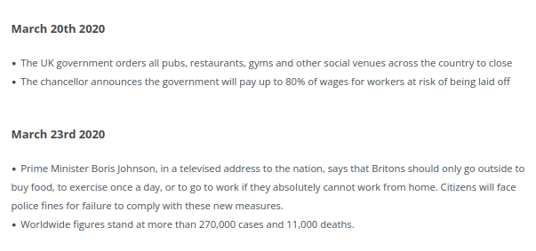
I have caught Covid for the third time this week, so naturally my thoughts have turned to how it all began.
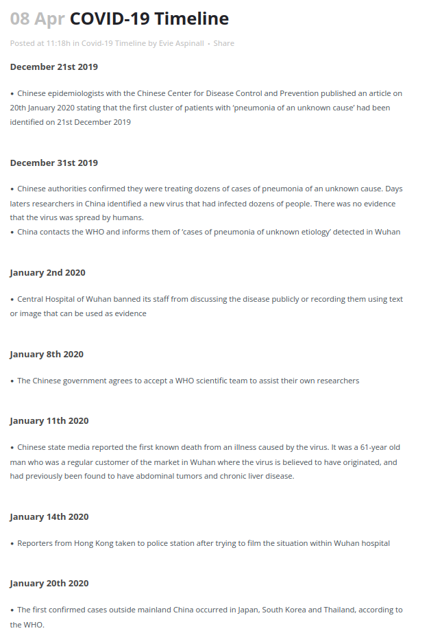
There are a few Covid posts starting to turn up online as the 6th anniversary of it all rumbles around. The British Foreign Policy Group have helpfully published a timeline from which I have taken everything that happened before Boris Johnson locked us down for the first time:
So a lot had happened by 23 March. You will all have your favourite bits from the saga above, I think mine is 22 January, when Public Health England announced they had moved the risk level to the general public from very low to low.
I remember teaching a macroeconomics class on 12 March when we knew it was going to be the last session on campus. The penny hadn’t dropped. Students were asking about how they would hand work in. We agreed it would have to be online. Some lecturers were talking about microwaving paper submissions to sterilise them. We had a little giggle about that. I had spoken to Stuart McDonald (now MBE) earlier that day where we had reluctantly agreed to postpone his visit to campus to speak to the Leicester Actuarial Science Society (LASS). Stuart would of course become one of the actuarial stars of the pandemic for his work with the COVID-19 Actuaries Response Group. I had a similar conversation by email with Lord Willetts, who was Chancellor at the University of Leicester at the time and who was going to talk to LASS about his books The Pinch and A University Education. We talked of postponing rather than cancelling. The realisation that everything was changing for the foreseeable future was still not there.
It took a long time for the penny to drop for the Government as well. As this analysis of the establishment of the “Covid Disinformation Ecosystem” says:
January featured fear and disbelief, February proved covid couldn’t simply be ignored, March was when governments realised the hospitalisation rate could overwhelm healthcare.
And a Government that was slow to respond initially was very vulnerable to the groups which sprung up during 2020 and 2021. As the Counter Disinformation Project says:
And the main initial target for the UK section of the ecosystem was Boris Johnson who was meeting privately with newspaper owners and editors. Enough doubt was put into Johnson’s mind that he dithered and delayed when cases began to rise, leading to a private meeting with Heneghan, Gupta and Sweden’s Anders Tegnell in September before he chose to ignore his scientific advisors’ calls for a circuit breaker lockdown. In the run up to the deadliest weeks of the pandemic the papers were calling for Johnson to “Save Christmas’.
However I don’t want to focus on our collective inability to make decisions during crises this time. This time I want to focus on the impact of the pandemic on our mental health.
By coincidence, today the 386 page Module 3 report from the Covid Inquiry on The impact of the Covid-19 pandemic on the healthcare systems of the United Kingdom was published. The longer this Inquiry goes on, the more it appears to resemble a truth and reconciliation commission rather than something likely to improve the handling of future pandemics. It gets past transgressions on the record, but in a way designed to move us on rather than improve our preparedness and organisation. I certainly saw nothing in the summaries that I didn’t already know. Module 3 has made 10 recommendations. The only one which mentions mental health at all is the last one on Psychological and emotional support for healthcare workers.
Looking through the module titles, it would seem that this is unlikely to be rectified until Module 10 – Impact on society – reports, currently scheduled for the first half of 2027. I find this relegation of our collective trauma to the lowest priority astonishing.
Data on the prevalence of mental health difficulties is harder to assess. For children and young people, surveys in England have provided a time series since 2020 that suggests very strongly that mental ill health is indeed more prevalent now than it was before the start of the pandemic. A steady rise in the decade prior to 2020 seems to have been followed by a sharp rise, and numbers have stayed high ever since. We do not have the equivalent data for adults, meaning that a clear picture has yet to emerge, but there is persuasive evidence that levels of mental ill health have been rising over the last decade, and the pandemic has contributed to many of the risk factors people face.
Before concluding as follows:
Crucially, the pandemic exposed fault-lines in the nation’s mental health, and the stark inequalities faced every day by people living with mental illness. The public’s mental health was deteriorating in the years running up to the pandemic, and mental health services were struggling to deal with the consequences of many years of underfunding and austerity measures across public services. People with a mental illness were already dying 15-20 years sooner than the general population, and facing widespread hardship. The pandemic exacerbated these inequalities, creating new risks to people’s mental health and reducing access to support.
We now have the opportunity to learn from this experience and build a mentally healthier future. We can act now to boost the public’s mental health in the aftermath of the pandemic, protecting those who have experienced the worst effects and offering better support to groups that don’t yet have access to the right support. And we can incorporate mental health into preparations for future emergencies, so that responses are psychologically informed from day one.
They also made 10 recommendations, mostly for the NHS and Department for Health and Care, but also covering education, communications and considerations for the upcoming (at the time) review of the Mental Health Act. Less than half of these recommendations have been addressed at all.
Now we are two years on from that report, what has changed?
Well, Roy Lilley has drawn a rather dispiriting picture for us. He draws attention to Wes Streeting’s announcement in the Health Service Journal on 12 March, that the proportion of the NHS budget spent on mental healthcare would be cut for the third year in a row. Lilley lists how the demands on mental health services have mushroomed since before the pandemic:
Around two million people were in touch with mental health services in 2019, today it’s around three million;
Child and Adolescent Services: in 2019 around 500,000 referrals. Now around a million;
And only around 45% of referrals are accepted, meaning the true demand is even higher;
Talking therapies are up by 60%; and
Crisis team referrals and sectioning under the Mental Health Act are also up 60%.
And he summarises the problem like this:
The total economic cost of mental ill-health in England in 2022 was estimated ~£300bn a year when lost productivity, welfare and wider costs are factored in.
The total MH budget is about £16bn. Meaning, the NHS is spending roughly £1 trying to address a £18 national problem.
It feels like we are still waiting for the penny to drop.
In my last post I referred to Dan Wang’s excellent new book, Breakneck, which I have now read at (for me) breakneck speed, finishing it in a week. It has made me realise how very little I knew about China.
Wang makes the point that China today is reminiscent of the US of a century ago. However he also makes the point that parts of the US were terrible to live in then: from racist segregation and lack of representation, to massive industrial pollution and insensitive planning decisions. As he says of the US:
The public soured on the idea of broad deference to US technocrats and engineers: urban planners (who were uprooting whole neighborhoods), defense officials (who were prosecuting the war in Vietnam), and industry regulators (who were cozying up to companies).
China meanwhile has a Politburo stuffed with engineers and is capable of making snap decisions without much regard to what people want. There is a sense of precarity about life there, with people treated as aggregates rather than as individuals. The country can take off in different directions very quickly and often does – there is a telling passage about the totally different life experiences of someone born in 1959 compared to someone born in 1949 (the worst year to be born in China according to Wang) – and even the elites can be dealt with brutally if they fall out of line with the current direction of travel. But they have created some impressive infrastructure, something which has become problematic for the US. Only around 10% of its GDP goes towards social spending, compared to 20% in the US and 30% amongst some European states, so there is no effective safety net. Think of the US portrayed in (as Christmas is fast approaching) “It’s a Wonderful Life” – a life that is hard to the point of brutality with destitution only one mistake away. And there is a level of social control alien to the west, controlling where people can live and work and very repressive of ethnoreligious minorities. And yet there is a feeling of progress and forward momentum which appears to be popular with most people in China.
As Wang notes at the end of his introduction:
“Breakneck” is the story of the Chinese state that yanked its people into modernity – an action rightfully envied by much of the world – using means that ran roughshod over many – an approach rightfully disdained by much of the world. It is also a reminder that the United States once knew the virtues of speed and ambitious construction.
The chapter on the one child policy, which ran for 35 years, is particularly chilling (China announced its first population fall in 2023 and its population is projected to halve to 700 million by 2100), and now the pressure is on women to have more children again. There is also a chapter on how China dealt with Covid – Wang experienced this first hand from Shanghai for 3 years – which made me understand perhaps why we wasted so much money in the UK on Track and Trace. You would need to be an engineering state to see it through successfully, and China ended up taking it too far in the end.
The economics of China is really interesting. As Wang notes:
China’s overbuilding has produced deep social, financial and environmental costs. The United States has no need to emulate it uncritically. But the Chinese experience does offer political lessons for America. China has shown that financial constraints are less binding than they are cracked up to be. As John Maynard Keynes said, “Anything we can actually do we can afford.” For an infrastructure-starved place like the United States, construction can generate long-run gains from higher economic activity that eventually surpass the immediate construction costs. And the experience of building big in underserved places is a means of redistribution that makes locals happy while satisfying fiscal conservatives who are normally skeptical of welfare payments.
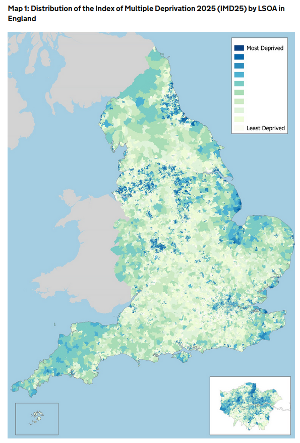
This goes just as much for the UK, where pretty much everywhere outside London is infrastructure-starved (and, as Nicholas Shaxson and John Christensen show here in their written evidence to a UK Parliamentary Committee, even where infrastructure is built outside London, the financing of it sucks money away from the area where the infrastructure is being built and towards finance centres, predominantly in London), but there is also strong resistance from all the main parties to significant redistribution via the benefit system. This results in inequalities which even the FT feels moved to comment on and a map of multiple deprivation in England which looks like this:
The good news is that it doesn’t have to be this way in the UK, there are prominent examples of countries operating in a different way, eg China. The bad news is that China is not doing it because of economics. They are doing it because the state was set up to build big from the beginning. It is in its nature. The lesson of China is that it will keep doing the same things whatever the situation (eg trying to fix the population fall caused by an engineering solution with another engineering solution). Sometimes the world economy will reward their approach and sometimes it will punish it, but that will not be the primary driver for how they behave. I think this may be true of the US, the EU states and the UK too.
Daniel Kahneman showed us in Thinking Fast and Slow, how most of our mental space is used to rationalise decisions we have already taken. One of the places where I part company with Wang is in his reverence for economists. He believes that the US should listen more to both engineers and economists to challenge the lawyerly society.
In the foreword for The Principles of Economics Course from 1990 by Phillip Saunders and William Walstad, Paul Samuelson, the first person from the US to win the Nobel Memorial Prize in Economic Sciences in 1970, wrote:
“Poets are the unacknowledged legislators of the World.” It was a poet who said that, exercising occupational license. Some sage, it may have been I, declared in similar vein: “I don’t care who writes a nation’s laws—or crafts its advanced treaties—if I can write its economic textbooks.” The first lick is the privileged one, impinging on the beginner’s tabula rasa at its most impressionable state.
My view would be that the economists are already in charge.
As a result, my fear is that economics is now used for rationalising decisions we have already made in many countries now, including our own. We are going to do what we are going to do. The economics is just the fig leaf we use to rationalise what may otherwise appear unfair, cruel, divisive and hope-denying policies. The financial constraints are less than they are cracked up to be, but they are a convenient fiction for a government which lacks any guiding principles for spending and investment otherwise and therefore fears that everyone would just be asking for more resources in its absence, and they would have no way of deciding between them.
In the year when I was born, Malvina Reynolds recorded a song called Little Boxes when she was a year younger than I am now. If you haven’t heard it before, you can listen to it here. You might want to listen to it while you read the rest of this.
I remember the first time I felt panic during the pandemic. It was a couple of months in, we had been working very hard: to put our teaching processes online, consulting widely about appropriate remote assessments and getting agreement from the Institute and Faculty of Actuaries (IFoA) for our suggested approach at Leicester, checking in with our students, some of who had become very isolated as a result of lockdowns, and a million other things. I was just sitting at my kitchen table and suddenly I felt tears welling up and I was unable to speak without my voice breaking down. It happened at intervals after that, usually during a quiet moment when I, consciously or unconsciously, had a moment to reflect on the enormity of what was going on. I could never point to anything specific that triggered it, but I do know that it has been a permanent change about me, and that my emotions have been very much closer to the surface ever since. I felt something similar again this morning.
What is going on? Well I haven’t been able to answer that satisfactorily until now, but recently I read an article by David Runciman in the LRB from nine years ago when Donald Trump got elected POTUS the first time. I am not sure that everything in the article has withstood the test of time, but in it Runciman makes the case for Trump being the result of the people wanting “Trump to shake up a system that they also expected to shield them from the recklessness of a man like Trump.”. And this part looks prophetic:
[Trump is]…the bluntest of instruments, indiscriminately shaking the foundations with nothing to offer by way of support. Under these conditions, the likeliest response is for the grown-ups in the room to hunker down, waiting for the storm to pass. While they do, politics atrophies and necessary change is put off by the overriding imperative of avoiding systemic collapse. The understandable desire to keep the tanks off the streets and the cashpoints open gets in the way of tackling the long-term threats we face. Fake disruption followed by institutional paralysis, and all the while the real dangers continue to mount. Ultimately, that is how democracy ends.
And it suddenly hit me that this was something I had indeed taken for granted my whole life until the pandemic came along. The only thing that had ever looked like toppling society itself was the prospect of a nuclear war. Otherwise it seemed that our political system was hard to change and impossible to kill.
And then the pandemic came along and we saw government national and local digging mass graves and then filling them in again and setting aside vast arenas for people to die in before quietly closing them again. Rationing of food and other essentials was left to the supermarkets to administer, as were the massive snaking socially-distanced queues around their car parks. Seemingly arbitrary sets of rules suddenly started appearing at intervals about how and when we were allowed to leave the house and what we were allowed to do when out, and also how many people we could have in our houses and where they were allowed to come from. Most businesses were shut and their employees put on the government’s payroll. We learned which of us were key workers and spent a lot of time worrying about how we could protect the NHS, who we clapped every Thursday. It was hard to maintain the illusion that society still provided solid ground under our feet, particularly if we didn’t have jobs which could be moved online. Whoever you were you had to look down at some point, and I think now that I was having my Wile E. Coyote moment.
The trouble is, once you have looked down, it is hard to put that back in a box. At least I thought so, although there seems to have been a lot of putting things in boxes going on over the last few years. The UK Covid-19 Inquiry has made itself available online via a YouTube channel, but you might have thought that a Today at the Inquiry slot on terrestrial TV would have been more appropriate, not just covering it when famous people are attending. What we do know is that Patrick Vallance, Chief Scientific Advisor throughout the pandemic, has said that another pandemic is “absolutely inevitable” and that “we are not ready yet” for such an eventuality. Instead we have been busily shutting that particular box.
The biggest box of course is climate change. We have created a really big box for that called the IPCC. As the climate conferences migrate to ever more unapologetic petro-states, protestors are criminalised and imprisoned and emissions continue to rise, the box for this is doing a lot of work.
If inquiries worked, we’d have the safest healthcare system in the world. Instead, we have a system addicted to investigating itself and forgetting the answers.
But perhaps the days of the box are numbered. The box Keir Starmer constructed to contain the anger about grooming gangs which the previous 7 year long box had been unable to completely envelop also now appears to be on the edge of collapse. And the Prime Minister himself was the one expressing outrage when a perfectly normal British box, versions of which had been giving authority to policing decisions since at least the Local Government (Review of Decisions) Act 2015 (although the original push to develop such systems stemmed from the Hillsborough and Heysel disasters in 1989 and 1985 respectively) suddenly didn’t make the decision he was obviously expecting. That box now appears to be heading for recycling if Reform UK come to power, which is, of course, rather difficult to do in Birmingham at the moment.
But what is the alternative to the boxes? At the moment it does not look like it involves confronting our problems any more directly. As Runciman reflected on the second Trump inauguration:
Poor Obama had to sit there on Monday and witness the mistaking of absolutism for principle and spectacle for politics. I don’t think Trump mistakes them – he doesn’t care enough to mind what passes for what. But the people in the audience who got up and applauded throughout his speech – as Biden and Harris and the Clintons and the Bushes remained glumly in their seats – have mistaken them. They think they will reap the rewards of what follows. But they will also pay the price.
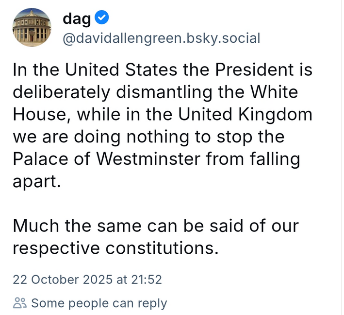
David Allen Green’s recent post on BlueSky appears to summarise our position relative to that of the United States very well:
I watched The War Game this week, as it had suddenly turned up on iPlayer and I had not seen it before. It was the infamous film from 1966 on the horrors of a nuclear war in the UK that was not televised until 1985. It has been much lauded as both necessarily horrifying and important over the years, but what struck me watching it was how much it looked back to the period of rationing (which had only ended in the UK 12 years earlier) and general war-time organisation from the Second World War. It would be a very different film if made now, probably drawing on our recent experiences of the pandemic (when of course we did dig huge pits for mass burials of the dead and set up vast Nightingale hospitals as potential field hospitals, before the vaccines emerged earlier than expected).
But what about the threat of nuclear war which still preoccupied us so much in the 1980s but which seems to have become much less of a focus more recently? With the New START treaty, which limits the number of strategic nuclear warheads that the United States and Russia can deploy, and the deployment of land and submarine-based missiles and bombers to deliver them, due to expire on 5 February 5, negotiations between Russia and the United States finally appear to be inprogress. However China has today confirmed that it does not want to participate in these.
In Mark Lynas’ recent book Six Minutes to Winter, he points to the Barret, Baum and Hostetler paper from 2013 which estimated the probability of inadvertent nuclear war in any year to be around 1%. This is twice the probability of insolvency we think acceptable for our insurance companies under Solvency II and would mean, if accurate, that the probability of avoiding nuclear war by 2100 was 0.99 raised to the power of 75 (the number of years until 2100), or 47%, ie less than a fifty-fifty chance.
That doesn’t seem like good enough odds to me. As Lynas says:
We cannot continue to run the daily risk of nuclear war, because sooner or later one will happen. We expend enormous quantities of effort on climate change, a threat that can endanger human civilisation in decades, but ignore one that can already destroy the world in minutes. Either by accident or by intent, the day of Armageddon will surely dawn. It’s either us or them: our civilisation or the nukes. We cannot both survive indefinitely.
The Treaty on the Prohibition of Nuclear Weapons (TPNW) was adopted at the UN in 2017 and came into force in 2021. In Article 1 of the Treaty, each state party to it undertakes never to develop, test, produce, possess, transfer, use or threaten to use nuclear weapons under any circumstances. 94 countries have signed the TPNW to date, with 73 full parties to it.
The House of Commons library entry on TPNW poses a challenge:
It is the first multilateral, legally binding, instrument for nuclear disarmament to have been negotiated in 20 years. However, the nuclear weapon states have not signed and ratified the new treaty, and as such, are not legally bound by its provisions. The lack of engagement by the nuclear weapon states subsequently raises the question of what this treaty can realistically achieve.
It then goes on to state the position of the UK Government:
The British Government did not participate in the UN talks and will not sign and ratify the new treaty. It believes that the best way to achieve the goal of global nuclear disarmament is through gradual multilateral disarmament, negotiated using a step-by-step approach and within existing international frameworks, specifically the Nuclear Non-Proliferation Treaty. The Government has also made clear that it will not accept any argument that this treaty constitutes a development of customary international law binding on the UK or other non-parties.
There are 9 nuclear states in the world: China, France, India, North Korea, Pakistan, Russia, Israel, the UK and the United States. Israel recently conducted a 12 day war with Iran to stop it becoming the 10th. Many argue that Russia would never have invaded Ukraine had it kept its nuclear weapons (although it seems unlikely that they would have ever been able to use them as a deterrent for a number of reasons). So the claims of these nuclear states that they are essential to their security are real.
But is the risk that continued maintenance of a nuclear arsenal poses worth it for this additional security? For the security only operates at the deterrence level. Once the first bomb lands we are no more secure than anyone else.
Which makes it all the more concerning when Donald Trump starts saying things like this (in response to a veiled threat by the Russian Foreign Minister about their nuclear arsenal):
“I have ordered two Nuclear Submarines to be positioned in the appropriate regions, just in case these foolish and inflammatory statements are more than just that. Words are very important, and can often lead to unintended consequences, I hope this will not be one of those instances.”
But with a probability of avoiding “unintended consequences” less than fifty-fifty by 2100? That really doesn’t feel like good enough odds to me.
Milan Kundera wrote his The Book of Laughter and Forgetting in 1979, a few years after moving to France and the same year he had his Czech citizenship revoked. His books had all been banned in Czechoslovakia in 1968, as most of them poked fun at the regime in one way or the other. The Book of Laughter and Forgetting was no exception, focusing, via seven stories, on what we choose to forget in history, politics and our own lives. One of the themes is a word which is difficult to translate into English: litost.
Litost seems to mean an emotional state of feeling of being on your own suddenly brought face to face with how obvious your own hopelessness is. Or something to that effect. Kundera explored several aspects of litost at length in the novel. However, for all the difficulties of describing it exactly, litost feels like a useful word for our times, our politics and our economics.
I want to focus on two specific examples of forgetting and the sudden incidents of litost which have brought them back into focus.
The first, although not chronologically, would be the pandemic. There are several articles around suddenly about the lessons we have not learnt from the pandemic, to mark the fifth anniversary of the first lockdown. Christina Pagel, backed up by module 1 of the Covid-19 Inquiry, reckons:
Preventing future lockdowns requires planning, preparation, investment in public health infrastructure, and investment in testing, virology and medical research…
She takes issue with some of the commentary as follows:
But the tenor of reporting and public opinion seems to be that “lockdowns were terrible and so we must not have lockdowns again”. This is the wrong lesson. Lockdowns are terrible but so are unchecked deadly pandemics. The question should be “lockdowns were terrible, so how can we prevent the spread of a new pandemic so we never need one again?”.
However the stampede to get back to “normal” has mitigated against investing in infrastructure and led to a massive reduction in testing and reporting, and the Covid-19 Inquiry has given the government cover (all questions can just be responded to by saying that the Covid Inquiry is still looking at what happened) to actively forget it as quickly as possible. Meanwhile the final module of the Covid-19 Inquiry is not due to conclude until early 2026, which one must hope is before the next pandemic hits. For which, as the former Chief Scientific Adviser and other leading experts have said, we are not remotely prepared, and certainly no better prepared than we were in 2020.
It is tempting to think that this is the first major recent instance involving the forgetting of a crisis to the extent that its repetition would be just as devastating the second time. Which is perhaps a sign of how complete our collective amnesia about 2008 has become.
Make no mistake, 2008 was a complete meltdown of the core of our financial system. People I know who were working in banks at the time described how even the most experienced people around them had no idea what to do. Alistair Darling, Chancellor of the Exchequer at the time, claimed we were hours away from a “breakdown in law and order”.
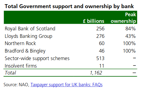
According to the Commons Library briefing note from October 2018, the Office for Budget Responsibility (OBR) estimates that, as at the end of January 2018, the interventions had cost the public £23 billion overall. The net balance is the result of a £27 billion loss on the RBS rescue, offset by some net gains on other schemes. Total support in cash and guarantees added up to almost £1.2 trillion, including the nationalisation of Northern Rock (purchased by Virgin Money, which has since been acquired by the Nationwide Building Society) and the Bradford & Bingley (sold to Santander) and major stakes in RBS (now NatWest) and Lloyds. Peak government ownership in these banks is shown below:
If you read the Bank of England wacky timeline 10 years on from 2018, you will see a lot about how prepared they are to fight the last war again. As a result of this, cover has been given to actively forget 2008 as quickly as possible.
Except now various people are arguing that the risks of the next financial crisis are increasing again. The FT reported in January on the IMF’s warnings (from their Global Financial Stability Report from April 2024) about the rise in private credit bringing systemic risks.
Meanwhile Steve Keen (one of the very few who actually predicted the 2008 crisis) in his latest work Money and Macroeconomics from First Principles, for Elon Musk and Other Engineers has a whole chapter devoted to triggering crises by reducing government debt, which makes the following point:
A serious crisis, triggered by a private debt bubble and crash, has followed every sustained attempt to reduce government debt. This can be seen by comparing data on government and private debt back to 1834.
(By the way, Steve Keen is running a webinar for the Institute and Faculty of Actuaries entitled Why actuaries need a new economics on Friday 4 April which I thoroughly recommend if you are interested)
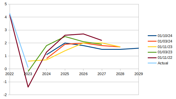
Which brings us to the Spring Statement, which was about (yes, you’ve guessed it!) reducing government debt (or the new formulation of this “increasing OBR headroom”) and boosting GDP growth. Watching the Chief Secretary to the Treasury, Darren Jones, and Paul Johnson from the IFS nodding along together in the BBC interviews immediately afterwards, you realised how the idea of allowing the OBR to set policy has taken hold. Johnson’s only complaint seemed to be that they appeared to be targeting headroom to the decimal point over other considerations.
I have already written about the insanity of making OBR forecasts the source of your hard spending limits in government. The backdrop to this Statement was already bad enough. As Citizens Advice have said, people’s financial resilience has never been lower.
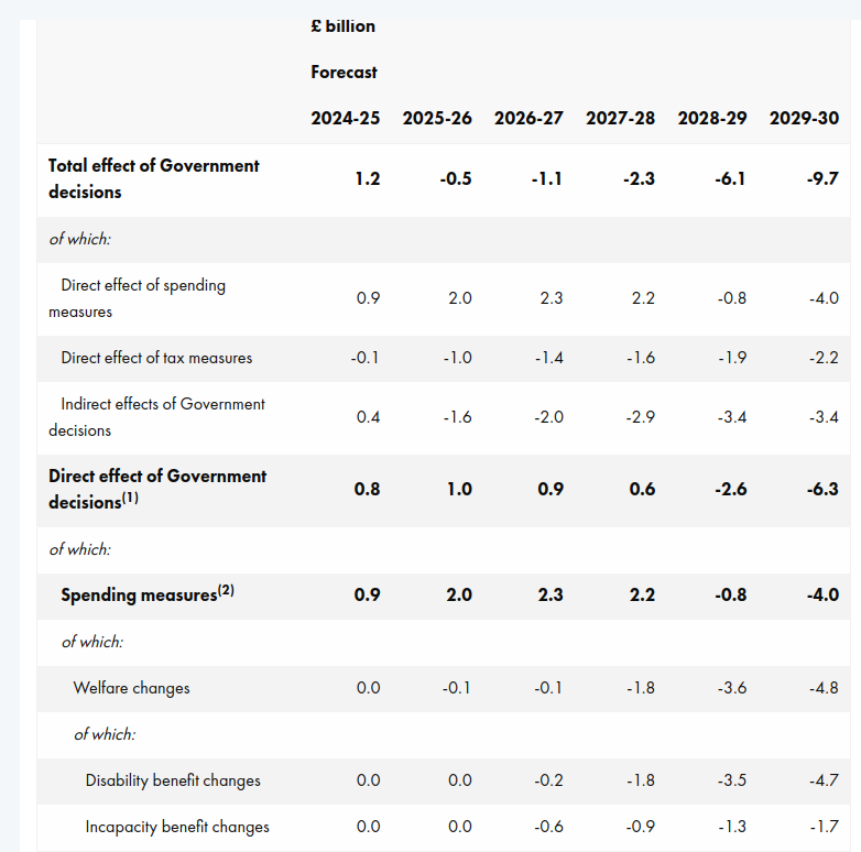
But aside from the callousness of it all, it does not even make sense economically. The OBR have rewarded the government for sticking to them so closely by halving their GDP growth projections and, in the absence of any new taxes, it seems as if disabled people are being expected to do a lot of the heavy lifting by 2029-30:
Part of this is predicated on throwing 400,000 people off Personal Independence Payments (PIPs) by 2029-30. According to the FT:
About 250,000 people, including 50,000 children, will be pushed into relative poverty by the cuts, according to a government impact assessment.
We are left standing. Abandoned, to watch the idiocy of what’s lost… the security, human dignity and wellbeing of our fellow man, woman and their family… everything that matters.
As an exercise in fighting the last war, or, according to Steve Keen, the wars successive governments have been fighting since 1834, it takes some beating. It was litost on steroids for millions of people.
So what does the government think these people are going to fill the income gap with? It will be private debt of course. And for those in poverty, the terms are not good (eg New Horizons has a representative APR of 49% with rates between 9.3% APR and maximum 1,721% APR).
And for those who can currently afford a mortgage (from page 47 of the OBR report):
Average interest rates on the stock of mortgages are expected to rise from around 3.7 per cent in 2024 to a peak of 4.7 per cent in 2028, then stay around that level until the end of the forecast. The high proportion of fixed-rate mortgages (around 85 per cent) means increases in Bank Rate feed through slowly to the stock of mortgages. The Bank of England estimates around one-third of those on fixed rate mortgages have not refixed since rates started to rise in mid-2021, so the full impact of higher interest rates has not yet been passed on.
So, even before considering the future tax increases the FT appears to be expecting, the levels of private debt look like they will shoot up very quickly. And we all know (excluding the government it seems) where that leads…
This blog has a long history with the OBR, which I won’t go into here, although you can get a sense of it from this. It was the reason the blog is called We Know Zero. However I find myself returning to talk about them once again in the light of some of the Government’s latest spending (or removal of spending) plans.
Daniel Susskind had this to say about the role they are currently playing for the Government, to determine whether it is going the right way to achieve economic growth:
This was never meant to be the OBR’s purpose. Set up in 2010 by George Osborne, then chancellor, it was designed to solve a different problem: that the official UK public finance forecasts were not credible. The Treasury had a strong incentive to massage these numbers into better shape, whatever the political make-up of the government. And the belief was that an independent statistical authority would be free of that temptation. To that extent, the OBR is a success story: its forecasts do appear to be less biased.
At this point I need to stifle a snigger: less biased than what? I think it may not have a political reason for bias, but their methodology is like train tracks as I have maintained since this blog started in 2013: if you lay them out in a particular way then, even if you don’t want to call it bias, that is the way the train will run (to misquote Yes Minister). It may be statistically unbiased, in the same way that someone who misses a penalty past each post (I am sure that this analogy has nothing to do with my team going out of the Champions League this week) has, on average, hit the target.
However I agree with Susskind that the OBR was certainly never set up to advise on policy. As he goes on to say:
With that in mind, the idea that the OBR somehow knows enough to take each UK government policy and state its impact on growth to a single decimal point is fanciful. Yet that is what it will attempt to do at the end of the month, with immense practical consequence. A reduction of 0.1 percentage point in the OBR’s potential productivity growth forecast, for instance, is estimated to create a hole of £7bn-£8bn in the public finances — that is the equivalent of the entire budget of Defra.
Or the foreign aid budget or disability benefits or…the list looks likely to go on.
In an open letter this week, 17 major charities including Scope, Trussell Trust, Citizens Advice, Mencap, Sense, the Joseph Rowntree Foundation and the RNIB urged the Government not to cut the Personal Independence Payments (PIP) and the Limited Capability for Work payment, saying:
Scope’s analysis of government figures shows that without PIP, a further 700,000 more disabled households could be pushed into poverty. Life costs more for disabled people. Huge numbers already live in poverty as a result of these extra costs. The impact of any cuts to disability benefits would be devastating.
Meanwhile Roy Lilley looks at those cuts from the NHS end of the lens. I don’t agree with his assessment of the IFS, but there is nothing else here to argue with:
Currently, 2.9 million working-age adults are claiming disability benefits, an increase of 900,000 from pre-pandemic levels, with 500,000 attributing their main condition to mental health issues.
Lilley asks why this is, comparing the mental stress attributed to the pandemic with that of the Blitz. He then cites a study by the Tavistock Institute:
While, in the post war years, mental health issues were still stigmatised, post-war policies focused on social security and housing aimed to reduce economic stress that so often is the contributing factor to poor mental health.
We have done a lot to reduce the stigma of mental health issues, but:
I question the policies. Social and economic factors. Job insecurity and financial stress must be the key factors that have a negative impact on mental health well being.
Back to the Trussell Trust, who have been running a campaign for a while now to guarantee everyone the essentials to live on. As they say:
More than three quarters of people on Universal Credit and disability payments have already gone without essentials in the last six months.
Back to Lilley, who as I said, is primarily concerned with the NHS:
Since 2019 the NHS has experienced a 36% increase in patients seeking mental health services.
As he goes on to say:
Labour’s plan to cut benefits won’t solve the problem. It’ll very likely make it worse.
Policies cutting the root causes of people needing benefits, like safe homes and decent jobs would seem much more sensible.
The Charybdis is a swirling water feature in the temperate house at Savill Garden. It was designed by Giles Rayner in 2006. https://funandgames.org/web/wp-content/uploads/2020/09/The-Charybdis_Savill-Gardens_9257-2-scaled.jpg
This is a quote attributed to Lenin (courtsey of Branko Milanovic’s X account, where a gentle exchange about whether it was genuine ensued), which seems perfect for the moment we are in.
It was back in 1998 that George Monbiot first pointed out that no sector was as wedded to PFI deals as health. The famous example in Captive State of the Walsgrave hospital in Coventry, knocked down and replaced by a smaller hospital at much greater cost, was just one of many. It didn’t occur to me at the time, but the wider lesson from these early examples, borne out by everything we have seen since, is that privatisation, in whatever form (and, after all, what is PFI but the privatisation of a funding source), always solves a smaller problem than the one you have. The history of privatisation in the NHS has been a series of smaller easier problems dealt with in some cases very efficiently by the private sector (although the efficiency only ever seems to increase the profits of the private companies concerned rather than reduce their price). As it has been in transport (with rail franchises yo-yoing in and out of state control whenever the ask becomes too complex for the train operators taking them on), and utilities, mail services, etc etc.
And the size of the problems that the private sector can take on would appear to be getting smaller.
Take insurance. Ann Pettifor highlights this week what Petra Hielkema, chair of the European Insurance and Occupational Pensions Authority, has to say about the future of the sector in the FT. Apparently he told them that governments and banks will struggle to cope with the soaring costs of natural catastrophes such as floods and wildfires. More households will be unable to insure their homes and the mounting losses from natural disasters could destabilise banks. Two things he said were particularly striking:
“I think it is the biggest risk facing society, frankly” and “Member states — they can’t cope with this.”
This contrast between public and private ownership of problems struck me while I was reading the excellent report from the Institute and Faculty of Actuaries and the University of Exeter on climate change: Planetary Solvency. By taking the approach that an insurance company would take in determining its risk appetite and then seeing if its risk exposure matched up to it, it occurred to me that the reason this had never been done before for global climate change was that any insurer would have left such a market years ago on the basis of a brief initial analysis of the problem. Something that a private insurer can always do with any problem.
What if, instead of the NHS being threatened by covert privatisation, the threat is that even the smaller problems private health is currently solving within the system get handed back to the NHS? Because that is the difference. During the pandemic, the threat was that the NHS might not be able to cope with the surge in very ill people and that many would die without care as a result. The reason large parts of NHS operations were repurposed and we were all urged to “flatten the curve” was because, ultimately, there is noone the NHS can hand the responsibility back to and their resources are measured in hours of the right people available to work for them rather than pounds spent and so have a hard physical limit. Although there were significant failures as the Covid Inquiry is currently exploring, the NHS as a whole did not fall over.
However, neither did the US system, because an insurer merely withdraws from a market which might cause it to. It has no responsibility to the system as a whole.
As one MIT researcher responded to being asked about the lessons for the US system of the pandemic:
“The pandemic has revealed the American health care system to be a non-system.”
So it seems to me that arguments about privatisation and nationalisation are a bit beside the point. We have big problems, getting bigger every day, which absolutely have to be solved and limited physical resources with which to do so. Unfortunately His Majesty’s Opposition are still trying to disentangle themselves from the wreckage of Tufton Street’s “thought leadership”, risking a Trumpian climate change denying, health service privatising Reform Party replacing them, and His Majesty’s Government appear to have no idea what they are doing.
So reality does feel pretty radical at the moment. We need to be equally radical in our response to it.