Public sector pensions and liabilities

Sometimes the best explanations of things come when we are trying to explain them to outsiders, people not expected to understand our particular forest of acronyms, slangs and conventions which, while allowing speedier communication, can also channel thinking down the same tired old tracks time after time. Such an example I think is the UK Government Actuary’s Department (GAD) paper on Pensions for Public Service Employees in the UK, presented to the International Congress of Actuaries last month in Washington.

Not a lay audience admittedly, but one sufficiently removed from the UK for the paper’s writers to need to represent the bewildering complexity of UK public sector pension provision very clearly and concisely. The result is the best summary of the current position and the planned reforms that I have seen so far, and I would strongly recommend it to anyone interested in public sector pensions.

There are two points which struck me particularly about the summary of the reforms, designed to bring expenditure on public service pensions down from 2.1% of GDP in 2011-12 to 1.3% by 2061-62.

The first came while looking at the excellent summary of the factors contributing to the decline of private sector pension provision. Leaving aside the more general points about costs and risks, and those thought applicable to the (mainly) unfunded public service schemes which have been largely addressed by the planned reforms, I noticed two of the factors thought specific to funded defined benefits (DB) plans:

  • A more onerous burden on trustees of plans, including member representation, and knowledge and understanding; and
  • Company pension accounting rules requiring liabilities to be measured based on corporate bond yields.

As the GAD paper makes clear, the Public Service Pensions Act will result in a significant increase in interventions on governance in particular in some public sector schemes. The Pensions Regulator’s recent consultation on regulating public service pension schemes is also proposing a 60 page code of practice be adopted in respect of the governance and administration of these schemes. This looks like the “onerous burden” which has been visited on the private sector over the last 20 years all over again.

The other point is not directly comparable, as company pension accounting rules do not apply to the public sector. However, as pointed out by the Office for National Statistics (ONS) this week, supplementary tables to the National Accounts calculating public sector pensions liabilities will be required of all EU member states from September this year onwards, to comply with the European System of Accounts (ESA) 2010. These are carried out using best estimate assumptions (ie without margins for prudence) and a discount rate based on a long term estimate of GDP growth (as compared to the AA corporate bond yield required by accounting rules).

The ONS released the first such tables published by any EU member state, for 2010, in March 2012. This for the first time values the liabilities in respect of unfunded public sector pension entitlements, at £852 billion, down from £915 billion at the start of the year.

I think there is a real possibility that publication of this information, as it has for DB pension schemes, will result in pressure to reduce these liabilities where possible. An example would be one I mentioned in a previous post, where mass transfers to defined contribution (DC) arrangements from public sector schemes following the 2014 Budget have effectively been ruled out because of their potential impact on public finances. If such transfers reduced the liability figure under ESA 2010 (which they almost certainly would) the Government attitude to such transfers might be different in the future.

The second point concerned the ESA 2010 assumptions themselves. There was a previous consultation on the best discount rate used for these valuations, ie the percentage by which a payment required in one year’s time is more affordable than one required now, with GDP growth coming out as the preferred option. Leaving aside the many criticisms of GDP as an economic measure, one option which was not considered apparently was the growth in current Government receipts, although this would seem in many ways to be a better guide to the element of economic growth relevant to the affordability of public sector provision. Taking the Office for Budget Responsibility (OBR) forecasts from 2013-14 to 2018-19 with the fixed ESA 2010 assumptions for discount rate and inflation of 5% pa and 2% pa respectively gives us an interesting comparison.
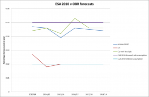
ESA v OBRThe CPI assumption appears to be fairly much in line with forecasts, but the average nominal GDP and current receipt year on year increase over the next 6 years of forecasts are 4.47% pa and 4.61% pa (4.72% pa if National Accounts taxes are used rather than all current receipts) respectively. A 0.5% reduction in the discount rate to 4.5% pa would be expected to increase the liability by over 10%.

Another, possibly purer, measure of economic growth, removing as it does the distortions caused by net migration, would be the growth of GDP per capita. If we take the OBR forecasts for real GDP growth per capita and set it against the long term ESA 2010 assumption of 1.05/1.02 – 1 = 2.94% the comparison is even more interesting:
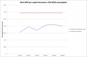
Real GDP v ESAIn this case the ESA assumption is around 1% pa greater than the forecasts would suggest, making the liability less than 80% of where it would be using the average forecast value.

The ESA 2010 assumptions are intended to be fixed so that figures for different years can easily be compared. It would clearly be easy to argue for tougher assumptions from the OBR forecasts (although the accuracy of these has of course not got a great track record), but perhaps more difficult to find an argument for relaxing them further.

Whether the consensus holds over keeping them fixed when and if the liability figures start to get more prominence and a lower liability becomes an important economic target for some of the larger EU member states remains to be seen. However if the assumptions cannot be changed, since public sector benefits now have a 25 year guarantee in the UK (other than the normal pension age now equal to the state pension age being subject to review every 5 years), then the cost cap mechanism (ie higher member contributions) becomes the only available safety valve. So we can perhaps expect nurses’ and teachers’ pension contributions to become the battleground when public sector pension affordability becomes a hot political issue once more.

We can poke fun at the Government’s enthusiasm to take on the Royal Mail Pension Plan and its focus on annual cashflows which made it look beneficial for their finances over the short term, but we may also look back wistfully to the days before public sector pensions stopped being viewed as a necessary expense of delivering services and became instead a liability to be minimised.

The misbehaviour of mistakes

The Comedy of Errors - with apologies to William Shakespeare in the week of his 450th birthday
The Comedy of Errors
– with apologies to William Shakespeare in the week of his 450th birthday

There are two ways that mistakes can happen when you are carrying out an experiment to test a hypothesis. Experiments usually have two possible outcomes: accepting a “null” hypothesis, which means concluding that the experiment does not challenge its truth, and rejecting a null hypothesis, which means concluding that the experiment does provide sufficient evidence to do so.

Type 1 errors, otherwise known as “false positives” are when you think there is evidence for rejecting the null hypothesis (eg deciding there actually is something wrong with a smear test) when there isn’t. Type 2 errors, otherwise known as “false negatives”, are when you accept the null hypothesis but you really shouldn’t (eg telling someone they are all clear when they are not).

Saddam Hussain once famously said “I would rather kill my friends in error, than allow my enemies to live”. This suggests that he was really very much more concerned about Type 2 errors than Type 1 errors.

He is not alone in this.

A recent widely reported academic paper published in Nature claimed to have a test that “predicted phenoconversion to either amnestic mild cognitive impairment or Alzheimer’s disease within a 2–3 year timeframe with over 90% accuracy”.

The latest statistics from the Alzheimer’s Society suggest that around 1 in 14 or 7% of over 65s will develop Alzheimer’s. Probably not all of these people will contract the disease within 3 years, but let’s assume for the sake of argument that they will. Even so this means that, out of 1,000 people over 65, 930 people will not get Alzheimer’s within 3 years.

Applying the 90% accuracy rate allows us to detect 63 out of 70 people who actually will get Alzheimer’s. There will be 7 cases not picked up where people go on to develop Alzheimer’s. However the bigger problem, the Type 1 error that Saddam Hussain was not so bothered about, is that 10% of the people who do not and will not get Alzheimer’s will be told that they will. That is 93 people scared unnecessarily.

So 63 + 93 = 156 people will test positive, of which only 63 (ie 40%) will develop Alzheimer’s within three years. The “over 90%” accuracy rate becomes only a 40% accuracy rate amongst all the people testing positive.

In statistical tests more generally, if the likelihood of a false positive is less than 5%, the evidence that the hypothesis is true is commonly described as “statistically significant”. In 2005 John Ioannidis, an epidemiologist from Stanford University, published a paper arguing that most published research findings are probably false. This was because of three things often not highlighted in the reporting of research: the statistical power of the study (ie the probability of not making a type 2 error or false negative), how unlikely the hypothesis is being tested and the bias in favour of testing new hypotheses over replicating previous results.

As an example, if we test 1,000 hypotheses of which 100 are actually true but with a 5% test of significance, a study with power of 0.8 will find 80 of them, missing 20 because of false negatives. Of the 900 hypotheses that are wrong, up to 5% – ie, 45 of them – could be accepted as right because of the permissible level of type 1 errors or false positives. So you have 80 + 45 = 125 positive results, of which 36% are incorrect. If the statistical power is closer to the level which some research findings have suggested of around 0.4, you would have 40 + 45 = 85 positive results, of which 53% would be incorrect, supporting Professor Ioannidis’ claim even before you get onto the other problems he mentions.

We would have got much more reliable results if we had just focused on the negative in these examples. With a power of 0.8, we would get 20 false negatives and 855 true negatives, ie 2% of the negative results are incorrect. With a power of 0.4, we would get 60 false negatives and 855 true negatives, ie still less than 7% of the negative results are incorrect. Unfortunately negative results account for just 10-30% of published scientific literature, depending on the discipline. This bias may be growing. A study of 4,600 papers from across the sciences conducted by Daniele Fanelli of the University of Edinburgh found that the proportion of positive results increased by over 22% between 1990 and 2007.

So, if you are looking to the scientific literature to support an argument you want to advance, be careful. It may not be as positive as it seems.

Inflation and Age

A recent piece of research into how the way people spend their money changes as they age got me thinking about how age might currently influence a particular household’s own Consumer Price Inflation (CPI).

The Office of National Statistics (ONS) produces a monthly inflation report for each major sector of expenditure, alongside the updates for CPI. The latest of these, out yesterday, showed CPI falling to 1.6%, finally less than wage inflation in the UK. However CPI is based on an average basket of goods to determine how people’s cost of living is increasing and this of course differs from person to person. In particular, the spending habits of the population, when split by the age of the household reference person (the ONS term for what used to be known as the “head of household”, when it was always the man of the house even when that house was owned by the woman: this was changed in the 90s), differ markedly.

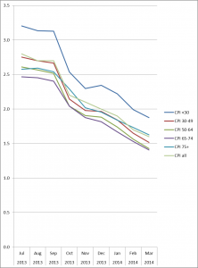
CPI by age

The graph is based on the latest splits available of spending by the 12 categories used by the ONS to determine CPI (these are from 2012, although the overall averages these figures provide give CPI figures of 0.1% or less different from the actual figures so I think they will do for illustrative purposes).

What we can see straight away is that the gap between CPI for under 30 year old households and the 65-74 year old households has shrunk from around 0.8% pa to around 0.5% pa. However, under 30 year olds are still experiencing consistently higher inflation than the rest of the population. In fact this section of the working population are still experiencing inflation well in excess of the average wage inflation of 1.7% announced today.

The big winners since July have been the 30-44 year olds, with their households down to 1.5% pa inflation from 2.7% pa at the start of the period. And if your head of household is between 50 and 74 you are now experiencing average inflation year on year of only 1.4% pa.

The people who have not won quite so much (other than the under 30s) have been the over 75s, with their households at 2.6% pa at the start of the period and at 1.6% pa (ie bang on the average) at the end. Interestingly, the under 30s and over 75s have an average inflation above the headline rate, and everyone in between is coming in below it.

Why the differences? Well the change in the inflation rate has varied hugely amongst the 12 categories of spending.

CPI constituents

Food and non-alcoholic drink inflation has fallen from 3.9% to 1.7%, Clothing and footwear from 2.5% to 0.2% and Transport from 1.5% to -1.0%, so any sector with spending habits weighted towards these areas is going to have done better than average. The 30-64 year old households spend between 5.9% and 6.1% on Clothing and between 15.9% and 16.7% on Transport compared to the averages of 5.6% and 15.2% respectively. However the over 75s spend 18.8% of their income on Housing, fuel and power, which has seen inflation remain stubbornly high at 3.1% pa, and have higher than average spending on Health (4.6% against 1.5% average) and Household goods and services (8.3% against 6.8% average), both of which saw an increase in inflation over the period. Education appears to be in a world of its own, with inflation falling from 19.7% at the start of the period to 10.3% at the end. Perhaps fortunately for those placing a lot of faith in the headline rate, Education does not account for more than 3% of spending in any group (it’s 3% for the under 30s) and only 1.6% overall.

So, as always, the picture is more complicated than the headline rate. And, when it comes to inflation, age matters.

The Cost of Defined Benefits is Defined

The Pensions Regulator has just published a remarkable survey. As it says:

In August 2013, The Pensions Regulator (the regulator) commissioned quantitative research into the running costs of defined benefit (DB) pension schemes. The specific objectives of the research were:

  • To understand the costs of administering a DB scheme;
  • To contextualise and understand scheme costs against services received;
  • To compare and contrast scheme costs by size, specifically at what size do scale efficiencies become apparent.

What they found instead was that costs for what they termed small schemes (those with 12 to 99 members, schemes with fewer than 12 members were excluded from the survey) were so variable that, even ignoring the top and bottom 5% of schemes, they ranged from £264 per member per year to £2,744 per member per year (over 10 times as much). This is far larger than any variation by size of scheme: the average for a small scheme is £1,054 per member per year, whereas the average for a very large scheme (more than 5,000 members) is £182 per member.

TPR chart

So the conclusions are clear: the costs of running a DB scheme are not primarily dependent on how big your scheme is, but how well you administer your scheme, how well you manage your advisors and service providers and how disciplined you are in setting an investment strategy and managing its implementation. For a small scheme, the irrelevance of size to costs is further illustrated by the following scatter graph helpfully supplied in the report, showing no correlation between total running costs per member and scheme size for schemes with 12 to 99 members:

Small scheme scatter

This is not necessarily a call for more independent trustees. The proportion of small schemes which used independent trustees (22%) was not so much less than the proportion of large schemes (1,000 to 4,999 members) which used them (35%) and yet the variation in costs for large schemes (£80 to £689 per member per year) was not nearly as great. But it is a call for a much greater weighing of costs and benefits in the services trustees procure for small schemes.

So there is considerable work to do for small DB schemes, particularly with the additional costs likely to result from the Regulator’s recent proposals, which were consulted upon earlier this year. Another point that comes out of the survey is that the vast majority of schemes, of all sizes, regards the year in question where these costs were measured (2012) as having higher costs than an “average” year. Perhaps this is true, or perhaps there is some denial going on here about what the new normal looks like.

If you want to see how your scheme compares to others of its size, the Regulator has provided a handy checklist to capture the information. This would seem to be an exercise which many small schemes, if they are not already aware of this as an issue, would be well advised to carry out as a matter of urgency.

Sponsors are not currently getting good value from some of these schemes, particularly small schemes, which account for 1,689 (or 36%) of the 4,696 DB scheme universe (excluding hybrid and public sector schemes). The cost of defined benefit has been defined. And it needs to come down.

Actuaries and Placebos

Source: Wikimedia Commons - Original work of the US Federal Government - public domain
Source: Wikimedia Commons – Original work of the US Federal Government – public domain

Placebos are medicines or procedures “prescribed for the psychological benefit to the patient rather than for any physiological effect” according to the Oxford English Dictionary. Originating as a way of doctors to clear their consulting rooms of people they did not feel could be helped with real medicine, placebos’ status, as Ted Kaptchuk makes clear, underwent a dramatic fall from acceptability after the Second World War and the general adoption of the randomised controlled trial to establish the efficacy of medical treatments. The lack of research since into the various aspects of treatment collectively called “the placebo effect” (Kaptchuk is a notable exception to this) is bemoaned by Kaptchuk, who feels an important element of successful treatments is not getting the attention it deserves.

This may be changing. After all, the impacts of placebos and nocebos (from the latin meaning “I will do you harm”, these are as mysterious as placebos, but make you feel worse rather than better) can be dramatic. Ben Goldacre does a five minute routine on them here (warning: it’s a bit rude). A recent Horizon documentary also looked at placebos, with the suggestion that they might have had an impact on the UK Olympic Team GB cyclists as well as in more serious cases like those of Parkinson’s sufferers.

Why am I talking about them? Because, in a more general way, to quote Seth Godin: “A placebo is a story we tell ourselves that changes the way our brain and our body work”. Godin asks why, if a placebo can make wine taste better and improve the way your back feels, we should be squeamish about discussing them.

The main reason, of course, is the feeling that it is unethical to promote treatments and products which have no scientific basis. This also explains why people operating within professions – whether medical or otherwise – are so wary of them. Professions see themselves, in the Baconian tradition, as bodies of people with expert knowledge using that expertise scientifically for the benefit of society. Placebos do not fit into this world view at all.

Imagine two pensions actuaries: Actuary A is a very experienced practitioner, known for years by many of his clients and a trusted source of wisdom. Everything he says, which he conveys with a practised seriousness and sonorousness, interspersed with frequent not-completely-discreet stories about the antics of other people he has met in his long career, is accepted by his clients like tablets of stone brought down from the mountain.

Actuary B is a young relatively newly qualified actuary. He has just obtained his scheme actuary certificate after toiling away in the background providing much of the analysis and calculation work underpinning the consultancy provided by the more senior actuaries in the firm, including Actuary A. He is seeking his first scheme actuary appointment, and has been trouping along to trustee meetings behind Actuary A for some carefully selected clients which the firm would like to move from A to B. B realises quickly, confirmed by his first trustee meeting where one of the trustees looks him up and down quickly and tells him that he doesn’t trust anyone with shiny shoes, that these clients have been selected because of their particular reluctance to pay the elevated charge out rate of Actuary A. Unfortunately this does not mean that they are keen to see a cheaper actuary installed on their schemes, quite the reverse in fact. The trustees who are most incredulous about the fees associated with actuarial advice seem also to be those who set most store in the mystical wisdom of Actuary A and his booming voice.

Now if I say that I think there are placebos at work here I do not mean that these clients are not receiving carefully constructed advice, appropriate to their needs and in compliance with all legislative and regulatory standards. What I am saying is that, from the lack of shine on Actuary A’s shoes, to the gravitas (I think it used to be referred to by a different generation as “bottom”) brought to bear on any particular issue by Actuary A, there are many things which do not add anything to the quality of advice (which in some cases has been almost entirely constructed by Actuary B), but which are valued at least as much (if not more, in Actuary B’s view) by the client.

As Simon Carne has pointed out recently, supported by John Reeve in this month’s The Actuary, the physical advice is subject to an ever increasing body of regulation, to the point where some clients might be deterred from even asking an actuary the time. However, everything about the environment in which the advice is conveyed – from the tone of voice; to the way the actuary sits; to the degree of direct eye contact; to the choice of gestures used; to, where meetings are held at the firm, the whole experience of someone entering the building and being led into a room deliberately designed to make an impression – is not. In the same way that a presentation is not just the collection of slides put together on PowerPoint, we need to give more recognition to the fact that the advice that is valued by clients is a lot more than that which is written or even spoken.

Although, judging from the number of times I have had to be the bearer of bad news (with the expectation that that will be the case preceding me and therefore helping me in delivering that message in many cases), perhaps the more usual term for this element of actuarial advice should be nocebo rather than placebo.

Where would you rather be working in your later years: UK or Germany?

Towers watson surveyAs a quick illustration of the differences between how businesses in the UK and Germany approach change this chart from the recent Economist Intelligence Unit research carried out for Towers Watson takes some beating. To UK eyes, an insane proportion (45%) of German businesses are proposing to make physical changes to their workplaces by 2020 to accommodate a greying workforce. There is an even more dramatic contrast when the issue of flexible working hours is raised. Less than half of UK businesses intend to offer more flexible working hours by 2020, compared to over three quarters of German businesses.

Neither are we interested in training our older workers apparently. Only 28% of UK businesses intend to ensure that the skills of their older employees remain up to date, compared to 48% of German businesses.

So where are UK businesses preparing to manage change then? Giving employees more choice over their benefits is cited by 60% of UK businesses, compared to 45% in Germany and the European average of 48%.

But is this the positive step it is presented as? It seems unlikely to me that these UK businesses that don’t want to invest in older workers’ working environments or give them flexibility over hours or location or train them is interested in providing any choice over benefits that doesn’t also cut their costs. There are going to be some battles ahead over exactly how the pensions changes in the Budget are to be implemented. Judging from this survey, they are going to be hard fought.