Investment consultants and value

I was introduced to a great piece of research by Tim Jenkinson, Howard Jones and Jose Vicente Martinez this week (Tim was speaking at the Workplace Pensions Live event in Birmingham). It looked at the performance of US active equity products recommended by investment consultants (a large sample covering 90% of the investment consulting market worldwide) compared to those not recommended by them over the period 1999-2011.

What they found was that:

  • Investment consultants’ recommendations seem less heavily influenced by return-chasing strategies than by more intangible personal assessments, eg of the capabilities of fund managers, the consistency of their philosophies and the usefulness of their reports (any of those explanations for recommendations sound familiar?);
  • People tend to follow the recommendations they are given; and
  • There is no evidence that investment consultants’ recommendations add value to plan sponsors.

IC underperformance
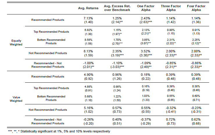
The underperformance of recommended funds compared to unrecommended was 1% pa on average when all funds were given an equal weighting, falling to an underperformance of 0.26% pa when weighted by the size of fund recommended. This suggests that when investment consultants move away from recommending larger funds they are doing even worse.


There may be other reasons for using an investment consultant other than higher returns of course. People may appreciate “a narrative that provides comfort” (similar to the placebo effect in financial advice I previously discussed here) and which gives them ready-made explanations for their own stakeholders. However, bearing in mind the consistent underperformance, why do they follow the recommendations they are given?

One reason may be that the recommendations provide cover for decisions made. Another may be regulatory pressures, eg the Pensions Regulator in the UK requires pension scheme trustees to take professional investment advice (a requirement Tim Jenkinson believes is unhelpful) and it may be viewed as odd to then ignore it.

But the report concludes that a more likely reason is that people are generally unaware of how little value is being added. Certainly studies like this one that set the problem out in such stark terms are fairly thin on the ground. The investment consultants’ world is a very concentrated one (of the $25 trillion funds under management: $4.4 trillion are managed by Aon Hewitt, $4 trillion by Mercer and $2.1 trillion by Towers Watson) and the necessary information can be difficult to get hold of.

Another reason that the underperformance may be less obvious is the impact of the recommendation itself. As John Allen Paulos explains in his classic A Mathematician Plays the Market, for an over or underperforming stock you both need the performance itself and for someone to pick it. If you always pick what the investment consultant recommends the second condition is automatically met. Sometimes that will be the lucky stock and sometimes it won’t, but you will always choose it when it is, whereas a random choice of stocks will choose it in its lucky weeks less frequently.

What all this tells us is that you cannot assume that the additional complexity investment consultants’ appear to be biased towards is adding any value to your pension scheme or business. Tim Jenkinson suggests there should be a presumption of passive investment unless a very persuasive argument for active management can be advanced. And at the small end, as he says: “if you’re not big, be simple”.

Postcode mortality

As Rowan Atkinson once said: “Life is one of those things that most of us find very difficult to avoid”. You would imagine that death would be similarly unavoidable, but not in all cases it would seem.

The Office of National Statistics (ONS) have just issued the latest figures (for 2012) on what they define as avoidable deaths (“mortality figures for causes of death that are considered avoidable in the presence of timely and effective healthcare or public health interventions”) and have concluded that these account for a staggering 23% of all deaths.

Avoidable deaths timelineAvoidable deaths defined in this way can be further broken down into preventable deaths (ie those that can be avoided mostly or completely through public health interventions, eg traffic accidents) and amenable deaths (ie those that can be avoided mostly or completely through good quality healthcare, eg epilepsy). Some, eg ischaemic heart disease (22% of avoidable deaths in men), are seen as both.


One interesting aspect of this release is the regional breakdown of avoidable deaths as a percentage. These vary from 15% in the South (outside London) to 20% in the North West for women and from 24% in the South West to 31% in London and the North for men.

Avoidable deaths by region

As we can see from the following graph, it is possible for the proportion of deaths by cause to change quite dramatically over time. Could this also be true for avoidable deaths by region?

Avoidable deaths by source

The methodology for calculating the impact of improved survival rates of various conditions in terms of the number of deaths avoided is “age-standardised”, which means that we are all living in a population with the same structure as an average European population from 1976, when ABBA were in their pomp. The actual potential proportion of lives saved may therefore be more or less than 23%. This also means that some of the differences between regions could be due to how different their population structures are to ABBAland, eg there are a lot more over 65s as a proportion of the 2013 Standard Population (which the ONS should be moving to using soon) than there are in the 1976 version.

However, as David Spiegelhalter shows here, it is relatively straightforward to convert an improvement or deterioration in mortality rates into an increase or decrease in life expectancy. Making a few heroic assumptions (in this case: 1. that the most popular mortality table currently used by occupational pension schemes, but without any mortality improvements since 2002/03, is an appropriate way to estimate the effect of removing avoidable mortality on life expectancy; and 2. that the mortality is avoided equally at all ages from 65 onwards) we can therefore estimate the 7% difference for men and 5% difference for women in the degree of avoidable mortality to be equivalent to around 0.6 years for men and 0.4 years for women in the life expectancy at age 65.

If the mortality rates could therefore be improved in regions with currently the highest proportions of avoidable mortality, so that the avoidable mortality remaining was no higher than in those regions where it is currently at the lowest proportions, life expectancy at 65 would be increased in some regions by up to 0.6 years.

However, averaging by region smooths out much larger differences between postcodes (postcode mortality mapping is commonly used, eg by insurance companies in setting annuity rates). For instance, the current gap between the highest and lowest life expectancy at age 65 is 6 years for men (between Harrow and Glasgow City) and 5.5 years for women (between Camden and Glasgow City). So perhaps we should be shooting for the rather higher ambition of removing all of the avoidable mortality. If the overall average avoidable mortality of 23% could actually be avoided, this would lead to an average increase in life expectancy at age 65 of 2 years.

Finally, what about the differences between men and women? The ONS report states than “Men are more likely to die from potentially avoidable causes than women, with about 28% (67,548 out of 240,238) dying from avoidable conditions compared with 17% (44,945 out of 259,093) of women in 2012.” That 11% difference would equate to a life expectancy difference at 65 of around 1 year, which is about half of the current gap between men and women at 65. Women living longer than men? It would seem that it’s only half inevitable.