
A recent piece of research into how the way people spend their money changes as they age got me thinking about how age might currently influence a particular household’s own Consumer Price Inflation (CPI).
The Office of National Statistics (ONS) produces a monthly inflation report for each major sector of expenditure, alongside the updates for CPI. The latest of these, out yesterday, showed CPI falling to 1.6%, finally less than wage inflation in the UK. However CPI is based on an average basket of goods to determine how people’s cost of living is increasing and this of course differs from person to person. In particular, the spending habits of the population, when split by the age of the household reference person (the ONS term for what used to be known as the “head of household”, when it was always the man of the house even when that house was owned by the woman: this was changed in the 90s), differ markedly.
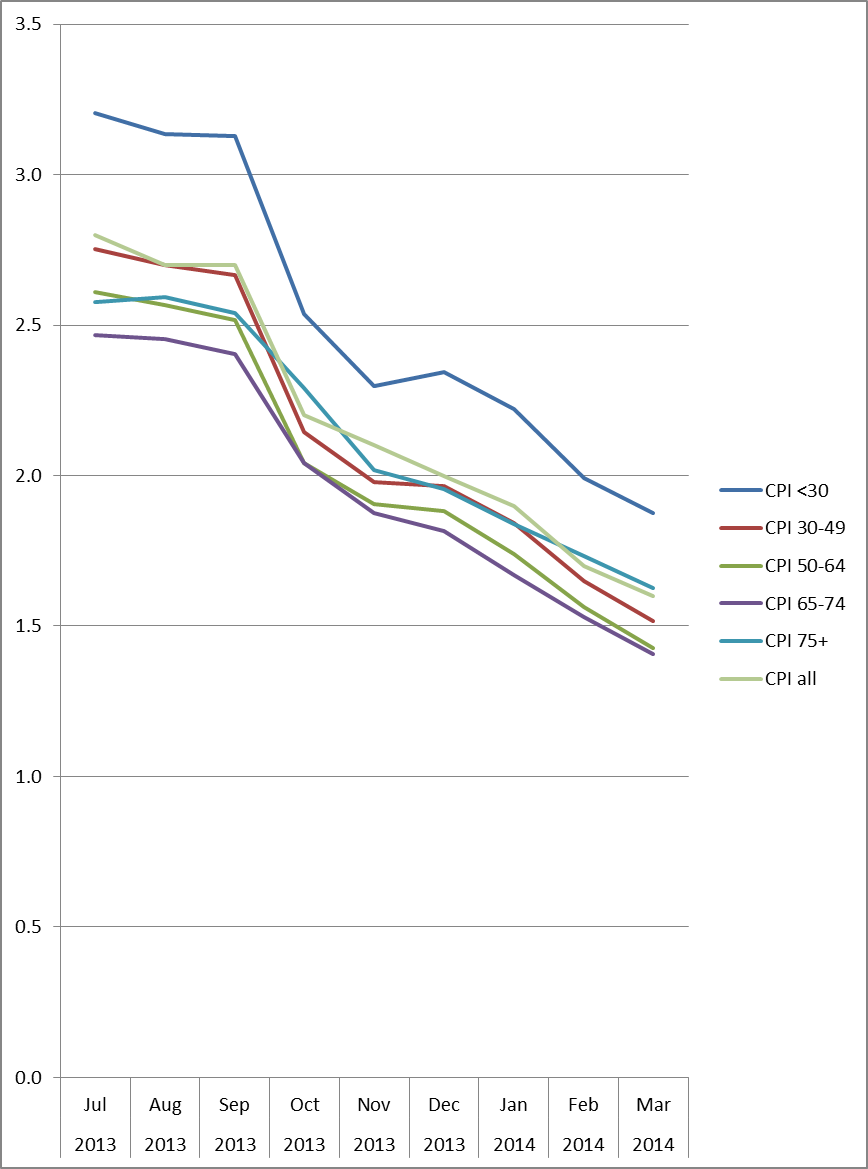
The graph is based on the latest splits available of spending by the 12 categories used by the ONS to determine CPI (these are from 2012, although the overall averages these figures provide give CPI figures of 0.1% or less different from the actual figures so I think they will do for illustrative purposes).
What we can see straight away is that the gap between CPI for under 30 year old households and the 65-74 year old households has shrunk from around 0.8% pa to around 0.5% pa. However, under 30 year olds are still experiencing consistently higher inflation than the rest of the population. In fact this section of the working population are still experiencing inflation well in excess of the average wage inflation of 1.7% announced today.
The big winners since July have been the 30-44 year olds, with their households down to 1.5% pa inflation from 2.7% pa at the start of the period. And if your head of household is between 50 and 74 you are now experiencing average inflation year on year of only 1.4% pa.
The people who have not won quite so much (other than the under 30s) have been the over 75s, with their households at 2.6% pa at the start of the period and at 1.6% pa (ie bang on the average) at the end. Interestingly, the under 30s and over 75s have an average inflation above the headline rate, and everyone in between is coming in below it.
Why the differences? Well the change in the inflation rate has varied hugely amongst the 12 categories of spending.

Food and non-alcoholic drink inflation has fallen from 3.9% to 1.7%, Clothing and footwear from 2.5% to 0.2% and Transport from 1.5% to -1.0%, so any sector with spending habits weighted towards these areas is going to have done better than average. The 30-64 year old households spend between 5.9% and 6.1% on Clothing and between 15.9% and 16.7% on Transport compared to the averages of 5.6% and 15.2% respectively. However the over 75s spend 18.8% of their income on Housing, fuel and power, which has seen inflation remain stubbornly high at 3.1% pa, and have higher than average spending on Health (4.6% against 1.5% average) and Household goods and services (8.3% against 6.8% average), both of which saw an increase in inflation over the period. Education appears to be in a world of its own, with inflation falling from 19.7% at the start of the period to 10.3% at the end. Perhaps fortunately for those placing a lot of faith in the headline rate, Education does not account for more than 3% of spending in any group (it’s 3% for the under 30s) and only 1.6% overall.
So, as always, the picture is more complicated than the headline rate. And, when it comes to inflation, age matters.