I feel like I have at least three reasons to be cheerful this morning:
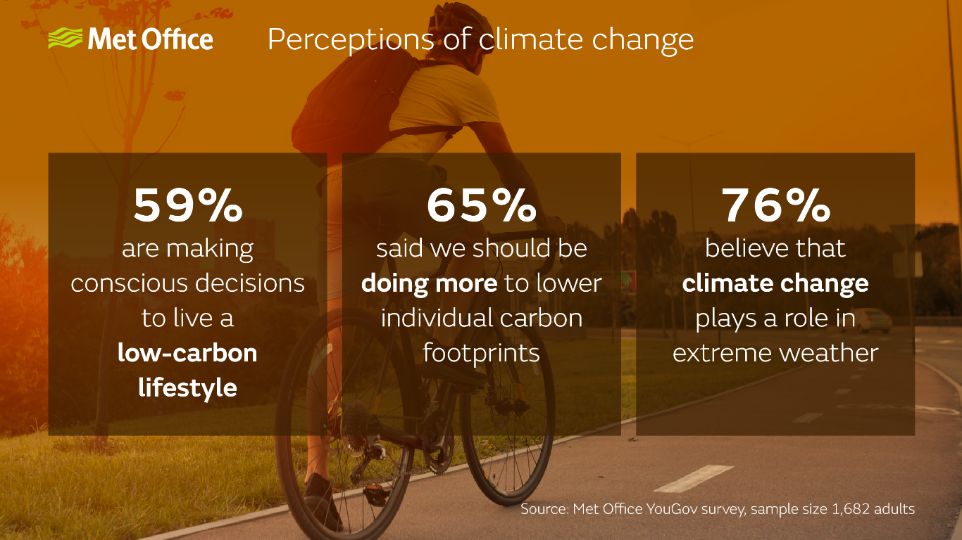
Firstly, the Met Office has released the results of their latest survey (see above) on our attitudes to reducing our carbon footprint and they are very heartening. It seems that most of us are looking up after all.
Secondly, it is also encouraging within the context of Extinction Rebellion’s wider strategy to mobilise 3.5% of the population into campaigning to end the fossil fuel economy and replace it with something better which works for everyone.
On 21 April we will be arriving in London to test out the level of support we now have. My third reason to be cheerful is that an impressive list of other organisations will be joining the demonstration, including Greenpeace, Friends of the Earth, Earth Day, NHS Workers Say No, Greener Practice, Global Justice Now, Black Lives Matter local groups, Don’t Pay UK, CND and the PCS Union.
Meanwhile the Bank of England is pondering whether to raise interest rates even further in response to a vegetable shortage and panicking when the inevitable fall in inflation (which is bound to happen once the comparisons used to calculate it are post the initial price shock) does not coincide with the smooth curves in their models.
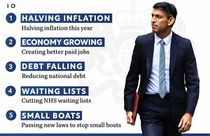
And the Government? A reminder of their top 5 priorities:
It becomes easy to see why the XR UK Strategy 2022 document says:
Those in power are neither willing nor capable of acting on the climate and ecological crisis. They lack the courage, conviction and creativity to do what is required.
So it looks like, once again, it is up to the rest of us to do what we have already understood needs to be done.
Seth Godin claims that all successful cultural change has a very simple two step loop to it: of awareness followed by tension and then further awareness, etc.
It does not look like the awareness is so much the issue any more, but what about the tension, ie why should we take action? I think the Government are providing the tension in buckets at the moment.
He summarises with a 3 point plan:
Tell 10 people.
Create tension among the 10 so they take action.
The action causes each of them to tell 10 people.
So this is me creating tension apparently. My wife would say I do that every time I open my mouth. And if 10 of you turn up on 21 April to wave a banner with me I will have a fourth reason to be cheerful!
Jim Callaghan’s memoirs of the way in which his 5% pay increase limit came about (courtesy of Andy Beckett’s excellent When The Lights Went Out) are fascinating:
At the Cabinet Meeting on 22 December, I threw out the idea that from August 1978, we should aim to get pay settlements down to 5%…As far as I can recall, because no formal proposal was before the Cabinet, there was no discussion…Ministers probably assumed that I was thinking aloud – as indeed I was. However, when I made my New Year Broadcast…the 5% idea hardened and popped out when the interviewer tempted me…
Inflation was at around 8% at the time. However average earnings between August 1977 and August 1978 rose by 14% and this was the anchor for future pay deals. In September 1978, 50,000 workers at Ford went on strike in response to a 5% pay offer and went on strike (“Stuff the 5%” was on some of the placards). Two months later, the strikers accepted an offer of 17% from Ford.
CPI was at 10.1% to January 2023 and CPIH (the one that includes housing costs) at 8.8%. However the anchor now appears to be working in the opposite direction due to years of low inflation: a recent CIPD survey indicated that planned pay settlements in the public sector fell to 2% from 3% in the quarter before, compared to a median of 5% in the private sector.
This may be changing. Another recent survey of 181 large private firms had 29% of firms expecting to award pay increases between 5% and 5.99% in 2023 and 24% increases of 6% or higher.
This therefore seems like an odd time for the UCEA (the Universities and Colleges Employers Association) to refuse to negotiate with the University and College Union, particularly after agreeing a two week “period of calm” without strike action specifically so that further negotiations could take place. Instead they are unilaterally implementing their arbitrary number.
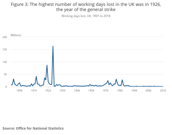
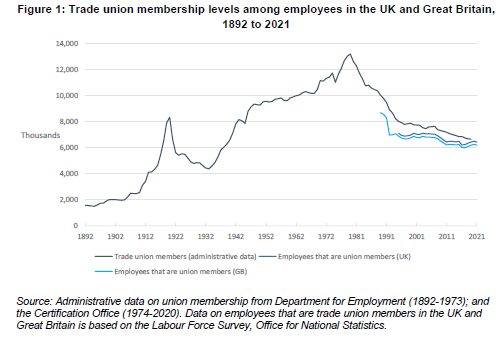
From the column inches expended on the recent industrial unrest, you could be forgiven for thinking that we were in the middle of an unprecedented time of strikes. More working days were lost to strike action in 2022 than at any time since 1989. However, as the graph above shows, and the accompanying ONS release details, what is in fact unprecedented is the degree of industrial peace we have had in the UK since 1985 when the miners’ strike was violently suppressed. The number of strike days lost in 2022 was 2.4 million, which sounds a lot until you realise that there were almost 30 million lost in the so-called winter of discontent in 1979 and the highest year for strikes was 1926, the year of the general strike, when 162 million days were lost.
Between 1919 and 1921 the number was above 25 million for all three years (peaking at 86 million in 1921, the second highest strike year on record). In 1919, an average of 100,000 workers were on strike every day: coal miners, railway workers, transport workers, dockers, police officers, soldiers, ex-servicemen, journalists, painters, teachers, farm workers, cotton spinners and many others. Yes, that’s right – police officers and soldiers were striking! This led to the Police Act of 1919 which established the Police Federation. As David Allen Green has pointed out, this has led to the seeming paradox of a group with no right to strike appearing to have some of the strongest employment protections.
And the soldiers? As John Westmoreland has written in Counterfire, this is even more interesting.
On 3 January 1919 2,000 soldiers in Folkestone refused to board troop ships bound for France to be deployed against the Russian Bolsheviks on the side of the White Russians. They refused orders and led a march of 10,000 through the town. They then formed a Soldiers’ Union. Despite a media blackout, there were around 50 mutinies across the UK and one particularly shocking one of the 13th Battalion of the Yorkshire Light Infantry at Archangel in Northern Russia in February 1919.
A very successful Hands Off Russia campaign increased the pressure on the Government, who were eventually forced to demobilise the troops. The mutineers largely escaped punishment, when mutiny was normally punishable by death (and General Haig indeed advocated shooting the strikers). The Government was forced to meet many of their demands. Demobilisation, which had been slow up until then because of the Russian military campaign planned, sped up considerably. British forces shrank from about 3.8 million at the Armistice to around 900,000 in late 1919 and down to 230,000 by 1922. Demobilising so many men in such a short space of time increased unemployment markedly, from just 1% of the labour force in May 1920 to 23% by May 1921.
Meanwhile, the Spanish flu pandemic, which claimed its first victim in May 2018, swept across the globe, infecting around 500 million people and killing around 50 million of them in the absence of treatments for flu or antibiotics to treat complications like pneumonia. This compares with the 756 million cases of Covid-19 recorded by the WHO to date, from which there have been 6.8 million deaths.
The strikes of 2023 are not extreme by historical standards at all. However, attempts by the Government to further muzzle the rights of people to withdraw their labour certainly are.
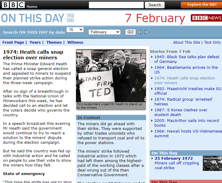
This was an unprecedented event in UK history. It evoked memories of wartime privation and there were fears that rationing would return. It put households under considerable additional strain while being praised for showing us a better way to live by some commentators. Some people said that they liked the lack of traffic and sense of life slowing down. Businesses developed significant cashflow problems as a result. It left a political legacy, part of which cost the prime minister of the time his job. I am of course talking about the three-day week of 1974.
On 13 December 1973, the UK Prime Minister Edward Heath made a special broadcast, telling us that we were facing a grave emergency. A couple of weeks later, at midnight on New Years Eve, the three-day week began. The idea was to manage the low oil stocks and dwindling coal stocks through the winter by reducing energy usage.
As Andy Beckett details in his excellent When The Lights Went Out, it was a hugely complex process with many restrictions, both important and petty, to observe. All businesses, except shops and those deemed essential to the life of the country, would receive electricity either between Monday and Wednesday or Thursday to Saturday. Television broadcasts stopped at 10.30pm each night. Speed limits were reduced to 50 mph and floodlighting for sports events was banned. People reported each other for infringements on a daily basis. Patrick Jenkin, the Minister for Energy, suggested people clean their teeth in the dark before the Observer did a piece on his own electricity consumption.
Heath and his Government had a strategy underlying the three-day week, which was not voiced in public: rely on the public to respond well to a national emergency if the government looked like it was in charge. Cabinet papers spoke of the need to “appeal to moderate opinion by seeking to enlist help in the national interest” and that the “best way to bring pressure to bear…[on the miners]…was to shock them.”
Therefore, when he called an election on 7 February to ask the public “Who governs Britain?”, two days after the National Union of Mineworkers (NUM) had voted 81% in favour of a national strike in support of their pay demand of 43%, he did not expect to lose his majority at the subsequent election. Harold Wilson became Prime Minister. The dispute with the NUM was settled on 6 March with a 35% increase awarded. The three-day week ended on 7 March.
The experts weighed in on the social aspects of the three-day week. Dr Anthony Allbeury, a leisure expert at the University of Oxford, spoke of the value of “re-reading an old book or digging a garden…not spending money…finding ourselves back in that almost peasant state.” Dr Richard Fox, a consultant psychiatrist, wrote that he “approves of the three-day week…to get together, be more spontaneous, to experiment more in…sex lives while the children are doing a five-day week at school”.
However the three-day week was not popular. People had had to move to longer shifts on the days they were working and seeing friends and family on those days became difficult. However fishing tackle sales increased and golf courses were busier, often lit up by car headlights at night.
Several companies reported improved productivity and began negotiations for a permanent four-day week, most of which came to nothing. My memories of the three-day week (I was 11 at the time) are mainly confined to the 50 mph speed limit, which was much commented on, and games of ludo by candlelight in the evenings, but I think there was a sense of a folk memory being created even at the time which we would draw upon later.
And draw upon it we did when the pandemic hit. In my view it explains some of the crazier employer-driven news stories: from how we need to get back to the office to save Pret to the whole quiet-quitting debate. These only make sense when you realise that the last time we had enforced days off for a (much shorter) period, the one and only priority was maintaining as much industrial output as possible (it fell by around 20% over the three-day week period).
Our way of working is changing because technology allows us to work in ways which better fit our lives than the 1970s-designed envelope we have been struggling with for a while now. It took a pandemic to force the employer-driven envelope apart and it is no use captains of industry trying to stick the bits of torn paper back into place and demanding we jump back into it. It is not all bad for employers: for instance, the four-day week certainly looks more likely to happen now.
The balance of power has changed. Unions may not have it, but employers have less of it too. And the Government apparently wants to play politics with the disputes in the background while insisting in public that it is nothing to do with them. We have seen how these kinds of games end for governments.
The Welsh Government made a fresh offer to health unions on 3 February which led to a suspension of all health strikes in Wales bar ambulance workers from the Unite union while negotiations continue.
On Friday the TSSA union (17,000 members) announced that members are to be given a vote on offers from the train companies in their long-running national dispute over pay, job security and conditions.
However:
Ambulance workers, teachers and university staff are amongst those striking over the next 3 weeks.
The very much larger union, the RMT (82,000 members), have rejected the train companies’ deal (9% over 2 years) due to the additional conditions attached affecting safety on the railways.
The Scottish Government is in talks with the Royal College of Nursing (RCN) and other unions representing NHS staff over a pay settlement for 2023-24, after imposing a pay deal which would give health workers an average 7.5% rise in December, which RCN nurses rejected.
Nurses from A&E, intensive care and cancer wards could join fresh strikes in England, as the RCN considers a continuous 48-hour strike, which could begin in weeks.
According to Reuters, a recent Chartered Institute of Personnel Development (CIPD) survey indicates that the gap between public and private employers’ wage expectations has widened. Planned pay settlements in the public sector fell to 2% from 3% in the quarter before, compared to a median of 5% in the private sector.
Meanwhile the UCU and the four other higher education unions (EIS, GMB, UNISON and Unite) and employer representatives from the Universities and Colleges Employers Association (UCEA) have agreed to further talks mediated by conciliation service Acas. The discussions began yesterday and continue today, covering pay, equality, job insecurity and workloads.
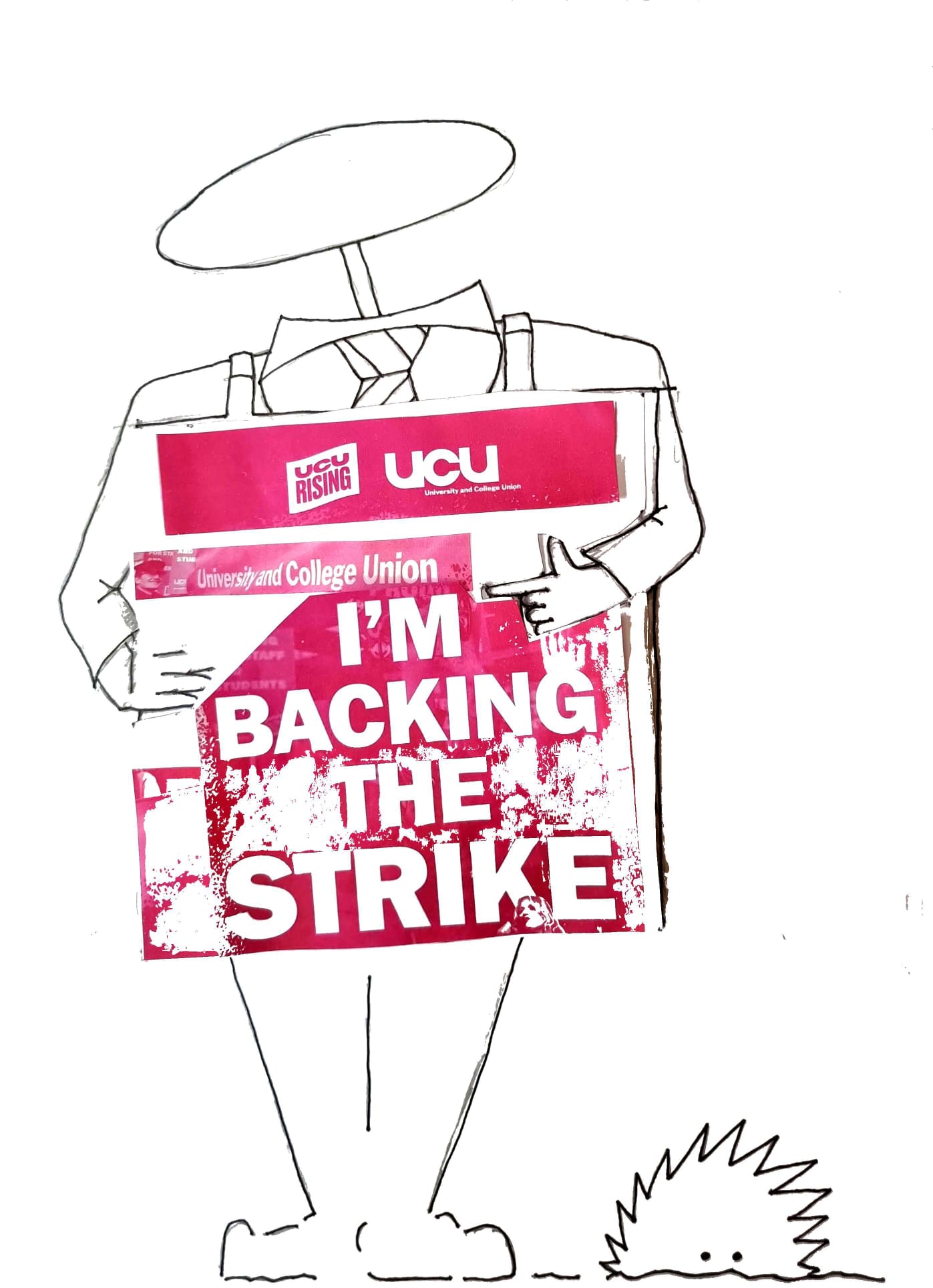
The strike continues today for three consecutive days. In total 18 days of strike action are planned throughout February and March, with a new strike ballot planned for March.
It seems fairly clear that public sector employers need to offer rather more than they have to date if any of these disputes are going to be resolved any time soon.
Day 3 of the UCU strike and we move onto fiscal austerity. This is the type of austerity we normally think of – increasing taxes and reducing government spending – and the most prevalent feature of all the UK governments we have had since 2010, with the cumulative lack of investment in the economy which is the underlying cause of most of the industrial action now taking place all around us. People are not just upset that their pay has not kept pace with inflation for 12 years, it is also the cumulative degradation of the conditions under which they work, seek healthcare, seek education for their children, travel anywhere or don ‘t travel anywhere that has enraged so many.
Rishi Sunak says he would love to give nurses a “massive” pay rise, but insists the money needs to be prioritised in other areas of the health service. Jeremy Hunt insists that his priority is tackling inflation and that public sector pay rises cannot be allowed to jeopardise this. Health secretary Steve Barclay hints that striking NHS staff could be offered a better pay deal from April – if unions accept “productivity and efficiency” reforms in return.
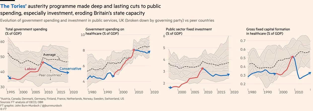
But improving productivity at work requires investment in where you work, as numerous studies have confirmed (one example here). Whereas, as the FT has shown recently, the UK has done the following since 2010:
Source: FT graphic by John Burn-Murdoch
And what about Jeremy Hunt’s reasons for keeping pay reducing in real terms in the public sector year after year? That paying an inflation matching increase would in some way “lock in” inflation. As Blair Fix tweeted recently:
Most economists accept that a wage-price spiral is possible, leading to runaway inflation. But why isn’t an interest-price spiral also possible? Interest and wages are just two forms of income. So why is one spiral ‘obvious’ while the other is blasphemy?
It doesn’t make sense until you realize that mainstream economists are in the business of legitimizing capitalist income. Wages can drive inflation (bad workers!) … but capitalist income is always productive.
He has also written about the problems caused by following economic theories treating inflation as a single value, when it is of course an average (or in fact usually at least an average of an average, sometimes switching between arithmetic and geometric averages in the process) taken of a highly volatile underlying data set. It is often said that inflation is redistributive: benefitting borrowers at the expense of lenders. However, one of the insights from Fix’s piece, drawing on Nitzan’s and Bichlar’s work in the 90s, is that big business also benefits from inflation: large corporations and oligopolies are raising prices the fastest at the expense of smaller businesses. Why do we never hear that this is driving inflation?
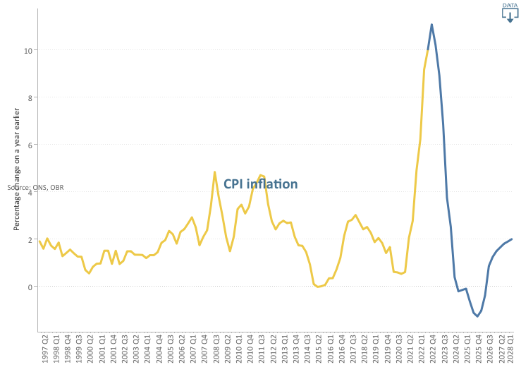
Because capitalist income is, in their view, “always productive”, you won’t hear about rent-price spirals or profit-price spirals from the current Government. Instead we will hear about how inflation needs to be reduced and this can only be done by further depressing the real value of all of our incomes for another year. This is what the Office for Budget Responsibility (OBR) has to say about CPI:
Following the Russian invasion of Ukraine, we now expect CPI inflation to peak in the fourth quarter of 2022 at its highest rate in around 40 years. The increase is driven primarily by higher gas prices feeding into sharp rises in domestic energy bills, alongside higher fuel prices and global goods inflation. Inflation then falls rapidly, and temporarily goes negative in mid-2024 as energy bills fall back and some global supply pressures reverse.
Source: Office for Budget Responsibility
On nominal wage growth and its contribution to Real Household Disposable Income (RHDI) they have this to say:
Nominal wage growth is also high in 2022 and 2023, although not high enough to prevent real wages from falling significantly. The contribution of labour income to annual RHDI growth then settles at an average of 2 percentage points a year over the remainder of the forecast.
Since one of the original motivations for starting this blog was the poor forecasting ability of the OBR, I am not going to set too much store on these forecasts, other than to point out the confidence it has that labour income demands will be thwarted and we will all see our real wages fall significantly over the next year. All in pursuit of a policy for which the expected value appears to be 6 months of deflation.
Deflation would be a disaster, As Frances Coppola has written:
Those who have money are happy because they are becoming wealthier. But someone, somewhere, is going hungry.
As she concludes:
So I’d rather money wasn’t deliberately kept scarce to placate savers. Let the supply of money respond to demand for it. When everyone wants to save in the form of money, you need to produce more of it so those who need to spend money don’t starve. Obviously, we don’t want to create so much money that it becomes worthless. But it is better to risk waking the demon of inflation than to deny people the means to live.
So when the Government says that they need to repress my pay in order to avoid locking in inflation, it reminds me of this paragraph from Catch 22:
Morale was deteriorating and it was all Yossarian’s fault. The country was in peril; he was jeopardizing his traditional rights of freedom and independence by daring to exercise them.
A Government intent on crushing real wage growth or even the hope of it while explicitly targeting deflation within the next two years; an extreme assymetry of power between wage earners on the one hand and lobbying corporations and asset owners on the other. This is why so many of us are exercising our traditional rights today.
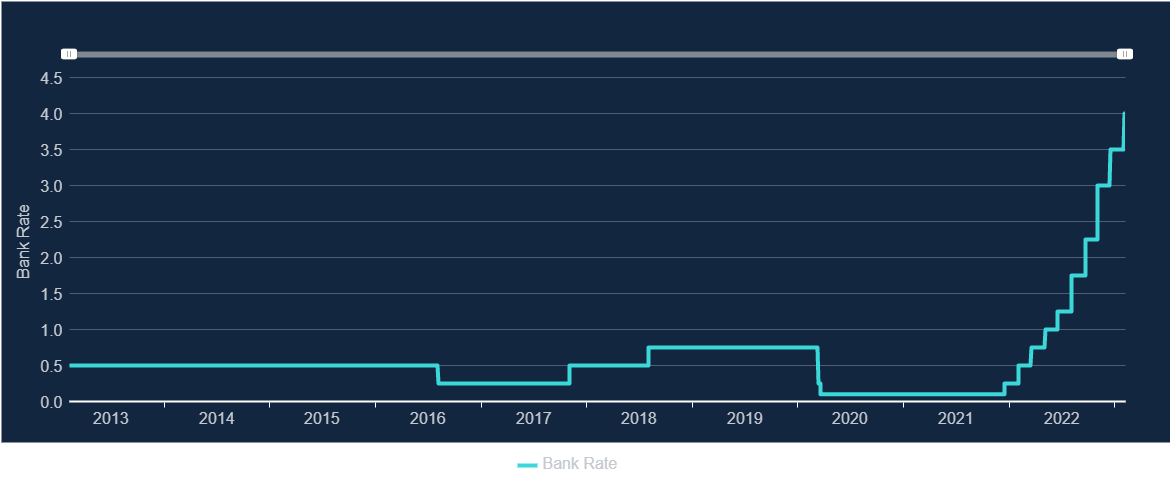
As we arrive at the second day of UCU strike action, we move from the industrial austerity discussed in my last blog to monetary austerity. With the latest rise in the Bank of England Base Rate to 4%, it also seems timely to consider the history of Bank of England independence.
Go to the Bank’s own website and you will find all the presentations from a 20 years on celebration of its independence from 2017. Ian McCafferty, External MPC Member at the Bank of England, gave a speech in 2017 about the circumstances of its introduction. The main reason given for the change was credibility of monetary policy.
But is this history entirely accurate? The Brussels and Genoa economic conferences of 1920 and 1922 (previously referred to here, and, as in the previous piece, the source of most of the next couple of paragraphs is from Clara Mattei’s excellent The Capital Order) first introduced the idea of central bank independence from democratic control as something desirable (before World War I, the Bank operated much more as a commercial bank and was the only limited-liability corporation allowed to issue bank notes, which gradually became a monopoly power). As Ralph Hawtrey, a senior economist at the UK Treasury of the time, said, the Bank of England should follow the precept: “Never explain; never regret; never apologise”.
The main reason formal independence does not appear to have been sought in the UK at the time, was that it was unnecessary. Montagu Norman was Governor of the Bank of England from 1920 until 1944, but was very close ideologically to Basil Blackett and Otto Niemeyer, who effectively ran the Treasury during those years. For example in 1927, the Governor of the Bank of France, Emile Moreau, relayed the opinion of the French Ambassador to London at the time: “Winston Churchill [Chancellor at the time]…isn’t really in control of the Treasury. The man who does in fact control it is Sir Otto Niemeyer, the intimate friend of M. Norman”.
The result of this was technocratic control of monetary policy, with politicians unable or unwilling to challenge the Bank or the Treasury. So, when Neville Chamberlain was Chancellor in March 1921, he said that: “the price of money is wholly outside government action”. Similarly, in March 1925 when Winston Churchill was Chancellor, he said that: “I think it would be an inconvenient practice if the Chancellor of the Exchequer were to set the precedent of expressing approval or disapproval of decisions taken at any time by the Bank of England”.
This was despite what, to at least some technocrats, must have been a terrifying increase in the electorate at the end of World War I – the size of the electorate tripled from the 7.7 million who had been entitled to vote in 1912 to 21.4 million by the end of 1918 as a result of the Representation of the People Act of February 1918. This gave the vote to 8.5 million women for the first time (those aged 30 or above and subject to some property requirements) and extended the male franchise to a further 5.2 million (all men over 21 if they were willing to serve British rule).
Technocratic rule ended following the 1945 General Election, when the new Labour Government nationalised the Bank, and the call for an independent central bank only really gained ground in 1992 when it was included in the Liberal Democrat election manifesto in that year. We might perhaps have expected this to have been brought in earlier alongside the change in direction towards monetarism under Margaret Thatcher in 1979. Milton Friedman was probably the best known advocate of monetarism at the time, but Friedman rejected central bank independence on the basis that it would be a bad idea “in a democracy to have so much power concentrated in a body free from any kind of direct, effective political control”.
So, viewed in that way, central bank independence can be viewed as the normal state of affairs, and the 52 years between 1945 and 1997 as the anomaly. One thing that is clear is that central bank independence makes monetary austerity much easier. As Gerard Vissering said at the Brussels Conference of 1920 about central bank independence: “A national or municipal government might possibly be powerless against such pressure on the part of the employees, because the latter can make their political influence felt on national government.” He went on, “…[a]n independent banking institution need not however allow itself to be led by the nose by any power whatsoever exercised by the employees”.
So central bank independence can be seen to be as much about political control as economic management. As McCafferty says, it was introduced for credibility. But credibility with who? Other governments following the same consensus is one answer and the financial markets probably another. There is also the argument about managing expectations within the domestic economy, another form of credibility – ie if people expect monetary policy to be unbending in pursuit of its inflation target, there is no point hoping that this will not be pursued, and therefore the forces pushing up inflation will dissipate sooner (and therefore, the argument is, you actually need generally lower interest rates to achieve your aim). Let’s call it the crushing of hope policy.
This argument does of course depend on the technocrats knowing best. However, as Martin Wolf wrote in the FT about Gordon Brown in May 2010:
...it is far too easy to blame him alone for the UK’s current plight. The truth, I would argue, is that his biggest error was to believe in the conventional wisdom about the prospects for durable economic stability, the robustness of modern financial markets and, surprisingly perhaps, the strength of the post-Thatcher UK economy.
As Blair Fix has pointed out here, increasing interest rates to control inflation looks more like a faith position than one based on much evidence in many cases. How many politicians would be prepared to die on the monetary austerity hill if the central bank were ever to lose its independence again?
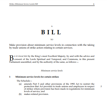
Hundreds of thousands of public sector workers were on strike today. I was one of them. Meanwhile the Bill above is making its way through Parliament – it was voted through earlier this week by all but one of the Conservative MPs, but is currently getting rather more scrutiny and push back in the House of Lords.
It seems likely that there will be legal challenges to some elements of the Bill and that some of them will be successful. The Labour Party have promised to reverse it if they win the next election.
I spent my first strike day ever (yes, I know, I am just a political union member and a mere picket tourist – all of these criticisms are entirely justified) by attending a meeting of the Leicester Actuarial Science Society with the Institute and Faculty of Actuaries (IFoA) President Matt Saker. It was a very well attended event and there were a lot of questions for Matt. These ranged from the IFoA strategy in Africa, to mutual recognition agreements with the Institute of Actuaries in India to the pros and cons of the recent vote to create a Chartered Actuary status for associates and fellows to the future relationship of the profession to AI applications, reflecting the global nature and broad range of interests of the student audience. I felt very much like I was witnessing the next generation of actuaries getting stuck into the issues that would be important to them through their careers, and it was inspiring to see.
Back to the strike. I differ from many of the strikers interviewed in that, in my view, I was not doing anything particularly altruistic by striking. I was standing up for my own pay and conditions. Which, it seems to me, everyone should be able to do in a free society. Years of anti union legislation, uberization and the growth of sectors with weak unions has made us used to having to negotiate for ourselves individually or in small groups against much more powerful employers. The fall in real pay over the last 12 years indicate that this has not really worked for us and perhaps a new era of collective bargaining is now necessary.
Meanwhile the Government thinks that it is a better idea to muzzle unions and repress future strike action than to deal with any of the grievances of the workers they represent. They think this is a better idea than to build anything, invest in anything, or do anything positive at all. You have to ask who such a move, temporary and largely struck down as illegal as it is likely to be, is designed to impress: future party donors perhaps?
The next generation I saw today did not strike me as one which will have much patience for such manufactured class wars and the governments which manufacture them.
It is my hope and, after today, my belief that they will think we have more important things to be doing.
It all began for me on 23 September 1985, the first day in my first graduate role as a management trainee at the home counties factory of a security printing firm. From the beginning I was left in no doubt by my new employers that the fairly powerful print unions at the time (SOGAT and the NGA) were the biggest impediment to the captains of industry within the firm from running the business successfully. Occasionally I was allowed into management meetings, where all of the things we could do if it wasn’t for the unions were discussed endlessly.
During my time in this first role, the printing industry changed dramatically: the typesetting was computerised, massively reducing the number employed virtually overnight and Rupert Murdoch set up his non-unionised newspaper factories at Wapping. There had already been three pieces of trade union legislation in the 1980s by the time I started work, the latest being the Trade Union Act of 1984, which required secret ballots for union elections and strikes rather than the show of hands which had been possible up until then. The Miners Strike had also only just ended in March 1985, which had a devastating impact on the trade unions more generally.
Further legislation now quickly followed:
the Public Order Act 1986 (which introduced new offences related to picketing, and increased police powers over protests involving groups of 20 people or more);
the Wages Act 1986 (which reduced many of the restrictions on employers fining and deducting money from employees’ pay, removed statutory holiday entitlement and reduced state funding for redundancies);
the Employment Act 1988 (which gave workers the right to not join a union, and trade union members the right to challenge strike ballots);
the Employment Act 1989 (which restricted trade union officials’ time off for duties and abolished government support for redundancy payments);
the Employment Act 1990 (which finally removed the closed shop – ie a workplace where union membership was compulsory – and secondary action protection);
the Trade Union and Labour Relations (Consolidation) Act 1992, which consolidated the legislation of the 80s and 90s, while clarifying that the right to take strike action was protected when it was “in contemplation or furtherance of a trade dispute”; and
the Trade Union Reform and Employment Rights Act 1993 (which gave trade unions a duty to inform employers of upcoming strikes).
This would appear to have given my first employers everything they could have wanted in terms of containing union power but, after some retrenchment in the 1990s owing to the incoming Labour Government taking the UK back into the Social Chapter of the Maastricht Treaty (which we had originally opted out of in 1992) in 1997, there was further legislation in the form of the Trade Union Act of 2016, which, amongst other measures:
introduced a new requirement of 50% of union members to vote in a ballot for strike action;
required that workers in important services (health, school education, fire, transport, nuclear decommissioning and border security) must gain at least 40% support of those entitled to vote in a workplace for a strike to be legal;
required two weeks’ notice of industrial action to be given to an employer (the employer can agree to one week);
limited the right to take industrial action after a strike ballot to six months, or nine months if the employer agrees.
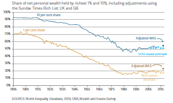
Over the period since 1985, wealth inequality, which had been steadily reducing since at least the end of World War I stalled and has been generally on a slightly increasing trend since:
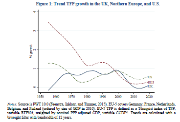
However, perhaps this was a price worth paying, if the forces of creativity and entrepreneurship had at last been allowed full rein, freed from the stifling dead hand of union power? Unfortunately not (TFP stands for total factor productivity in the graph below):
So whatever, the continuing problems of UK PLC, it does not look like union power was ever really one of the major ones. Undeterred, the Government is proposing further restrictions on trade unions and their members, including enforcing minimum service levels during strike action for ambulance staff, firefighters and railway workers and requiring some employees to work during a strike under threat of being sacked if they refuse.
The TUC has made a submission to the International Labour Organisation of the United Nations over what it sees as breaches of Conventions 87 (Freedom of Association and Protection of the Right to Organise) and 98 (Right to Organise and Collective Bargaining). As David Allen Green has blogged:
But regardless of your view on the ultimate rights and wrongs of strikes by public sector and other public service workers, there is something fundamentally objectionable in the current government’s proposals to compel certain “key” workers to attend work when they otherwise would be entitled to strike….Simply prohibiting other key workers from being able to strike, without sufficient alternative entitlements and arrangements to balance this loss of a right, is misconceived and illiberal.
It is an authoritarian gesture, rather than a solution to a problem.
Roy Lilley (at the Institute of Health and Social Care Management) in a postscript to a recent blog, focused on what a strategic failure the proposals represent within the NHS industrial dispute:
HMG plans, to ban strike action by some public workers is a further example of ‘push-back’ management. Push the disputes into the courts instead of dealing with the root-cause of strike action, improve industrial relations and representation.
So what has my part been in the downfall of trade unionism to date? In my first job, other than an abortive attempt to develop a new shift pattern(!) for the security guards in the factory, I had few skirmishes with union leaders compared to those with my management colleagues. In the finance sector, where I spent most of the middle 20 years of my working life, I rarely came across any staff representation at all. As a school teacher I joined the ATL rather than the NUT (they have since merged to form the National Education Union) due to its reputation for being determinedly non-militant. And, in my current role, I rather flounced out of the UCU over a difference of opinion over the pensions dispute raging at the time.
So I have not been a very good supporter of trade unionism over the years. However it now seems clear to me that the industrial austerity (ie the crushing of labour power within the economy, further discussed here) described above during my lifetime has been a political rather than an economic project all along. None of the economic justifications given for it since the 1980s have been borne out and the unopposed rugby of industrial management we have increasingly witnessed since has resulted, in my view, in poorer outcomes than if the 99% had been consulted regularly.
I sense that the current Government will only be satisfied when trade union membership levels fall to zero. So if, like me, you don’t want that to happen, the time to push back against running the economy at all times exclusively in the interests of the owners of capital is now.
Photo from the Climate Strike and march in Pittsburgh on 9/24/21. Link from: https://www.flickr.com/photos/9602574@N02/51512352257/. Photo taken by Mark Dixon(https://www.flickr.com/people/9602574@N02). This file is licensed under the Creative CommonsAttribution 2.0 Generic license.
Mark Blyth wrote a great book about how it was a dangerous idea; Simon Wren Lewis described it as a con; Stephanie Kelton defined it as the “deliberate infliction of harm upon society in the presence of alternatives”; Frances Coppola wrote about its terrible price; Steve Keen described it as naive; Mariana Mazzucato, Robert Skidelsky, Ann Pettifor, David Blanchflower and others wrote in the New Statesman on why the UK should not impose it in response to higher debt following the pandemic; and Richard Murphy gave the possible reasons for imposing it as “ignorance, dogmatism and spite”.
What are all of these economists talking about? Austerity. And nearly all of the criticism thrown at this “dangerous” idea is that it does not work economically (ie it will not bring down government debt levels or boost economic growth, the usual justifications given for pursuing it): a criticism for which there is a large and ever growing data set in support.
Now there are any number of Four Yorkshiremen out there to say that this thing we’re calling austerity is luxury and that we are all snowflakes to complain about it, so let’s be clear about what is meant here. Clara Mattei, in her excellent new bookThe Capital Order, describes the three forms of austerity policies: fiscal, monetary and industrial, usually used in combination. Fiscal austerity (reducing public spending, particularly on health, education and benefits and increasing the burden of taxation) and monetary austerity (reductions in the money supply and increases in interest rates) are familiar to most of us and normally the only elements of austerity discussed in the media. To these Mattei adds the idea of industrial austerity, which includes (often described as supply side policies, with the connotation of getting the economy fit to compete in world markets) policies aimed at reducing the negotiating power of workers, from anti-union legislation, to reductions in unemployment benefits, minimum wage levels and wage levels and job security within the public sector.
The contention of The Capital Order is that the reason that austerity has been used again and again in the last 100 years, despite repeatedly failing to achieve the economic goals used to justify it, is that its goals have not been economic but political. The political goal of austerity policies is to defend capitalism whenever events make it seem likely that people will look for alternatives (think World War I or the socialism following World War II or the 2008 crash, or now, the pandemic). Whenever government intervention in the economy has been needed on a sufficient scale to demonstrate that economies can strike a different balance between capital accumulation and labour power, austerity has been brought out immediately afterwards to put labour power back in its box, by making nearly everyone too poor, too busy and too regulated to be able to protest about it.
If this premise is accepted, and I think Mattei makes a convincing case in her analysis of post-World War I austerity policies in Italy and the UK, then the implications are profound. Rather than repeated wrong-headed economic policies by people who do not understand economics, we would instead have deliberate political policies by people who completely understand what they are trying to achieve by them.
The other part of the strategy, via the first international financial conferences in Brussels and then Genoa, in 1920 and 1922 respectively, was to establish an international consensus for policies where “individuals had to work harder, consume less, expect less from the government as a social actor, and renounce any from of labour action that would impede the flow of production.” Lord Chalmers, former permanent secretary at the UK Treasury, summarised this approach as: “work hard, live hard, save hard”. The aim was to return to a pre World War I economic orthodoxy and therefore remove what would be very painful economic measures for most people from the political sphere and into the sphere of “economic science”.
A quotation from the League of Nations in 1920 sums up the how important it was that such a consensus be achieved, to make it extremely difficult for any country to stand against it:
This principle must be clearly brought home to the peoples of all countries; for it will be impossible otherwise to arouse them from a dream of false hopes and illusions to the recognition of hard facts.
These “hard facts” then become the justification for sticking with economic policies, however discredited they might be economically, and buttress them: against alternative economic views (the effective shutdown of the New Approaches to Economic Challenges (NAEC) unit of the OECD being the most recent high profile example) and against popular pressure to change course (eg through such measures as central bank independence from government control over monetary austerity or proposed legislation to limit the scope of political protest).
And of course this effective outlawing of alternative schools of economic thought has other implications too. For example, as Steve Keen has shown, the potential impact of climate change in economic models to date has been disastrously underestimated, allowing fossil fuel lobbyists to delay climate action as a result.
We have all three types of austerity in play at the moment in the UK: monetary, fiscal and industrial. We can either believe that this is designed to force our compliance with the mantra to “work hard, live hard, save hard” even if we do not want to, or that it is for the economic reasons given. The former option requires us to believe that the elites in nearly every government in the world are committed to defending capitalism at all costs and that, if we want to contest this, we will have the political battle of our lives on our hands with the odds steadily more stacked against us with every new piece of legislation passed; the latter requires us to believe that our governments are economically ignorant, dogmatic and spiteful. All our current problems and our solutions to them: from the economic crisis, to the ecological crisis and the increasing political crises globally (what Adam Tooze calls the polycrisis) – depend on what we decide to believe.