
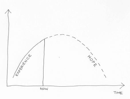
 There is a particular variety of We Know Zero graphs that look like this one – showing an experience of a steady increase in something (usually bad, but not always) up until now, followed by a projection of that thing falling in the future. My wife Marsha suggested I call them Hope-over-Experience graphs, which seems to suit them very well.
Such diagrams are often very comforting for those who want to maintain the status quo. Let’s look at three such curves in particular (the excellent Doughnut Economics by Kate Raworth has alerted me to the first two of these).
The Kuznets Curve
There is a considerable body of evidence, most notably from Kate Pickett and Richard Wilkinson, that inequality impacts most health and social problems adversely, to the detriment of all socio-economic groups, but what is to be done about it? Enter our first Hope-over-Experience graph. In this case the x-axis is actually income per capita, but to the extent that this is something expected to increase with time I don’t think this matters too much. The y-axis is inequality. It was originally proposed by Simon Kuznets (the inventor of GDP) in his 1955 paper Economic Growth and Income Inequality (my apologies, but you will need journal access to read this) based on data from England, Germany and the United States from 1875 onwards, and the belief that economic growth will automatically deal with inequality has been a powerful influence on economic policy at the World Bank and elsewhere since.
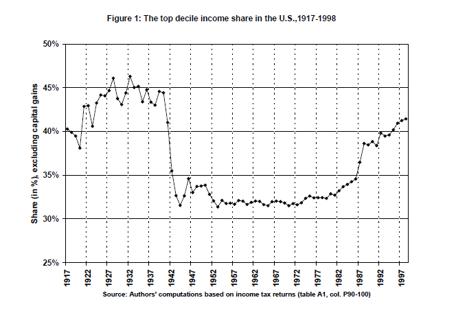
However, more recent data has shown the patterns suggested by this limited original data set are no longer correct, if indeed they ever were. Thomas Piketty and Emmanuel Saez, in their 2001 paper Income Inequality in the United States 1913-1998, state:
In particular, the evidence presented in this paper, together with the evidence on France by Piketty (2001a, 2001b) and the U.K. by Atkinson (2001),
strongly suggest that there was no such thing as a “spontaneous”, Kuznets-like decline of inequality in developed countries during the first half of the 20th
century. The inequality decline was to a large extent accidental (depression, inflation, wars) and amplified by political factors (progressive taxation). This does not mean that the current rise of inequality will not be followed by a mechanical downturn during the first few decades of the 21st century: this is simply saying that such a mechanical downturn apparently never occurred in the past.
Their data suggests a curve which looks like this instead:
The Environmental Kuznets Curve
This was first proposed by Gene Grossman and Alan Krueger in 1994 in their working paper Economic Growth and the Environment, which suggested that there was an eventual inverse relationship between pollution and income per capita, with a turning point mooted at around $8,000. Most of their graphs are not quite as U-shaped as the Kuznets Curve, but this nonetheless has come to be known as the Environmental Kuznets Curve.
However, in 2016, the international industrial ecology research community and United Nations Environment agreed on a comprehensive data set for global material extraction and trade covering 40 years of global economic activity and natural resource use, which led to several papers including the UNEP Global Material Flows and Resource Productivity: A Report of the International Resource Panel (again apologies but journal access needed). Their graph of material extraction instead looked like this:
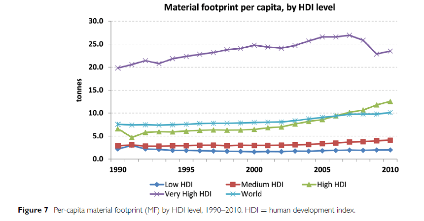
The Human Development Index (HDI) is the geometric average of 3 indices: Gross National Income, Health and Education. An optimum score of 1 is achieved where life expectancy is 85 or more years, adult literacy is 100%, school enrolment is 100% and the Gross National Income is US$40 000 or more per person per year in purchasing power parity. So again, this is not very supportive of a reduction in material footprint with increased wealth.
Which brings us to the third graph, often cited as an argument for why one of the most obvious ways to reduce inequality rather than just focusing on average income per capita, ie make taxation more progressive, is pointless.
The Laffer Curve
The story of the Laffer Curve, dating from the 1970s, is recounted by Arthur Laffer himself here. It plots tax rates against tax revenues to indicate that there is a tax rate beyond which tax revenues actually reduce. As he says:
The Laffer Curve itself does not say whether a tax cut will raise or lower revenues. Revenue responses to a tax rate change will depend upon the tax system in place, the time period being considered, the ease of movement into underground activities, the level of tax rates already in place, the prevalence of legal and accounting-driven tax loopholes, and the proclivities of the productive factors. If the existing tax rate is too high…then a tax-rate cut would result in increased tax revenues. The economic effect of the tax cut would outweigh the arithmetic effect of the tax cut.
However, returning to Piketty, this time in the 2011 paper, Optimal Taxation of Top Labor Incomes: A Tale of Three Elasticities by Piketty, Saez and Stefanie Stantcheva, the evidence underpinning this curve is again highly questionable. As they point out in the abstract (bold type added by me):
This paper presents a model of optimal labor income taxation where top incomes respond to marginal tax rates through three channels: (1) standard labor supply, (2) tax avoidance, (3) compensation bargaining…The macro-evidence from 18 OECD countries shows that there is a strong negative correlation between top tax rates and top 1% income shares since 1960, implying that the overall elasticity is large. However, top income share increases have not translated into higher economic growth. US CEO pay evidence shows that pay for luck is quantitatively more important when top tax rates are low. International CEO pay evidence shows that CEO pay is strongly negatively correlated with top tax rates even controlling for firm characteristics and performance, and this correlation is stronger in firms with poor governance. All those results suggest that bargaining effects play a role in the link between top inco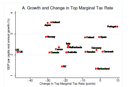 mes and top tax rates implying that optimal top tax rates could be higher than commonly assumed.
There are a number of charts which could be used from this paper, but I have chosen the plot of economic growth against changes in top marginal tax rate to illustrate most clearly the problems with the Laffer Curve idea:
This graph should show an inverse relationship if the Laffer Curve were true.
Why do I feel the need to debunk these simple so-called economic laws which are nothing of the sort? Because you will always prioritise economic growth over everything else if you believe that:
- Growth will fix inequality;
- Growth will fix pollution;
- Trying to fix inequality through the tax system is counter-productive.
And these beliefs will then also have policy implications when faced with a different sort of curve.
This was an explainer from Grant Sanderson at 3Blue1Brown about COVID-19 from March 2020 setting out quite simply how it was likely to spread, and how different case numbers in different countries (eg between Italy and the UK) were as likely to be due to being at different time points since the start of the pandemic as reflecting the relative success of their containment policies. We now know the UK Government locked down too late, at least partly because they prioritised economic growth over containment policies in the first few weeks:
Those attitudes changed and we have had an incredibly successful vaccine rollout in the UK, but this has been at the expense of any idea of international cooperation in vaccine supply. Wealthy countries such as the UK have bought enough vaccinations to cover our populations almost three times over, while Covax, the global vaccine procurement scheme, only aims to vaccinate 20% of the populations of recipient countries this year.
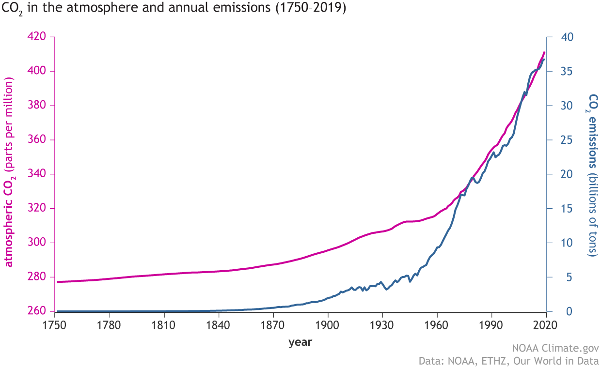
This is very short-sighted if we think there might be an international issue even more threatening to life than COVID-19 which can only be combatted by unprecedented levels of international cooperation. And of course this is exactly what we have in the form of the climate emergency and our final graph (from the National Oceanic and Atmospheric Administration (NOAA) in the US showing the relentless rise in the level of carbon dioxide in the atmosphere as global emissions continue to increase:
Living in Hope-over-Experience may be very comfortable for some people for a limited time, but if it stops us engaging with the more implacable curves of the world we actually live in then none of us will be safe.