I recently finished reading Chasm City by Alastair Reynolds, which I highly recommend. In it, sufficiently rich people have been able to buy a programme of treatments which make them immortal. Not that they can’t die, but they needn’t if they’re careful. Good science fiction, I thought.
Then I read Paul Kitson’s (the new UK Head of Pensions Consulting at EY) piece on LinkedIn where he wrote (bold mine):
Pension schemes, corporate sponsors, members – everyone, in fact – must now contend with a forward looking plan that (somehow!) considers on one side the possibility of future pandemic outbreaks shortening life expectancy, and on the other side the many £billions being spent on ‘regenerative medicine’ (AKA “the ending of ageing” or “escape velocity for death”!).
So perhaps not entirely, I thought.
In Chasm City, the immortals who live in “the Canopy” have two main problems:
Hanging on to their wealth and, if possible, increasing it, as forever is a long time to finance.
Boredom.
One particular group amuse themselves by hunting poor people in “the Mulch” (lower level where the poor live). Others indulge in increasingly dangerous pastimes to inject some urgency into the otherwise featureless expanse of their lives. No wealth moves from the Canopy to the Mulch, not even in a trickle.
I am just finishing Do Androids Dream of Electric Sheep by Philip K Dick (a classic, I know, but I hadn’t read it before, although I have seen Bladerunner). One of the features of the post-apocalyptic world of 1992 described are “mood organs” which allow you to dial up a given mood at any time, eg 481 is “awareness of the manifold possibilities open to me in the future” whereas 888 is the desire to watch TV, no matter what’s on it. Again, good science fiction, I thought.
Then I read a piece in this months’ Actuary magazine called Apt apps, about doctors being recommended by NICE to offer patients with insomnia the Sleepio app as an effective and cost-saving alternative to sleeping pills. So perhaps not entirely, I thought.
The first book was written in 2001 and the second in 1968, so it would seem that lead times are variable.
Both books deal with the fragility of identity, whether via memory implants and religious viruses in Reynolds’ book or how we go about separating androids from people from “chickenheads” in Dick’s. The divisions between the life experiences of the different groups are so stark, but it is the characteristics of the people in them which takes up everyone’s time and attention in both books, rather than the structure of the societies which create such extreme winners and losers. Which suddenly doesn’t feel like science fiction at all.
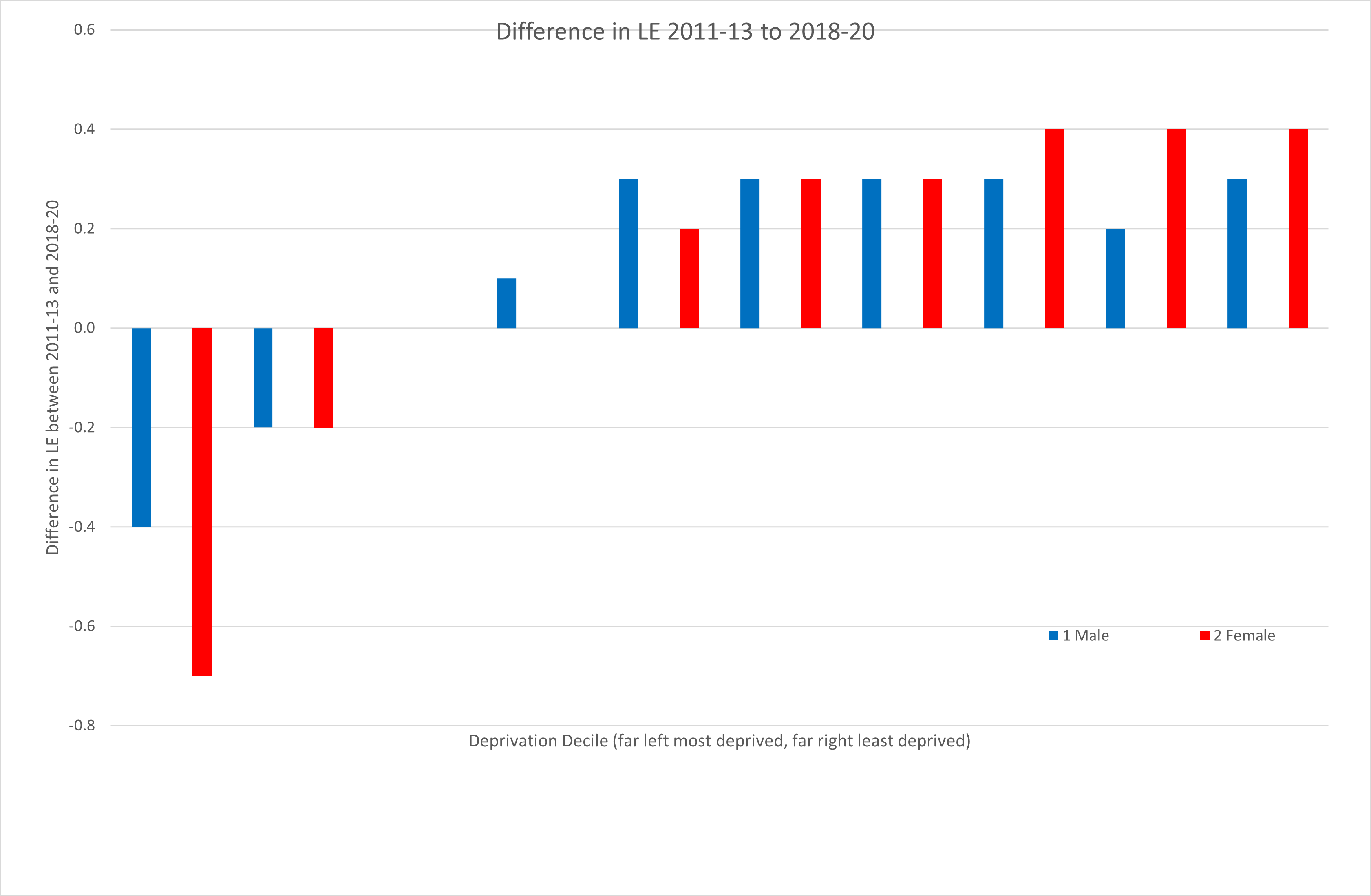
Meanwhile what has happened to England’s life expectancies by decile of deprivation in the last 10 years?
Source: ONS https://www.ons.gov.uk/peoplepopulationandcommunity/healthandsocialcare/healthinequalities/bulletins/healthstatelifeexpectanciesbyindexofmultipledeprivationimd/2018to2020#health-state-life-expectancies-data
So not quite immortality yet at the top, but inequality is clearly worsening in life expectancy. The Government Actuary’s Department gave an upbeat view last year on what the impact of the recent Levelling Up White Paper might be. Others are upbeat too.
However the Government’s track record is not good on inequality. Sir Michael Marmot produced the Marmot Review on health inequalities in the UK in 2010 and then followed this up with a review of what progress had been made 10 years later. As he points out in his recent interview in The Actuary:
Health spending fell from around 42% to 35% during the 2010s. He notes that this reduction was carried out in a regressive way: “There has been a 16% reduction in health spending for the most affluent, but a 32% reduction for the most deprived groups.” In addition, he says, while unemployment fell over the course of the decade, the income of employed people also went down – so the proportion of people living in poverty rose, as did child poverty.
These are the kinds of interventions that matter for most people rather than sleep apps or regenerative medicine to achieve escape velocity from death. And they are definitely not science fiction.
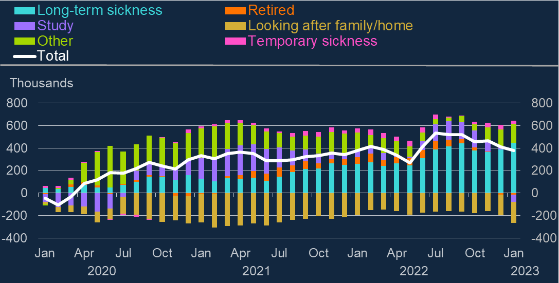
I am returning to the scene of my crimecartoon, which did not really deal with what the Governor of the Bank of England was saying as it was more a criticism about how he was saying it. However in response to a comment on my piece, I also realised that I was critical of what he was saying too. My criticism centres on the following graph:
“As you can see in blue…, long-term sickness has driven much of the persistent rise in inactivity amongst 16 to 64 year olds since the start of the pandemic. That is a striking fact.”
This is backed up by recent research carried out by LCP, whose conclusions included the following:
The rise in working age inactivity is not purely amongst those over 50; at the time of the Autumn Statement, nearly half the increase had come from the under 50s, with a big rise in the number of students a major factor;
Data on flows into and out of long-term sickness show that persistently high inflows into long-term sickness are a key problem; one growing group is those who flowed into long-term sickness having been previously categorised as ‘short-term sick’; this suggests that failure to address short-term sickness, including through clinical intervention, could have contributed to the increase in long-term sickness;
Amongst the entire economically inactive population of working age, very few of those who are retired say they ‘want a job’, whereas over 600,000 of the long-term sick say they would like to work if they could; this suggests that policies designed to help the long-term sick are ‘pushing at an open door’ in terms of supporting people who would actually go back to work given the right opportunities and treatment;
The “striking fact” for me is that the Governor of the Bank of England, faced with very similar data to LCP, instead concluded the following:
…the rise in economic inactivity is a change to the supply of labour, independent of demand, in particular by older workers. If those workers have accumulated enough savings to sustain a desired level of consumption much like the one they had before their early retirement, at least for a while, aggregate demand will not have fallen by as much as aggregate supply. We should expect this to put upward pressure on inflation in a way that would call for a higher level of interest rates to dampen demand.
But this is a comment on a dataset which shows most new inactivity is in the over 50s (which it isn’t) and that there is no large group of people currently economically active who wish to return to work given the right levels of support (there are 600,000 of the long-term sick in this category). What the LCP report concludes plausibly from the data is that policies designed to help the long-term sick who want to go back to work given the right opportunities and treatment and those designed to support the NHS to increase its capacity in primary care and mental health services in particular, would have much more impact on the number of people defined as economically inactive. As the LCP report says:
Clearly, a range of policy initiatives will be required to tackle economic inactivity, and these will include measures to reduce the ‘inflow’ into inactivity (eg people currently in work retiring or going off sick), but in terms of measures designed to increase the ‘outflow’ from inactivity, doing more for the long-term sick is likely to be far more effective than concentrating on those people who have already retired.
Meanwhile, the Governor of the Bank of England has an interest rate hammer for a tool and he therefore needs the problems he is addressing to look as much like a nail as possible (my explanations in non-italics):
So while population ageing is very likely to pull long-run R* down (this is the long-run average real equilibrium interest rate, net of inflation, averaged over the economic cycle), as I discussed earlier, the effects on shorter-run r* (which is the theoretical equilibrium rate of interest at a given point in the economic cycle) from a change in labour force participation are harder to assess. In the shorter run, by reducing the productive capacity of the economy, the rise in inactivity driven by early retirement (which is virtually non-existent as his own graph shows) seems likely to have contributed to a rise in cyclical r*. This is part of the reason why we have had to raise Bank Rate by as much as we have.
But what about a rise in inactivity caused by long-term sickness? Interestingly, Jonathan Haskel, another MPC member who also voted for the latest rate rise, recently presented some fascinating work with Josh Martin on long-term sickness and labour market outcomes. Amongst the implications of the rapid rise in long-term sick amongst the UK’s economically inactive population are: • Long-term sickness is more than just a reason for economic inactivity – many in-work are long-term sick; • The out of work long-term sick have high rates of wanting jobs, but less success in getting them, which suggests cultural or structural barriers.
Making their lives more difficult by interest rate rises which increase their living costs and reduce the security of any employment they may already have seems an odd way to solve either of these problems.
OK I am talking about satisfaction with the NHS a little bit, as it was all over the media yesterday. Just 29% satisfaction compared to 70% in 2010, with the chart above helpfully showing the precipitous decline since then. Does that remind you of another set of graphs I put up not too long ago?
It should. We stopped spending the same proportion of GDP that other similar countries do on their health services and our performance in terms of patient satisfaction plummets. Who would have thought it?
In fact this was only a headline as the Kings Fund and Nuffield Trust had just issued their analysis of the NHS-related bits of British Social Attitudes Survey Number 39, which had originally been published in October, and was itself based on data collected between September and October 2021. However it is an impressive survey overall, with 44,000 households taking part (you can find the full technical details of the survey here).
What is very clear is that the nation is changing fast. Some things are not – a slender majority in favour of increasing taxes and spending more on health, education and social benefits has remained almost static since pre pandemic and all of the averages conceal very polarised views between Brexiteers and Remainers, the different communities in Scotland and Northern Ireland, and particularly between Londoners and the rest of the UK.
This looks like it is beginning to be recognised, with a big increase in the proportion agreeing that working people do not get their fair share of the nation’s wealth (up to 67% compared to 57% in 2019) and, for the first time, a slim majority in favour of moving to proportional representation.
Only 17% say it is very important for being truly British to have been born in Britain, which is down from 48% in 1995, which feels like a sea change in attitudes towards immigration to me.
And then we turn to the environment. Rather echoing the Met Office research I highlighted recently, 45% view climate change as the most important environmental issue, compared with only 19% in 2010, with 40% of the population very concerned about the environment, compared with 22% in 2010.
Which brings us to two climate stories in quick succession.
The first was yesterday, when the Committee for Climate Change, appointed to assess the Government’s progress against its own commitments on climate change, gave its 2023 report to Parliament on England’s progress in building climate resilience across the economy – and the extent of policies and delivery to meet them. It was not a positive assessment.
There is a striking lack of climate preparation from Government:
Policies and plans. Despite some evidence of improved sectoral planning by Government for key climate risks, ‘fully credible’ planning for climate change – where nearly all required policy milestones are in place – is only found for five of the 45 adaptation outcomes examined in this report.
Delivery and implementation. In none of the 45 adaptation outcomes was their sufficient evidence that reductions in climate exposure and vulnerability are happening at the rates required to manage risks appropriately. For around one-quarter of outcomes, available indicators show insufficient evidence of progress.
Baroness Brown, Chair of the Adaptation Committee, went further:
The Government’s lack of urgency on climate resilience is in sharp contrast to the recent experience of people in this country. People, nature and infrastructure face damaging impacts as climate change takes hold. These impacts will only intensify in the coming decades.
This has been a lost decade in preparing for and adapting to the known risks that we face from climate change. Each month that passes without action locks in more damaging impacts and threatens the delivery of other key Government objectives, including Net Zero. We have laid out a clear path for Government to improve the country’s climate resilience. They must step up.
By coincidence, today is the Government’s Energy Security Day, backed by a report called Powering Up Britain. This follows a High Court ruling last October which found that, when they signed off their carbon strategy, they didn’t have the legally required information on how carbon budgets would be met. The article went on to say:
Ten million tonnes of carbon could be illegally unleashed in the mid-2030s as a result. Doubt was also shed on the 95 per cent of the sixth carbon budget that was accounted for in the government’s estimates.
Mr Justice Holgate also ruled that the strategy breached the Climate Change Act by failing to provide enough detail on the emissions savings, leaving parliament and the public in the dark.
Originally called Green Day, but presumably dropped after Jeremy Hunt’s comments about not wanting to be an American Idiot, the Energy Security Day has highlighted the following Government priorities:
Energy security: setting the UK on a path to greater energy independence.
Consumer security: bringing bills down, and keeping them affordable, and making wholesale electricity prices among the cheapest in Europe.
Climate security: supporting industry to move away from expensive and dirty fossil fuels.
Economic security: playing our part in reducing inflation and boosting growth, delivering high skilled jobs for the future.
Further analysis at this stage has not been made easy by the way that the Government has released details. Chris Stark, the Chief Executive of the Committee for Climate Change has described it on Twitter as “government by press release”, ie
The government now adopts this communications strategy regularly: press release the night before – published documents later. It gives them two bites of the press coverage.
But it makes it hard for a statutory organisation like @theCCCuk, with legal duties, to comment.
Others have been less constrained in their response. The main criticisms are that many of the policies presented in the report have been announced previously, that there is no significant increase in support for home insulation and that the focus on carbon capture and storage (CCS) is out of all proportion given the long-standing difficulties of scaling up the technology.
The BBC quote Bob Ward, policy director at the Grantham Research Institute on Climate Change at LSE:
What does not make sense is to carry on with further development of new fossil fuel reserves on the assumption CCS will be available to mop up all the additional emissions.
I had an initial skim of the report looking for what was planned for heat pumps, which regular readers of this blog will know I have some history with. I found this:
The Government has an ambition to phase out all new and replacement natural gas boilers by 2035 at the latest and will further consider the recommendation from the Independent Review of Net Zero in relation to this. People’s homes will be heated by British electricity, not imported gas. The Heat Pump Investment Accelerator will mean heat pumps are manufactured in the UK at a scale never seen before. We want to make it as cheap to buy and run a heat pump as a gas boiler by extending the Boiler Upgrade Scheme by three years, and by rebalancing the costs of electricity and gas.
So reading between the hype, they are going to invest £30 million in heat pump manufacture in the UK, which they claim will attract £270 million of “private investment into manufacturing and associated supply chains”.
The other parts are:
Committing to extending the £5,000 grant for another three years (which is less than the difference between the cost of installing a heat pump and a gas boiler currently in many cases, although this may change if schemes like the recently announced Octopus pilot become more widely adopted).
The “Clean Heat Market Mechanism” which is supposed to encourage the installation of low carbon heating appliances.
A consultation to shift green levies off electricity and on to gas bills.
The country is changing fast. The Government needs to be more transformational than this to keep up. Or, in Baroness Brown’s words, step up!
The Welsh Government made a fresh offer to health unions on 3 February which led to a suspension of all health strikes in Wales bar ambulance workers from the Unite union while negotiations continue.
On Friday the TSSA union (17,000 members) announced that members are to be given a vote on offers from the train companies in their long-running national dispute over pay, job security and conditions.
However:
Ambulance workers, teachers and university staff are amongst those striking over the next 3 weeks.
The very much larger union, the RMT (82,000 members), have rejected the train companies’ deal (9% over 2 years) due to the additional conditions attached affecting safety on the railways.
The Scottish Government is in talks with the Royal College of Nursing (RCN) and other unions representing NHS staff over a pay settlement for 2023-24, after imposing a pay deal which would give health workers an average 7.5% rise in December, which RCN nurses rejected.
Nurses from A&E, intensive care and cancer wards could join fresh strikes in England, as the RCN considers a continuous 48-hour strike, which could begin in weeks.
According to Reuters, a recent Chartered Institute of Personnel Development (CIPD) survey indicates that the gap between public and private employers’ wage expectations has widened. Planned pay settlements in the public sector fell to 2% from 3% in the quarter before, compared to a median of 5% in the private sector.
Meanwhile the UCU and the four other higher education unions (EIS, GMB, UNISON and Unite) and employer representatives from the Universities and Colleges Employers Association (UCEA) have agreed to further talks mediated by conciliation service Acas. The discussions began yesterday and continue today, covering pay, equality, job insecurity and workloads.
The strike continues today for three consecutive days. In total 18 days of strike action are planned throughout February and March, with a new strike ballot planned for March.
It seems fairly clear that public sector employers need to offer rather more than they have to date if any of these disputes are going to be resolved any time soon.
Day 3 of the UCU strike and we move onto fiscal austerity. This is the type of austerity we normally think of – increasing taxes and reducing government spending – and the most prevalent feature of all the UK governments we have had since 2010, with the cumulative lack of investment in the economy which is the underlying cause of most of the industrial action now taking place all around us. People are not just upset that their pay has not kept pace with inflation for 12 years, it is also the cumulative degradation of the conditions under which they work, seek healthcare, seek education for their children, travel anywhere or don ‘t travel anywhere that has enraged so many.
Rishi Sunak says he would love to give nurses a “massive” pay rise, but insists the money needs to be prioritised in other areas of the health service. Jeremy Hunt insists that his priority is tackling inflation and that public sector pay rises cannot be allowed to jeopardise this. Health secretary Steve Barclay hints that striking NHS staff could be offered a better pay deal from April – if unions accept “productivity and efficiency” reforms in return.
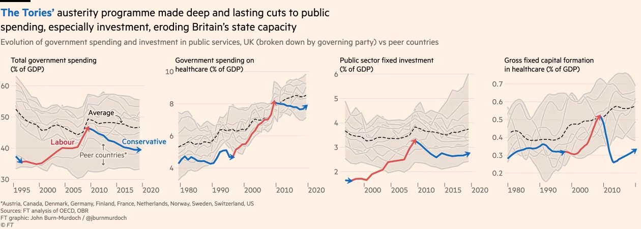
But improving productivity at work requires investment in where you work, as numerous studies have confirmed (one example here). Whereas, as the FT has shown recently, the UK has done the following since 2010:
Source: FT graphic by John Burn-Murdoch
And what about Jeremy Hunt’s reasons for keeping pay reducing in real terms in the public sector year after year? That paying an inflation matching increase would in some way “lock in” inflation. As Blair Fix tweeted recently:
Most economists accept that a wage-price spiral is possible, leading to runaway inflation. But why isn’t an interest-price spiral also possible? Interest and wages are just two forms of income. So why is one spiral ‘obvious’ while the other is blasphemy?
It doesn’t make sense until you realize that mainstream economists are in the business of legitimizing capitalist income. Wages can drive inflation (bad workers!) … but capitalist income is always productive.
He has also written about the problems caused by following economic theories treating inflation as a single value, when it is of course an average (or in fact usually at least an average of an average, sometimes switching between arithmetic and geometric averages in the process) taken of a highly volatile underlying data set. It is often said that inflation is redistributive: benefitting borrowers at the expense of lenders. However, one of the insights from Fix’s piece, drawing on Nitzan’s and Bichlar’s work in the 90s, is that big business also benefits from inflation: large corporations and oligopolies are raising prices the fastest at the expense of smaller businesses. Why do we never hear that this is driving inflation?
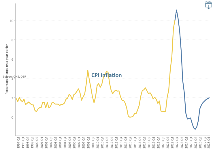
Because capitalist income is, in their view, “always productive”, you won’t hear about rent-price spirals or profit-price spirals from the current Government. Instead we will hear about how inflation needs to be reduced and this can only be done by further depressing the real value of all of our incomes for another year. This is what the Office for Budget Responsibility (OBR) has to say about CPI:
Following the Russian invasion of Ukraine, we now expect CPI inflation to peak in the fourth quarter of 2022 at its highest rate in around 40 years. The increase is driven primarily by higher gas prices feeding into sharp rises in domestic energy bills, alongside higher fuel prices and global goods inflation. Inflation then falls rapidly, and temporarily goes negative in mid-2024 as energy bills fall back and some global supply pressures reverse.
Source: Office for Budget Responsibility
On nominal wage growth and its contribution to Real Household Disposable Income (RHDI) they have this to say:
Nominal wage growth is also high in 2022 and 2023, although not high enough to prevent real wages from falling significantly. The contribution of labour income to annual RHDI growth then settles at an average of 2 percentage points a year over the remainder of the forecast.
Since one of the original motivations for starting this blog was the poor forecasting ability of the OBR, I am not going to set too much store on these forecasts, other than to point out the confidence it has that labour income demands will be thwarted and we will all see our real wages fall significantly over the next year. All in pursuit of a policy for which the expected value appears to be 6 months of deflation.
Deflation would be a disaster, As Frances Coppola has written:
Those who have money are happy because they are becoming wealthier. But someone, somewhere, is going hungry.
As she concludes:
So I’d rather money wasn’t deliberately kept scarce to placate savers. Let the supply of money respond to demand for it. When everyone wants to save in the form of money, you need to produce more of it so those who need to spend money don’t starve. Obviously, we don’t want to create so much money that it becomes worthless. But it is better to risk waking the demon of inflation than to deny people the means to live.
So when the Government says that they need to repress my pay in order to avoid locking in inflation, it reminds me of this paragraph from Catch 22:
Morale was deteriorating and it was all Yossarian’s fault. The country was in peril; he was jeopardizing his traditional rights of freedom and independence by daring to exercise them.
A Government intent on crushing real wage growth or even the hope of it while explicitly targeting deflation within the next two years; an extreme assymetry of power between wage earners on the one hand and lobbying corporations and asset owners on the other. This is why so many of us are exercising our traditional rights today.
It all began for me on 23 September 1985, the first day in my first graduate role as a management trainee at the home counties factory of a security printing firm. From the beginning I was left in no doubt by my new employers that the fairly powerful print unions at the time (SOGAT and the NGA) were the biggest impediment to the captains of industry within the firm from running the business successfully. Occasionally I was allowed into management meetings, where all of the things we could do if it wasn’t for the unions were discussed endlessly.
During my time in this first role, the printing industry changed dramatically: the typesetting was computerised, massively reducing the number employed virtually overnight and Rupert Murdoch set up his non-unionised newspaper factories at Wapping. There had already been three pieces of trade union legislation in the 1980s by the time I started work, the latest being the Trade Union Act of 1984, which required secret ballots for union elections and strikes rather than the show of hands which had been possible up until then. The Miners Strike had also only just ended in March 1985, which had a devastating impact on the trade unions more generally.
Further legislation now quickly followed:
the Public Order Act 1986 (which introduced new offences related to picketing, and increased police powers over protests involving groups of 20 people or more);
the Wages Act 1986 (which reduced many of the restrictions on employers fining and deducting money from employees’ pay, removed statutory holiday entitlement and reduced state funding for redundancies);
the Employment Act 1988 (which gave workers the right to not join a union, and trade union members the right to challenge strike ballots);
the Employment Act 1989 (which restricted trade union officials’ time off for duties and abolished government support for redundancy payments);
the Employment Act 1990 (which finally removed the closed shop – ie a workplace where union membership was compulsory – and secondary action protection);
the Trade Union and Labour Relations (Consolidation) Act 1992, which consolidated the legislation of the 80s and 90s, while clarifying that the right to take strike action was protected when it was “in contemplation or furtherance of a trade dispute”; and
the Trade Union Reform and Employment Rights Act 1993 (which gave trade unions a duty to inform employers of upcoming strikes).
This would appear to have given my first employers everything they could have wanted in terms of containing union power but, after some retrenchment in the 1990s owing to the incoming Labour Government taking the UK back into the Social Chapter of the Maastricht Treaty (which we had originally opted out of in 1992) in 1997, there was further legislation in the form of the Trade Union Act of 2016, which, amongst other measures:
introduced a new requirement of 50% of union members to vote in a ballot for strike action;
required that workers in important services (health, school education, fire, transport, nuclear decommissioning and border security) must gain at least 40% support of those entitled to vote in a workplace for a strike to be legal;
required two weeks’ notice of industrial action to be given to an employer (the employer can agree to one week);
limited the right to take industrial action after a strike ballot to six months, or nine months if the employer agrees.
Over the period since 1985, wealth inequality, which had been steadily reducing since at least the end of World War I stalled and has been generally on a slightly increasing trend since:
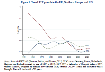
However, perhaps this was a price worth paying, if the forces of creativity and entrepreneurship had at last been allowed full rein, freed from the stifling dead hand of union power? Unfortunately not (TFP stands for total factor productivity in the graph below):
So whatever, the continuing problems of UK PLC, it does not look like union power was ever really one of the major ones. Undeterred, the Government is proposing further restrictions on trade unions and their members, including enforcing minimum service levels during strike action for ambulance staff, firefighters and railway workers and requiring some employees to work during a strike under threat of being sacked if they refuse.
The TUC has made a submission to the International Labour Organisation of the United Nations over what it sees as breaches of Conventions 87 (Freedom of Association and Protection of the Right to Organise) and 98 (Right to Organise and Collective Bargaining). As David Allen Green has blogged:
But regardless of your view on the ultimate rights and wrongs of strikes by public sector and other public service workers, there is something fundamentally objectionable in the current government’s proposals to compel certain “key” workers to attend work when they otherwise would be entitled to strike….Simply prohibiting other key workers from being able to strike, without sufficient alternative entitlements and arrangements to balance this loss of a right, is misconceived and illiberal.
It is an authoritarian gesture, rather than a solution to a problem.
Roy Lilley (at the Institute of Health and Social Care Management) in a postscript to a recent blog, focused on what a strategic failure the proposals represent within the NHS industrial dispute:
HMG plans, to ban strike action by some public workers is a further example of ‘push-back’ management. Push the disputes into the courts instead of dealing with the root-cause of strike action, improve industrial relations and representation.
So what has my part been in the downfall of trade unionism to date? In my first job, other than an abortive attempt to develop a new shift pattern(!) for the security guards in the factory, I had few skirmishes with union leaders compared to those with my management colleagues. In the finance sector, where I spent most of the middle 20 years of my working life, I rarely came across any staff representation at all. As a school teacher I joined the ATL rather than the NUT (they have since merged to form the National Education Union) due to its reputation for being determinedly non-militant. And, in my current role, I rather flounced out of the UCU over a difference of opinion over the pensions dispute raging at the time.
So I have not been a very good supporter of trade unionism over the years. However it now seems clear to me that the industrial austerity (ie the crushing of labour power within the economy, further discussed here) described above during my lifetime has been a political rather than an economic project all along. None of the economic justifications given for it since the 1980s have been borne out and the unopposed rugby of industrial management we have increasingly witnessed since has resulted, in my view, in poorer outcomes than if the 99% had been consulted regularly.
I sense that the current Government will only be satisfied when trade union membership levels fall to zero. So if, like me, you don’t want that to happen, the time to push back against running the economy at all times exclusively in the interests of the owners of capital is now.
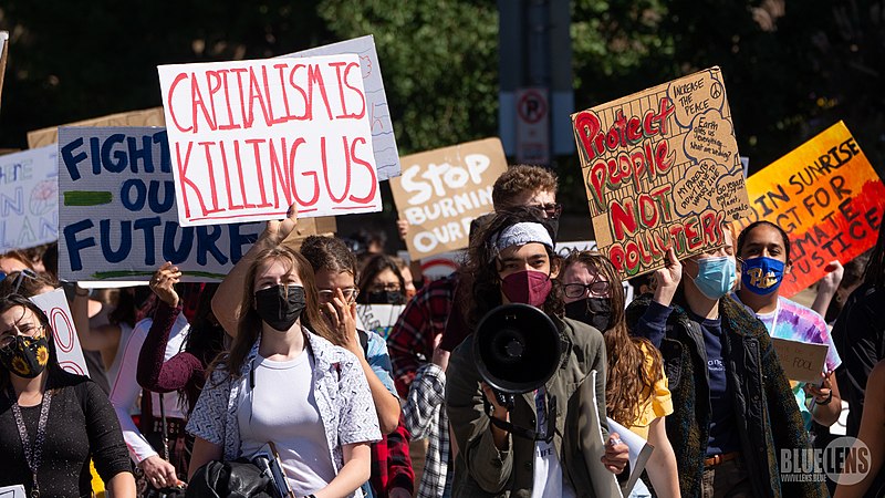
Photo from the Climate Strike and march in Pittsburgh on 9/24/21. Link from: https://www.flickr.com/photos/9602574@N02/51512352257/. Photo taken by Mark Dixon(https://www.flickr.com/people/9602574@N02). This file is licensed under the Creative CommonsAttribution 2.0 Generic license.
Mark Blyth wrote a great book about how it was a dangerous idea; Simon Wren Lewis described it as a con; Stephanie Kelton defined it as the “deliberate infliction of harm upon society in the presence of alternatives”; Frances Coppola wrote about its terrible price; Steve Keen described it as naive; Mariana Mazzucato, Robert Skidelsky, Ann Pettifor, David Blanchflower and others wrote in the New Statesman on why the UK should not impose it in response to higher debt following the pandemic; and Richard Murphy gave the possible reasons for imposing it as “ignorance, dogmatism and spite”.
What are all of these economists talking about? Austerity. And nearly all of the criticism thrown at this “dangerous” idea is that it does not work economically (ie it will not bring down government debt levels or boost economic growth, the usual justifications given for pursuing it): a criticism for which there is a large and ever growing data set in support.
Now there are any number of Four Yorkshiremen out there to say that this thing we’re calling austerity is luxury and that we are all snowflakes to complain about it, so let’s be clear about what is meant here. Clara Mattei, in her excellent new bookThe Capital Order, describes the three forms of austerity policies: fiscal, monetary and industrial, usually used in combination. Fiscal austerity (reducing public spending, particularly on health, education and benefits and increasing the burden of taxation) and monetary austerity (reductions in the money supply and increases in interest rates) are familiar to most of us and normally the only elements of austerity discussed in the media. To these Mattei adds the idea of industrial austerity, which includes (often described as supply side policies, with the connotation of getting the economy fit to compete in world markets) policies aimed at reducing the negotiating power of workers, from anti-union legislation, to reductions in unemployment benefits, minimum wage levels and wage levels and job security within the public sector.
The contention of The Capital Order is that the reason that austerity has been used again and again in the last 100 years, despite repeatedly failing to achieve the economic goals used to justify it, is that its goals have not been economic but political. The political goal of austerity policies is to defend capitalism whenever events make it seem likely that people will look for alternatives (think World War I or the socialism following World War II or the 2008 crash, or now, the pandemic). Whenever government intervention in the economy has been needed on a sufficient scale to demonstrate that economies can strike a different balance between capital accumulation and labour power, austerity has been brought out immediately afterwards to put labour power back in its box, by making nearly everyone too poor, too busy and too regulated to be able to protest about it.
If this premise is accepted, and I think Mattei makes a convincing case in her analysis of post-World War I austerity policies in Italy and the UK, then the implications are profound. Rather than repeated wrong-headed economic policies by people who do not understand economics, we would instead have deliberate political policies by people who completely understand what they are trying to achieve by them.
The other part of the strategy, via the first international financial conferences in Brussels and then Genoa, in 1920 and 1922 respectively, was to establish an international consensus for policies where “individuals had to work harder, consume less, expect less from the government as a social actor, and renounce any from of labour action that would impede the flow of production.” Lord Chalmers, former permanent secretary at the UK Treasury, summarised this approach as: “work hard, live hard, save hard”. The aim was to return to a pre World War I economic orthodoxy and therefore remove what would be very painful economic measures for most people from the political sphere and into the sphere of “economic science”.
A quotation from the League of Nations in 1920 sums up the how important it was that such a consensus be achieved, to make it extremely difficult for any country to stand against it:
This principle must be clearly brought home to the peoples of all countries; for it will be impossible otherwise to arouse them from a dream of false hopes and illusions to the recognition of hard facts.
These “hard facts” then become the justification for sticking with economic policies, however discredited they might be economically, and buttress them: against alternative economic views (the effective shutdown of the New Approaches to Economic Challenges (NAEC) unit of the OECD being the most recent high profile example) and against popular pressure to change course (eg through such measures as central bank independence from government control over monetary austerity or proposed legislation to limit the scope of political protest).
And of course this effective outlawing of alternative schools of economic thought has other implications too. For example, as Steve Keen has shown, the potential impact of climate change in economic models to date has been disastrously underestimated, allowing fossil fuel lobbyists to delay climate action as a result.
We have all three types of austerity in play at the moment in the UK: monetary, fiscal and industrial. We can either believe that this is designed to force our compliance with the mantra to “work hard, live hard, save hard” even if we do not want to, or that it is for the economic reasons given. The former option requires us to believe that the elites in nearly every government in the world are committed to defending capitalism at all costs and that, if we want to contest this, we will have the political battle of our lives on our hands with the odds steadily more stacked against us with every new piece of legislation passed; the latter requires us to believe that our governments are economically ignorant, dogmatic and spiteful. All our current problems and our solutions to them: from the economic crisis, to the ecological crisis and the increasing political crises globally (what Adam Tooze calls the polycrisis) – depend on what we decide to believe.
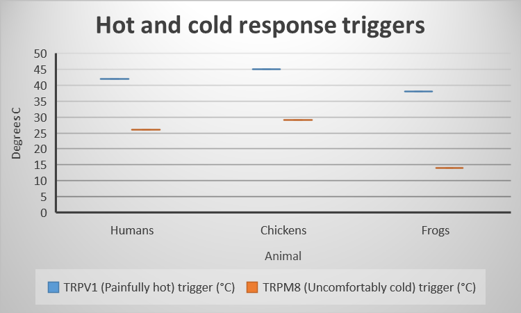
Levels of body temperatures at which extreme hot and cold sensors are triggered – data source: An Immense World – Ed Yong
In January this year, the southern hemisphere experienced, in some cases, record-breaking heatwaves, with temperatures reaching 50.7° C in Western Australia. In the last few weeks, it has been the turn of the northern hemisphere.
In the UK this week, we recorded the highest day (40.3° C in Coningsby in Lincolnshire) and night (25.8° C in Kenley in Surrey) temperatures ever. What is clear is that climate change has already significantly changed the probabilities of extreme weather events occurring in the UK, meaning that our own past experiences of weather ranges and likelihoods are now out of date.
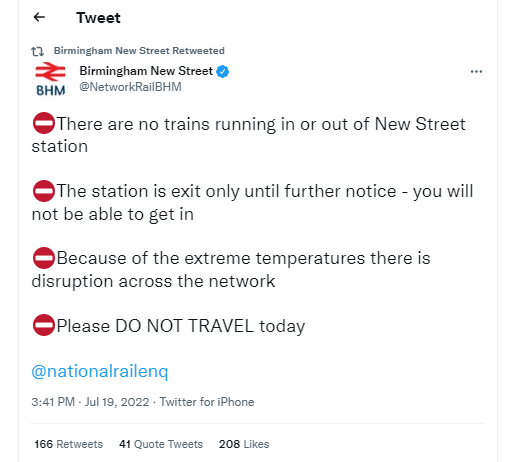
This is likely to have many consequences. This week our railways literally went into meltdown in places, with New Street operating an “exit only” policy for a period while no trains were running to or from the station at all. Overhead cables were damaged, requiring lengthy repair work and buckling rails led to widespread speed restrictions across the network. This is because the heat tolerances of our railway system were set in cooler times, meaning that most of the network can operate up to around 46° C. As track temperatures can be up to 20° hotter than air temperatures, this threshold was widely exceeded.
So, if our infrastructure has limits, what about life on the planet? Well yes, in animals these are controlled by proteins called TRP channels, which allow neurons to be stimulated at temperatures which would be immediately extremely harmful to the organisms concerned. A few of these are shown above. In humans, this is a body temperature of around 42° C (a healthy temperature is around 37° C and our bodies work hard to keep it there, but we starts to feel unwell from 37.8° C upwards and may become comatose at 42° C. We are likely to die or at least suffer serious brain damage at 43° C), but the hot and cold limits vary hugely between different species. So rapid changes in the temperature distributions means that habitable areas, which would need to be at temperatures well short of these limits, for a wide range of animals and plants will also be changing rapidly, requiring migration or extinction for many.
In humans, where we have more control over our environments, we will still need to adapt many of our practices, from how we construct our infrastructure, to how we use resources and spend our time. One obvious question that has come up this week is why we don’t have a maximum workplace temperature (currently we don’t have a minimum either, although we do have guidance around minimum temperatures). The House of Commons Library Briefing Note on this from 2010 can be found here.
In Germany, a maximum of 26°C is the norm but the guidelines state that, if the outside temperature is higher, a workplace temperature may in certain circumstances be higher than 26°C.
In Spain, Real Decreto 486 of 1997 lays down that, in places where sedentary work takes place, the temperature should be between 17 and 27°C. In places of light physical work, an acceptable temperature will be between 14 and 25°C, although there are some limitations and conditions around these requirements.
There are clearly complications around setting a maximum comfort level which would probably also need to account for humidity and activity, but the Health and Safety Executive have suggested 30° C in their guidance as a maximum acceptable temperature, less if the work is strenuous. They also suggest polling employees to see if a particular temperature is comfortable, making adjustments if more than 10% are uncomfortable in an air-conditioned office.
There are now renewed calls to introduce a maximum workplace temperature in law. And, as Lord Turner so eloquently put it on Sky News, this is at only 1.2°C warming. If all of the promises made at Glasgow are kept we may stay between 1.8°C and 2.5°C. However in the UK, the Climate Change Committee, the body set up specifically to monitor our compliance with our climate commitments, has already said that our current programmes will not deliver net zero. And Liz Truss, who may be Prime Minister in 6 weeks, has vowed to halt the only green levies we have so far been able to put into law.
In the meantime, it appears to be a great time to be a Melanophila, or fire-chasing, beetle.
I recently finished reading an excellent book about how to read Russian short stories: A Swim in a Pond in the Rain by George Saunders. Of course it is about much more than this, drawing on George’s 20 years of experiences of teaching a creative writing course at Syracuse University and his own writing experience (primarily a short story writer, he won the Booker Prize for his first novel in 2017: Lincoln in the Bardo. It has caused me to think more deeply about my teaching (I teach some mathematics, economics, professional skills and communication skills) as a result. The two pages where George talks about finding his literary “voice” are, for me, worth the price of the book on their own – I never really understood how critical this was and why noone I had read had talked about it in very clear terms before. I can also, at long last, see the point of literary criticism. This book is all about the fight for meaning, and a bare-knuckled fight it is at times.
I think finding your own voice can apply in any field, not just the creative ones. George describes realising that he did not belong on Hemingway Mountain and the process of finally accepting his own “Shit Hill” with huge power. But at least as a writer you know you are supposed to be finding your own distinct way of writing. I sometimes think that, in many professional careers, this is not widely encouraged.
However it is, in my view, massively important. Finding your voice in a professional career is about discovering what you are good at and what you are interested in and trying to bridge the gap between the two. It is about being prepared to learn from those around you, although not necessarily the thing they think they are trying to teach you. It is about being prepared to spend time, sometime considerable time, on mastering things which are important to you, even if they seem to have no importance to anyone else. In this way you will develop an independent professional career where you have something interesting to say in your chosen field.
This may sound very utopian to some, particularly those in the early years of a career where you may have little control over your workload or the structure of your working day. However that will not be the case for ever unless you choose it to be and, provided you do not lose the habits for finding your own voice in the meantime, the opportunities to do so will only grow.
What you may have gathered from this is that I see finding your voice, not as some quick process that takes place over a short period at the start of your career (at least not in the pursuits I have been involved in so far), but as a lifetime’s search. Mine didn’t really start until I was 40 and, health willing, will carry on for many years to come (I still have no real idea what my voice as a writer is yet).
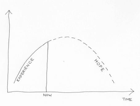
There is a particular variety of We Know Zero graphs that look like this one – showing an experience of a steady increase in something (usually bad, but not always) up until now, followed by a projection of that thing falling in the future. My wife Marsha suggested I call them Hope-over-Experience graphs, which seems to suit them very well.
Such diagrams are often very comforting for those who want to maintain the status quo. Let’s look at three such curves in particular (the excellent Doughnut Economics by Kate Raworth has alerted me to the first two of these).
The Kuznets Curve
There is a considerable body of evidence, most notably from Kate Pickett and Richard Wilkinson, that inequality impacts most health and social problems adversely, to the detriment of all socio-economic groups, but what is to be done about it? Enter our first Hope-over-Experience graph. In this case the x-axis is actually income per capita, but to the extent that this is something expected to increase with time I don’t think this matters too much. The y-axis is inequality. It was originally proposed by Simon Kuznets (the inventor of GDP) in his 1955 paper Economic Growth and Income Inequality (my apologies, but you will need journal access to read this) based on data from England, Germany and the United States from 1875 onwards, and the belief that economic growth will automatically deal with inequality has been a powerful influence on economic policy at the World Bank and elsewhere since.
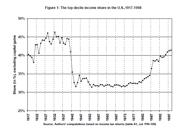
However, more recent data has shown the patterns suggested by this limited original data set are no longer correct, if indeed they ever were. Thomas Piketty and Emmanuel Saez, in their 2001 paper Income Inequality in the United States 1913-1998, state:
In particular, the evidence presented in this paper, together with the evidence on France by Piketty (2001a, 2001b) and the U.K. by Atkinson (2001), strongly suggest that there was no such thing as a “spontaneous”, Kuznets-like decline of inequality in developed countries during the first half of the 20th century. The inequality decline was to a large extent accidental (depression, inflation, wars) and amplified by political factors (progressive taxation). This does not mean that the current rise of inequality will not be followed by a mechanical downturn during the first few decades of the 21st century: this is simply saying that such a mechanical downturn apparently never occurred in the past.
Their data suggests a curve which looks like this instead:
The Environmental Kuznets Curve
This was first proposed by Gene Grossman and Alan Krueger in 1994 in their working paper Economic Growth and the Environment, which suggested that there was an eventual inverse relationship between pollution and income per capita, with a turning point mooted at around $8,000. Most of their graphs are not quite as U-shaped as the Kuznets Curve, but this nonetheless has come to be known as the Environmental Kuznets Curve.
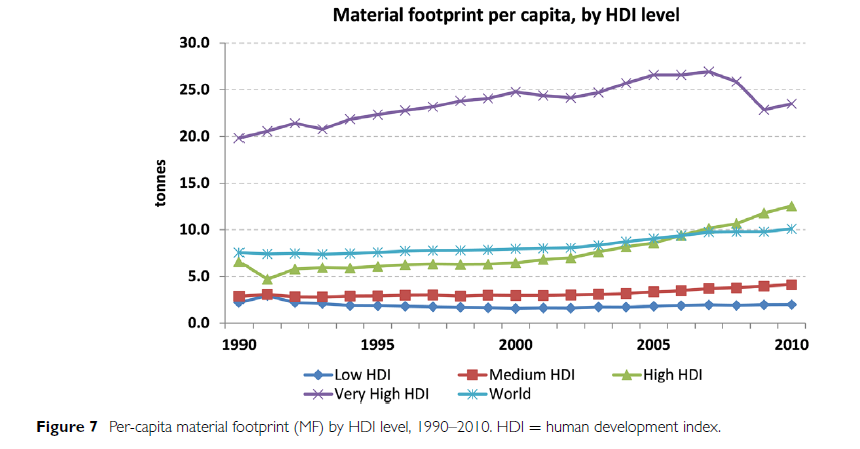
However, in 2016, the international industrial ecology research community and United Nations Environment agreed on a comprehensive data set for global material extraction and trade covering 40 years of global economic activity and natural resource use, which led to several papers including the UNEP Global Material Flows and Resource Productivity: A Report of the International Resource Panel (again apologies but journal access needed). Their graph of material extraction instead looked like this:
The Human Development Index (HDI) is the geometric average of 3 indices: Gross National Income, Health and Education. An optimum score of 1 is achieved where life expectancy is 85 or more years, adult literacy is 100%, school enrolment is 100% and the Gross National Income is US$40 000 or more per person per year in purchasing power parity. So again, this is not very supportive of a reduction in material footprint with increased wealth.
Which brings us to the third graph, often cited as an argument for why one of the most obvious ways to reduce inequality rather than just focusing on average income per capita, ie make taxation more progressive, is pointless.
The Laffer Curve
The story of the Laffer Curve, dating from the 1970s, is recounted by Arthur Laffer himself here. It plots tax rates against tax revenues to indicate that there is a tax rate beyond which tax revenues actually reduce. As he says:
The Laffer Curve itself does not say whether a tax cut will raise or lower revenues. Revenue responses to a tax rate change will depend upon the tax system in place, the time period being considered, the ease of movement into underground activities, the level of tax rates already in place, the prevalence of legal and accounting-driven tax loopholes, and the proclivities of the productive factors. If the existing tax rate is too high…then a tax-rate cut would result in increased tax revenues. The economic effect of the tax cut would outweigh the arithmetic effect of the tax cut.
However, returning to Piketty, this time in the 2011 paper, Optimal Taxation of Top Labor Incomes: A Tale of Three Elasticities by Piketty, Saez and Stefanie Stantcheva, the evidence underpinning this curve is again highly questionable. As they point out in the abstract (bold type added by me):
This paper presents a model of optimal labor income taxation where top incomes respond to marginal tax rates through three channels: (1) standard labor supply, (2) tax avoidance, (3) compensation bargaining…The macro-evidence from 18 OECD countries shows that there is a strong negative correlation between top tax rates and top 1% income shares since 1960, implying that the overall elasticity is large. However, top income share increases have not translated into higher economic growth. US CEO pay evidence shows that pay for luck is quantitatively more important when top tax rates are low. International CEO pay evidence shows that CEO pay is strongly negatively correlated with top tax rates even controlling for firm characteristics and performance, and this correlation is stronger in firms with poor governance. All those results suggest that bargaining effects play a role in the link between top incomes and top tax rates implying that optimal top tax rates could be higher than commonly assumed.
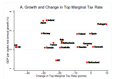
There are a number of charts which could be used from this paper, but I have chosen the plot of economic growth against changes in top marginal tax rate to illustrate most clearly the problems with the Laffer Curve idea:
This graph should show an inverse relationship if the Laffer Curve were true.
Why do I feel the need to debunk these simple so-called economic laws which are nothing of the sort? Because you will always prioritise economic growth over everything else if you believe that:
Growth will fix inequality;
Growth will fix pollution;
Trying to fix inequality through the tax system is counter-productive.
And these beliefs will then also have policy implications when faced with a different sort of curve.
This was an explainer from Grant Sanderson at 3Blue1Brown about COVID-19 from March 2020 setting out quite simply how it was likely to spread, and how different case numbers in different countries (eg between Italy and the UK) were as likely to be due to being at different time points since the start of the pandemic as reflecting the relative success of their containment policies. We now know the UK Government locked down too late, at least partly because they prioritised economic growth over containment policies in the first few weeks:
Those attitudes changed and we have had an incredibly successful vaccine rollout in the UK, but this has been at the expense of any idea of international cooperation in vaccine supply. Wealthy countries such as the UK have bought enough vaccinations to cover our populations almost three times over, while Covax, the global vaccine procurement scheme, only aims to vaccinate 20% of the populations of recipient countries this year.
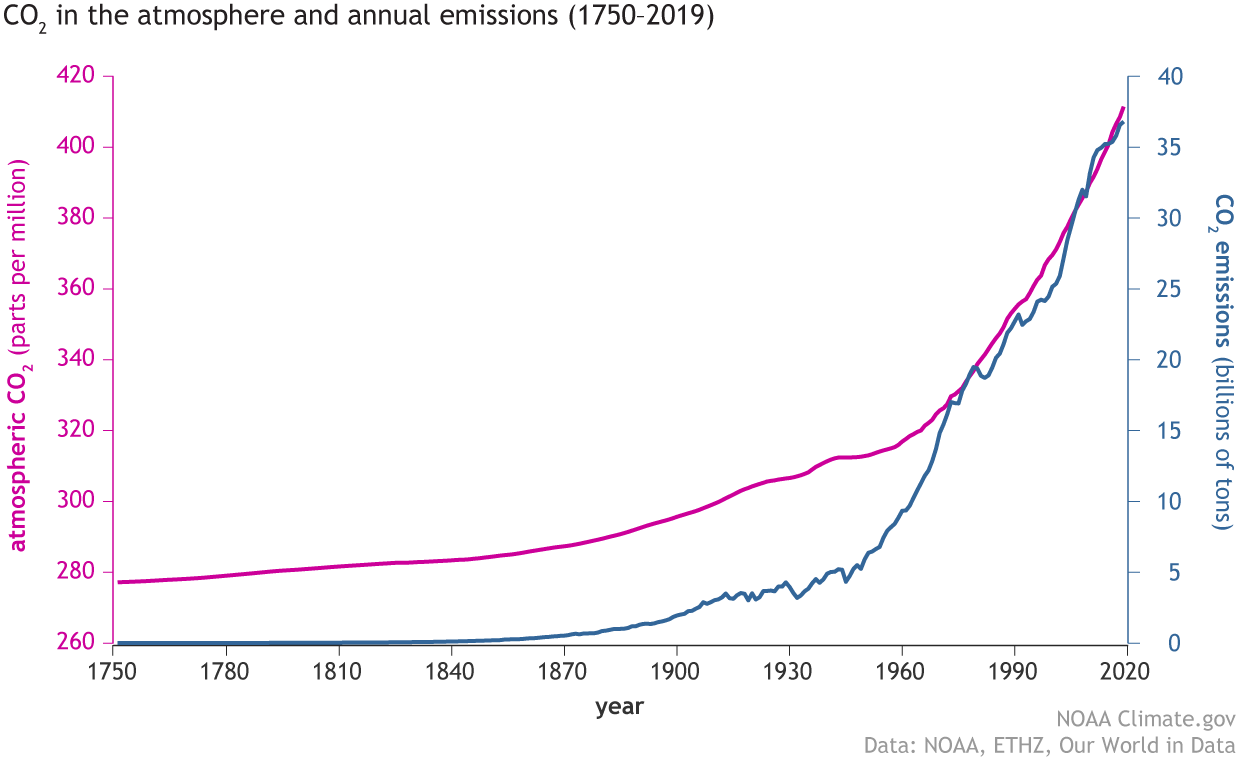
This is very short-sighted if we think there might be an international issue even more threatening to life than COVID-19 which can only be combatted by unprecedented levels of international cooperation. And of course this is exactly what we have in the form of the climate emergency and our final graph (from the National Oceanic and Atmospheric Administration (NOAA) in the US showing the relentless rise in the level of carbon dioxide in the atmosphere as global emissions continue to increase:
Living in Hope-over-Experience may be very comfortable for some people for a limited time, but if it stops us engaging with the more implacable curves of the world we actually live in then none of us will be safe.