For those of you totally immersed in the daily to and fro of the finance industry, this post about Stuart Kirk will probably seem a little late in the day. For those of you who are not, let me explain briefly what I am talking about today!

Stuart Kirk was Global Head of Responsible Investments at HSBC Asset Management. On 19 May 2022 he gave a talk at the FT Live Moral Money Summit Europe conference with the provocative title of Why investors need not worry about climate risk. Stuart’s talk was a real crowd splitter. Many called for his dismissal (HSBC subsequently suspended him), others regarded his talk as a missed opportunity and full of things which were not true, while others have regarded his stance as speaking truth to power.

However what interests me most about all of the column inches devoted to the affair is what he has not been criticised for and what this tells us about financial markets.

What Stuart said was structured around the following 12 statements:

  1. Unsubstantiated, shrill, partisan, self-serving, apocalyptic warnings are ALWAYS wrong.
  2. As the warnings became ever graver, the more asset prices INCREASED in value.
  3. One of only three explanations can explain the impending end of the world and higher risk asset prices:
    1. Climate risk is negligible.
    2. Climate risk is already in the price.
    3. All investors are wrong.
  4. Even by the UN IPCC own numbers, climate change will have a negligible effect on the world economy – A (large) temperature rise of 3.6 degrees by 2100 means a loss of 2.6 per cent o global GDP. Let’s assume 5%.
  5. Adaption is cheap and effective: climate related costs relative to GDP and mortality rates are down.
  6. Perhaps the biggest error of thinking with climate risk is confusing volumes and values – Plenty of things happen between a volume disruption and a move in asset values.
  7. Climate “winners” and losers” can create value. Climate “winners” and “losers” can destroy value.
  8. The difference between volumes and value is regularly made clear in markets.
  9. Even if climate risk isn’t negligible, it’s too far into the future to matter for most companies.
  10. To make climate change appear like a significant threat, scaremongers are torturing their models.
  11. It’s easy to show that climate change is an investment risk if you engineer a bond market collapse.
  12. Climate change isn’t a long-run risk just like wars, energy crises, pandemics, financial crises and so on (with the graphs shown above to supposedly prove this point).

Can you spot the pattern here? All of these statements are about the map that Stuart is standing in (think of Joey standing in his map to orientate himself in Friends). It is a complicated map of asset prices and charts and reports written by lots of other people standing in the map with Stuart, but it is still just a map. And the map is the territory as far as Stuart is concerned. If something does not appear in his map, it is not worth worrying about. And climate risk is struggling to make it into his map. In Stuart’s view, this is a problem for climate risk, and the people “torturing” their models to make climate risk appear significant and piling him up with regulatory reporting responsibilities are very annoying.

But of course this take is completely upside down. This is not a problem for climate risk. Rather climate risk is a problem for us and the fact that it does not appear in our models unless we torture them (which I am sure is true) means that we have the wrong models. Because the scientific consensus about the consequences of climate change on our current trajectory of between 3 and 4 degrees warming are (amongst others from Mark Lynas’ Six Degrees: Our Future on a Hotter Planet):

Africa […] split between the north which will see a recovery of rainfall and the south which becomes drier […] beyond human adaptation.
Indian monsoon rains will fail. The Himalayan glaciers providing the waters of the Indus, Ganges and Brahmaputra, the Mekong, Yangtze and Yellow rivers [will decrease] by up to 90%.
The Amazonian rain forest basin will dry out completely. In Brazil, Venezuela, Columbia, East Peru and Bolivia life will become increasingly difficult due to wild fires which will cause intense air pollution and searing heat. The smoke will blot out the sun. Drought will be permanent in the sub-tropics and Central America.
Australia will become the world’s driest nation.
In the US Gulf of Mexico high sea temperatures will drive 180+ mph winds. Houston will be vulnerable to flooding by 2045. Galveston will be inundated. Many plant species will become extinct as they will be unable to adapt to such a sudden change in climate.
The [IPCC] in its 2007 report concluded that all major planetary granaries will require adaptive measures at 2.5° temperature rise regardless of precipitation rates.[and] food prices [will] soar. Population transfers will be bigger than anything ever seen in the history of mankind. [The feedback effects from the] Amazon rain forests dry[ing] out and wild fires develop[ing] [will lead] to those fires [releasing] more CO2, global warming [intensifying] as a result, vegetation and soil begin[ning] to release CO2 rather than absorb[ing] it, all of which could push the 3° scenario to a 4°-5.5° [one].

Much of the discussion about the talk was that Stuart was speaking out bravely and that HSBC had only suspended him to silence inconvenient truths, that he had been silenced by “extreme environmental ideology“. I have no idea about all of the reasons why HSBC suspended Stuart other than their official statements, but it seems clear to me that many people in the finance industry agree with what he said. This suggests to me an extreme ideology of its own of resolutely refusing to look out of the window.

In Kim Stanley Robinson’s excellent New York 2140, global sea levels have risen by 50 feet. Everyone lives in tower blocks connected by sky bridges which occasionally topple into the canals which were once streets. I used to think that money markets would not survive events like this, but Robinson posits what I believe is a more likely future scenario. The Intertidal Property Pricing Index is developed instead, carefully constructed to be reasonably stable despite the instability of the actual real estate being valued, and people bet on it. And soon everyone is fixated on what this index is saying daily rather than the buildings collapsing around them.

This is exactly what our finance sector will do of course, there will be money to be made out of such activities after all. And so expectations that they will, in any way, be a leader out of the climate emergency are, in my view, unrealistic.

We will however need the finance industry to facilitate aspects of how we transform our economies over the next 10 to 20 years. And this will involve much more of the regulation which annoys Stuart and others so much.

Last week, the news from the Actuary magazine was that climate change could slash global GDP by 18%. This was based on a Swiss Re report, the economics of climate change, from which the analysis above is taken.

According to the report, “The current trajectory of temperature increases, assuming action with respect to climate change mitigation pledges, points to global warming of 2.0–2.6°C by mid-century.” It was unclear why they had decided to stop at 2050, when current commitments continue to push temperatures up until 2100. And the scenarios from the IPCC’s AR5 Synthesis Report (see below) show that the path we are currently on diverges far more considerably from the Paris agreements after 2050. Climate effects are very long-term and many of the impacts of a 2-3°C warming would be irreversible ones, ensuring continuing losses at similar or greater levels for decades to come, and that is before we even consider the much higher probabilities of feedback effects: from the melting of the permafrost, additional methane releases, loss of Amazonian carbon and the loss of the albedo reflectivity of Arctic ice. The Swiss Re report makes clear that is has not considered these.

You might notice that there is a separate column to the left, in a different colour, with the title “Well-below 2°C increases” and sub-title of “Paris target”. It is actually an agreement which 189 countries have signed up to, including the UK. As the Paris Agreement says (Article 2 Point 1):

This Agreement, in enhancing the implementation of the Convention, including its objective, aims to strengthen the global response to the threat of climate change, in the context of sustainable development and efforts to eradicate poverty, including by:
(a) Holding the increase in the global average temperature to well below 2°C above pre-industrial levels and pursuing efforts to limit the temperature
increase to 1.5°C above pre-industrial levels, recognizing that this would significantly reduce the risks and impacts of climate change;

There has been some debate over whether the Agreement is aiming for 1.5°C warming with a 50% chance of staying below it, or for “well below” 1.5°C similar to the 2°C goal with a 66% chance of avoiding more than 1.5°C warming, but the modelling used for the next IPCC report has adopted the latter definition. Either way, I cannot see why Swiss Re has decided to put the Paris Agreement targets in a different column from what it calls the “likely range of temperature gains” as if those we have committed to are no longer feasible to aim at.

In saying this, I do not underestimate the massive challenge of keeping to the Paris target. As Mark Lynas says in Our Final Warning, at the end of 2018 over 1,000 GW of additional fossil-fuelled electrical power generation capacity was planned, permitted or already under construction around the world, equivalent to adding an additional 188 Gt CO2 into the atmosphere to the 658 Gt already baked in from existing infrastructure, which gives a total of 846 Gt of CO2 not including impacts from deforestation, agriculture and future land-use change. This compares to a future carbon budget as estimated at the end of 2018 by the IPCC (although estimates of this vary considerably) of 420 Gt of CO2 (or 1,170  Gt of CO2 for 2°C warming). So an extraordinary change of direction is required and we should be very cautious of getting anywhere near these limits when we do not know precisely where they are.

Which brings me onto the modelling of economic impacts. The first thing to say is that modelling in terms of impact on GDP, while guaranteed to get the attention of the financial community, is perhaps not the best way of communicating the devastation of runaway climate change.

In the summary of Mark Lynas’ excellent book Six Degrees: Our Future on A Hotter Planet , which summarised the scientific consensus already arrived at by 2007, the three degree increase for which damages are being estimated is expected to lead to Africa […] split between the north which will see a recovery of rainfall and the south which becomes drier […] beyond human adaptation. Indian monsoon rains will fail. The Himalayan glaciers providing the waters of the Indus, Ganges and Brahmaputra, the Mekong, Yangtze and Yellow rivers [will decrease] by up to 90%. The [IPCC] in its 2007 report concluded that all major planetary granaries will require adaptive measures at 2.5° temperature rise regardless of precipitation rates.[and] food prices [will] soar. Population transfers will be bigger than anything ever seen in the history of mankind. [The feedback effects from the] Amazon rain forests dry[ing] out and wild fires develop[ing] [will lead] to those fires [releasing] more CO2, global warming [intensifying] as a result, vegetation and soil begin[ning] to release CO2 rather than absorb[ing] it, all of which could push the 3° scenario to a 4°-5.5° [one]. The recent update to this: Our Final Warning, describes “entering the three-degree world means we are now living in a hotter climate than any experienced on Earth throughout the entire history of our species”. These impacts, which are likely to pose existential risks for many, appear totally inconsistent with the economic loss modelling shown above.

In his 2020 paper, The appallingly bad neoclassical economics of climate change (apologies, Journal access required), Steve Keen says in the abstract:

Forecasts by economists of the economic damage from climate change have been notably sanguine, compared to warnings by scientists about damage to the biosphere. This is because economists made their own predictions of damages, using three spurious methods: assuming that about 90% of GDP
will be unaffected by climate change, because it happens indoors; using the relationship between temperature and GDP today as a proxy for the impact
of global warming over time; and using surveys that diluted extreme warnings from scientists with optimistic expectations from economists. Nordhaus has misrepresented the scientific literature to justify using a smooth function to describe the damage to GDP from climate change. Correcting for these errors makes it feasible that the economic damages from climate change are at least an order of magnitude worse than forecast by economists, and may be so great as to threaten the survival of human civilization.

There follows a demolition of the methodologies employed by Nordhaus and others in this field. To be fair to the Swiss Re report, some of the criticisms in Keen’s paper appear to have been borne in mind when constructing their model, eg:

A shortcoming of our model build so far is that some economic impacts are linearly estimated: non-linearities are not adequately captured. We use multiplicative factors of 5 and 10 to simulate the increasing severity of outcomes from nonlinearities… Importantly, the framework does not consider
tipping points, events such as the partial disintegration of ice sheets, biosphere collapses or permafrost loss, that pose a threat of abrupt and irreversible climate change. This is because it is thought that tipping points will materialise well after our model horizon of mid-century only.

And as the Swiss Re report also acknowledges:

It is likely that the estimated impacts of GDP damages from climate change will rise as existing modelling develops to incorporate economic linkages in trade, migration and other channels, and to generalise the results to multiple countries.

And they are getting criticisms from the usual suspects of climate denial, eg Bjorn Lomberg on Twitter here, that even their attempts to date to quantify the uncertainties caused by non-linearity are a step too far.

And yet there remains a problem with these analyses in that they fail to capture existential risk. One of the things Steve Keen points out in his paper is the different attitude Nordhaus found towards estimating damages from climate change in natural scientists as opposed to economists. Natural scientists typically estimated the damage at 20-30 times higher than economists and some refused to cooperate with the exercise at all:

I must tell you that I marvel that economists are willing to make quantitative estimates of economic consequences of climate change where the only measures available are estimates of global surface average increases in temperature. As [one] who has spent his career worrying about the vagaries of the dynamics of the atmosphere, I marvel that they can translate a single global number, an extremely poor surrogate for a description of the climatic conditions, into quantitative estimates of impacts of global economic conditions. 

But how do you calibrate what is clearly a complicated model that Swiss Re and Moody’s have constructed for this analysis? Obviously we all have a very recent GDP fall in our minds at the moment – here is a summary from the UK Commons Library of Economic Indicators as at 30 April 2021 (themselves sourced from OECDstat and Eurostat):

This shows an almost identical GDP fall of 10.5% year on year in Q2 2020 for the OECD as predicted in the event of a 3.2°C warming, although it has bounced back pretty quickly since. For a longer term view of the global data, Our World In Data have an Annual growth in GDP per capita graph which runs from 1961 to 2017 (see below).

One very large GDP fall which stands out in the data here is the 26.5% fall in China in 1961. This was towards the end of the China’s Great Famine, in which approximately 3 million people died of starvation over a 3 year period. This certainly qualifies as an existential event and Swiss Re’s modelling suggest something of similar proportions in Asia and Africa at 3.2°C warming.

The biggest danger in all of this is that rich countries will look at a 10.6% reduction in GDP (at 3.2°C warming) and think this liveable with and adaptable to for their populations. After all, Simon Wren Lewis calculates that the austerity policies between 2010 and 2018 in the UK reduced GDP by nearly half of this amount every year for at least the second half of this period, compared to where it would have been without these policies, with an estimated cumulative loss of 15.9% of GDP. An 18.1% overall world average loss, however, effectively means more than a 25% loss for the rest of the world outside the OECD, as the OECD accounts for around half of the world’s total GDP which, even if we did not allow for the acknowledged likelihood that these are underestimates, is still in the Chinese Famine category of disaster and neither liveable with nor adaptable to.

We are already seeing vaccine nationalism carve up the world between rich and poor countries, with up until last month only 0.3% of the vaccines administered around the world having gone to people in low-income countries. This is likely to reduce the ability of poorer countries to be represented properly at this year’s COP26 when it frames a global response to the climate change which will affect them so disproportionately. And the losses if we do not act will be measured in far more frequent floods and sea level rise, extreme storms and heatwaves, crop failures, water and food shortages and mass migration on a scale we have never seen before, not GDP.

Could climate change slash global GDP by 18%? It’s much worse than that.


There is a particular variety of We Know Zero graphs that look like this one – showing an experience of a steady increase in something (usually bad, but not always) up until now, followed by a projection of that thing falling in the future. My wife Marsha suggested I call them Hope-over-Experience graphs, which seems to suit them very well.

Such diagrams are often very comforting for those who want to maintain the status quo. Let’s look at three such curves in particular (the excellent Doughnut Economics by Kate Raworth has alerted me to the first two of these).

The Kuznets Curve

There is a considerable body of evidence, most notably from Kate Pickett and Richard Wilkinson, that inequality impacts most health and social problems adversely, to the detriment of all socio-economic groups, but what is to be done about it? Enter our first Hope-over-Experience graph. In this case the x-axis is actually income per capita, but to the extent that this is something expected to increase with time I don’t think this matters too much. The y-axis is inequality. It was originally proposed by Simon Kuznets (the inventor of GDP) in his 1955 paper Economic Growth and Income Inequality (my apologies, but you will need journal access to read this) based on data from England, Germany and the United States from 1875 onwards, and the belief that economic growth will automatically deal with inequality has been a powerful influence on economic policy at the World Bank and elsewhere since.

However, more recent data has shown the patterns suggested by this limited original data set are no longer correct, if indeed they ever were. Thomas Piketty and Emmanuel Saez, in their 2001 paper Income Inequality in the United States 1913-1998, state:

In particular, the evidence presented in this paper, together with the evidence on France by Piketty (2001a, 2001b) and the U.K. by Atkinson (2001),
strongly suggest that there was no such thing as a “spontaneous”, Kuznets-like decline of inequality in developed countries during the first half of the 20th
century. The inequality decline was to a large extent accidental (depression, inflation, wars) and amplified by political factors (progressive taxation). This does not mean that the current rise of inequality will not be followed by a mechanical downturn during the first few decades of the 21st century: this is simply saying that such a mechanical downturn apparently never occurred in the past.

Their data suggests a curve which looks like this instead:

The Environmental Kuznets Curve

This was first proposed by Gene Grossman and Alan Krueger in 1994 in their working paper Economic Growth and the Environment, which suggested that there was an eventual inverse relationship between pollution and income per capita, with a turning point mooted at around $8,000. Most of their graphs are not quite as U-shaped as the Kuznets Curve, but this nonetheless has come to be known as the Environmental Kuznets Curve.

However, in 2016, the international industrial ecology research community and United Nations Environment agreed on a comprehensive data set for global material extraction and trade covering 40 years of global economic activity and natural resource use, which led to several papers including the UNEP Global Material Flows and Resource Productivity: A Report of the International Resource Panel (again apologies but journal access needed). Their graph of material extraction instead looked like this:

The Human Development Index (HDI) is the geometric average of 3 indices: Gross National Income, Health and Education. An optimum score of 1 is achieved where life expectancy is 85 or more years, adult literacy is 100%, school enrolment is 100% and the Gross National Income is US$40 000 or more per person per year in purchasing power parity. So again, this is not very supportive of a reduction in material footprint with increased wealth.

Which brings us to the third graph, often cited as an argument for why one of the most obvious ways to reduce inequality rather than just focusing on average income per capita, ie make taxation more progressive, is pointless.

The Laffer Curve

The story of the Laffer Curve, dating from the 1970s, is recounted by Arthur Laffer himself here. It plots tax rates against tax revenues to indicate that there is a tax rate beyond which tax revenues actually reduce. As he says:

The Laffer Curve itself does not say whether a tax cut will raise or lower revenues. Revenue responses to a tax rate change will depend upon the tax system in place, the time period being considered, the ease of movement into underground activities, the level of tax rates already in place, the prevalence of legal and accounting-driven tax loopholes, and the proclivities of the productive factors. If the existing tax rate is too high…then a tax-rate cut would result in increased tax revenues. The economic effect of the tax cut would outweigh the arithmetic effect of the tax cut.

However, returning to Piketty, this time in the 2011 paper,  Optimal Taxation of Top Labor Incomes: A Tale of Three Elasticities by Piketty, Saez and Stefanie Stantcheva, the evidence underpinning this curve is again highly questionable. As they point out in the abstract (bold type added by me):

This paper presents a model of optimal labor income taxation where top incomes respond to marginal tax rates through three channels: (1) standard labor supply, (2) tax avoidance, (3) compensation bargaining…The macro-evidence from 18 OECD countries shows that there is a strong negative correlation between top tax rates and top 1% income shares since 1960, implying that the overall elasticity is large. However, top income share increases have not translated into higher economic growth. US CEO pay evidence shows that pay for luck is quantitatively more important when top tax rates are low. International CEO pay evidence shows that CEO pay is strongly negatively correlated with top tax rates even controlling for firm characteristics and performance, and this correlation is stronger in firms with poor governance. All those results suggest that bargaining effects play a role in the link between top incomes and top tax rates implying that optimal top tax rates could be higher than commonly assumed.

There are a number of charts which could be used from this paper, but I have chosen the plot of economic growth against changes in top marginal tax rate to illustrate most clearly the problems with the Laffer Curve idea:

This graph should show an inverse relationship if the Laffer Curve were true.

Why do I feel the need to debunk these simple so-called economic laws which are nothing of the sort? Because you will always prioritise economic growth over everything else if you believe that:

  • Growth will fix inequality;
  • Growth will fix pollution;
  • Trying to fix inequality through the tax system is counter-productive.

And these beliefs will then also have policy implications when faced with a different sort of curve.

This was an explainer from Grant Sanderson at 3Blue1Brown about COVID-19 from March 2020 setting out quite simply how it was likely to spread, and how different case numbers in different countries (eg between Italy and the UK) were as likely to be due to being at different time points since the start of the pandemic as reflecting the relative success of their containment policies. We now know the UK Government locked down too late, at least partly because they prioritised economic growth over containment policies in the first few weeks:

Those attitudes changed and we have had an incredibly successful vaccine rollout in the UK, but this has been at the expense of any idea of international cooperation in vaccine supply. Wealthy countries such as the UK have bought enough vaccinations to cover our populations almost three times over, while Covax, the global vaccine procurement scheme, only aims to vaccinate 20% of the populations of recipient countries this year.

This is very short-sighted if we think there might be an international issue even more threatening to life than COVID-19 which can only be combatted by unprecedented levels of international cooperation. And of course this is exactly what we have in the form of the climate emergency and our final graph (from the National Oceanic and Atmospheric Administration (NOAA) in the US showing the relentless rise in the level of carbon dioxide in the atmosphere as global emissions continue to increase:


Living in Hope-over-Experience may be very comfortable for some people for a limited time, but if it stops us engaging with the more implacable curves of the world we actually live in then none of us will be safe.

Diagram 1

We are currently behaving like this is the world we live in – because if you are a finance person it is. The Dasgupta Report on the Economics of Biodiversity does nothing substantive to challenge this, despite a foreword from David Attenborough admitting “We are totally dependent upon the natural world”, other than putting a bigger number on the Sustainability portion (Natural Capital). John Kay mentioned in his talk, as part of the Dr Patrick Poon Presidential Speaker series on Finance in the Public Interest for the Institute and Faculty of Actuaries, the habit of actuaries in particular of often “attaching meaningless numbers to data”. There would seem to be great potential for doing precisely this in putting a number on Natural Capital.

But it is worse than that. As the September 2020 InfluenceMap report on sustainability finance policy engagement makes clear, most financial institutions (bottom-right quadrant, in blue, below) have shown caution and, despite having made some high-level supportive comments, have tended not to engage in a detailed or intensive manner. A small number of financial institutions (top-right quadrant, blue) have been actively engaged in promoting sustainable finance policy. A few financial institutions (centre-left of the diagram, blue) appear to be more cautious about sustainable finance policy.

This chart plots the results of InfluenceMap’s analysis for the financial institutions and industry associations included in the analysis. Engagement Intensity refers to how actively the entity is engaging, while Organization Score measures the degree of support/opposition to policy.

Diagram 2

In the meantime, the IFRS Foundation is proposing to set up a Sustainability Standards Board with its own reporting standards. This is what Richard Murphy (who got me thinking about this in Venn diagram terms originally) is rightly complaining about as it would lead to this:

His sustainability cost accounting idea offers a plausible alternative approach in my view. As the introduction says: 

…accounting has to change because we need a clear, audited, enforced and unambiguous indicator of the process of change that business must go through to support continued human life on this planet. Sustainable cost accounting can do that by indicating who can, and cannot, use capital to best effect in this changed environment. That is precisely why it is needed, however uncomfortable the consequences might be.

What is actually needed therefore is clearly an approach rooted in this:

Diagram 3

This is the long term position most working in sustainability would, I believe, like to see. However there are differences of opinion in how to get there.

Kate Raworth argues that you may need to talk within Diagram 1 to start with in order to engage the finance professionals, which of course includes the central bankers and treasury official who might limit the speed at which we could move to Diagram 3. Others disagree, saying once you start talking to finance professionals in their own language, you are condemned to a solution in Diagram 1.

What seem clear to me is that, if our arguments are between Diagram 1 and Diagram 3, perhaps we can dispense with Diagram 2.

Source: Wikimedia Commons: Shattered right-hand side mirror on a 5-series BMW in Durham, North Carolina by Ildar Sagdejev. Cropped by Nick Foster

It starts in 2025 with a description of a horrific heatwave in India which will stay with me for a very long time. As well it should as, in the book, it kills 20 million people. In response, India send thousands of aircraft up to 60,000 feet to spray aerosol particulates of sulphur dioxide into the stratosphere, in defiance of the international conventions banning such activities, to deflect some of the solar radiation with the aim of reducing the probability of future heatwaves for a period. By how much or for how long or with what other consequences is unknown.

As we build up to COP26 in Glasgow in November this year, in the book we start with the results of COP29 in Bogota, where the organisation which would come to be known as The Ministry for the Future (and the title of the book by Kim Stanley Robinson) was set up “to advocate for the world’s future generations of citizens, whose rights, as defined in the Universal Declaration of Human Rights, are as valid as our own. This new Subsidiary Body is furthermore charged with defending all living creatures present and future who cannot speak for themselves, by promoting their legal standing and physical protection.”

The Indian crisis happens a few months later. The new head of this body, Mary Murphy, is briefly held captive by, Frank, one of the survivors of the heatwave in her own flat in Zurich (the book also feels like a love letter to Zurich) and challenged to do more:

It’s not enough. Your efforts aren’t slowing the damage fast enough. They aren’t creating fixes fast enough. You can see that, because everyone can see it. Things don’t change, we’re still on track for a mass extinction event, we’re in the extinctions already. That’s what I mean by not enough. So why don’t you do something more?

This has a profound impact on Mary, who keeps in touch with Frank and his troubled suffering life throughout the book. It also leans her towards effectively endorsing the involvement of her No 2 in “black” operations to ensure certain people are “scared away from burning carbon”.

Indeed the book is suffused with eco-terrorism. Technological progress has partly displaced the state monopoly of violence, with drone technology in particular meaning that no aircraft or ship or surface navy is safe from a well-enough organised group by the end of the book. People stop flying when aircraft start being shot down regularly, and those that still do fly use carbon-negative airships, where solar panels generate more power than the ships use. Davos attendees get taken hostage and given a compulsory seminar at one point. Tax havens become obsolete when all money becomes digital and tracked.

Mary’s interactions with central bankers are probably the closest this book ever comes to comedy. In the first, she tries to argue for a “carbon coin”, a digital currency which would be paid out to organisations and people who could prove they had removed carbon from the environment. This would be the incentive to work alongside the carbon taxes. The contemptuous response from the Federal Reserve and others at first is “not our purview”, however by the end they are on board with this and many of the other ideas developed along the way.

There are so many ideas in this book, far too many to cover them all here: some of them familiar to me from economics (carbon quantitative easing, Jevons’ Paradox, Modern Monetary Theory, Gini Coefficient – these each get a short chapter among many other ideas and interspersed with riddles) and others not so. The Indian techno fix is the first of many: some successful, like sucking out the meltwater under glaciers to slow them sliding into the ocean and others not so, like the billionaire wanting to refreeze the oceans. Russia dyes parts of the Arctic yellow to reflect more sunlight back. Huge areas of land are rewilded.

What strikes me most is that the arguments we tend to have here and now about which course to take (Freud’s phrase is quoted here in the book – “the narcissism of small differences”) seem largely moot in this one imagined near-future: all of them are tried there – it’s not techno-fixes or de-carbonisation of transport and heating, it’s both. It’s not carbon QE or re-wilding, it’s both. If something doesn’t work, it’s abandoned. By far the most important determinant of which of the IPCC future scenarios we end up on seems to be how quickly we start. Economists come in for particular ridicule there – whatever course of action is planned, they can find one group who thinks it will have one effect, one who think it will have the opposite effect and one which thinks it will make no difference at all. The difference is that the economists are no longer guiding policy there, but facilitating and post hoc rationalising it.

There is a wartime feel to the book throughout, with people doing what they feel needs to be done in desperate circumstances. The choices are all different levels of bad, but bad is almost incalculably better than worst. And the overall impression is of a world changing rapidly, with one of its herd animals belatedly getting into better balance with the others. Even at 560 odd pages the impressions are inevitably just that – one chapter is just a list of different organisations working on aspects of the climate emergency in different countries, described as about 1% of the total number active. It is like the shards of a smashed wing mirror picking out details from the vanishing world behind. I have never wanted to apply the word polymesmeric (which I first saw on the cover of Catch 22 by Joseph Heller) to a book as much as I have to this one.

The hoped-for outcome of all of this? In one conversation this is described as a “success made of failures” or a “cobbling-together from less-than-satisfactory parts”, which I think sums it up nicely.

And I definitely want to visit Zurich one day. Probably by airship.


NASA, ESA, and the Hubble Heritage Team (STScI/AURA), Public domain, via Wikimedia Commons

Fiscal space is defined as the difference between a nation’s sovereign debt-to-GDP ratio and the limit beyond which the nation will default unless policymakers take fiscal steps that are outside of anything they have done historically. That limit is sometimes referred to as the fiscal cliff, just to ram home the imagery of fixed physical limits beyond which disaster beckons.

How much fiscal space does the UK have? Moody’s have an answer, which depends most heavily on when you ask the question. In September 2019 it was as follows:

This shows the UK with a fiscal space (the “dynamic” means they assume interest rates increase as borrowing does, due to “crowding out” arguments – ie government borrowing pushing up the price of borrowing for everyone – so beloved of most economists) of around 175% of GDP, with this then projected to fall over the following 5 years as rates “normalized”. While the cost of borrowing seems to be dynamic, the actual borrowing itself is not allowed to be in these calculations – it is assumed that they just add to debt without increasing the revenue components of the primary balance.

Well of course then we had 2020, at which point (June 2020) Moody’s appear to have stopped talking about fiscal space and instead are now focusing on something called “debt affordability”. What happened to dynamism and crowding out? Not explained:

However despite this triumph of debt affordability, they then produce another graph to indicate that governments still need to be bearing down on debt to GDP ratios:

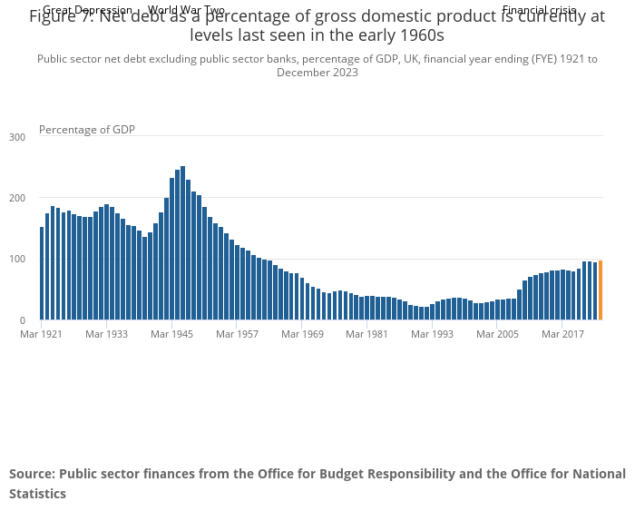
As they say in the document “rating implications will depend on governments’ ability to reverse debt trajectories ahead of potential future shocks”. Remember this was in June 2020. Let’s also remind ourselves of another graph:

Requiring governments to reverse debt trajectories in this environment is insane and likely to result in more deaths if not ignored. However as recently as last month in their issuer comment for the UK they said:

However, compared to the government’s March budget (that was quickly overtaken by events), there are some initial signs that fiscal policy outside of investment is likely to be less expansive than previously announced. What remains unclear is whether this ambition will be able to withstand the political pressures that seem to be inevitable given the government’s previous commitments. Even before the Spending Review, longer-term spending commitments for health, education, and defence had already been announced. Together, these three areas account for around 60% of total expenditure.

I have been hard on Moody’s in this piece, they are most certainly not alone. But this attempt to divorce sovereign debt levels from what is actually going on in countries needs to stop as does the constant discounting of the value of any government spending at all. Political pressures to spend more on health and education are not always things that governments need to “withstand” in order to look good in a Moody’s graph. There are far more important things at stake.


Blaise Pascal, mathematician and philosopher, once said:

All of humanity’s problems stem from man’s inability to sit quietly in a room alone.

This seems to have a particular relevance at the moment, when many of us are being asked to do precisely that. I also agree that this is definitely a problem we have. However I prefer to think of it as just one consequence of our inability to think about change in any rational way. We fear change, which is why we yearn so much to go back to “normal” at the moment, even if normal life was pretty unsatisfactory for many of us before the pandemic struck. We fight against change if we think what we have is threatened from outside the room we might otherwise sit quietly in, whether that is the loss of our income or that of our influence in the world or our “sovereignty”.

The only way in which we can contemplate change is in the context of some utopian ideal of improved productivity making one aspect of our lives much better while not requiring us to change any other part of them. Hence so much resistance to any idea of redistributing what we already have in favour of “Pareto improvements” to the economy, ie those which benefit some people without making anyone else worse off, and the obsession amongst economists with the “productivity puzzle” in the UK in particular:

So we look for ways to achieve this miraculous productivity improvement while leaving everything else essentially unchanged and the magic word which promises this more than anything else is innovation. Innovation will enable us to do more with less (or, more usually, make us do a lot more much cheaper, therefore encouraging us to use even more in the process). Innovation will have spin offs in lots of other areas we have not even imagined yet, but they will all be good ones! Innovation will solve the productivity puzzle.

In The Innovation Delusion, Lee Vinsel and Andrew Russell challenge this. As we have become more and more desperate for all change to look like innovation, we have made actual innovation harder to achieve, while saddling ourselves with higher and higher maintenance costs of new “innovative” infrastructure which is increasingly unsustainable to finance, rather than maintaining what we already have better.

I therefore prefer the quote that they use, from Kurt Vonnegut:

Another flaw in the human character is that everybody wants to build and nobody wants to do maintenance.

Innovation-speak, as they call it, is not innovation at all, but presenting ideas as innovative when they are not. As they say:

It plays on our worry that we will be left behind: our nation will not be able to compete in the global economy; our businesses will be disrupted; our children will fail to find good jobs because they don’t know how to code…Innovation-speak is a dialect of perpetual worry.

No wonder we are unable to sit quietly in a room alone.

And in the coming years when we will need to make substantial changes that work well enough for all of us to be able to continue living on this planet together, this approach will not work. We need for our thinking not to be magical, but grounded in realism. We need to make new things that we can afford to maintain sustainably. Innovation-speak will not get us there.

Burt Kwouk and Peter Sellers in 1975’s The Return of the Pink Panther. Photograph: Allstar/ITC

Stephen Fry at the Hay Festival a few nights ago regaled us with many tales from his new book Troy. They were full of people making The Tough Decisions based on The Science or, as they tended to call it then, Prophecy. The seer Aesacus interpreted a dream about a flaming torch meaning Priam and Hecuba needed to kill the son Hecuba was carrying to stop him from bringing the destruction of Troy. Noone could bring themselves to kill the baby, who grew up to be Paris, and Troy was indeed destroyed. However rather than ignore The Science, they outsourced the deed, ultimately to the random wildlife roaming Mount Ida and so it never got done. Now my question would not be why they ignored The Science, but why they felt that The Science was something to be consulted with in secret with no second opinion and then enacted in a half-hearted way because they didn’t really believe it anyway. It’s almost as if there was no actual science in existence to give them an alternative.

One of the other interesting things Stephen said was in response to the question of whether there was value in students studying the classics at school. His very strongly argued case rested on two main points:

  • The value of learning stories made up not by a single writer but by a people; and
  • The greater level of understanding of much other art if you know “the second language” of the classics.

It is of course a highly elitist argument, but as a way of understanding an Elite which are currently following The Science in a direction they don’t really believe in, perhaps more relevant than it has ever been. Because if we are ruled by a group speaking in a second language and resistant to evidence-based policy perhaps we need to start acting accordingly.

Currently we are reading a lot in the media about how terrifyingly quickly Government debt is growing and how urgently we will need to cut Government spending once the pandemic is over, even on those key workers we have realised our (by any historical standards) fantastically rich economy cannot do without. I am thinking of the Institute of Fiscal Studies of course, the Adam Smith Institute and ultimately all arguments of this sort end up including the Cato Institute too. Now I could start to rebut these claims, pointing out that Government debt is not particularly big, that it is currently very cheap and that the last thing we will need for an economic recovery from it is austerity or whatever the Johnson Government decide to rebrand such a policy to make it politically acceptable.

But I am not going to waste my ink, particularly not now. One reason would be that there is an element of Jonathan Swift’s dictum at play here, ie:

Reasoning will never make a Man correct an ill Opinion, which by Reasoning he never acquired.

But another, in my view much more powerful, reason is that we are pretty universally experiencing a trauma which has triggered fight, flight or freeze responses that have impaired our thought processes quite significantly. As Joanne Stubley from the Tavistock and Portman NHS Foundation Trust puts it so well:

Whilst the wish to be involved and to contribute clearly may have altruistic, reparative aims inherent in it, there is also a growing sense of competition that is emerging – competition for who is the expert, who will lead the research, the clinical pathways mapping or write the best paper on Covid 19. This jostling for position may be fuelled by survival anxieties both in relation to the threat of the virus (life and death anxieties that propel us to action) but perhaps also anxiety for what will occur when the threat has passed. We have lived with the reality of austerity in the NHS for many years, and services have become accustomed to the competition inherent in the marketplace economy. With the threat of serious economic downturn and recession looming, this causes further anxiety in relation to the long-term viability of services. Holding in mind a compassionate, thoughtful position that allows for cooperation becomes so much more difficult when this part of the brain is turned down when under threat – survival in the immediate threat does not make use of this more sophisticated mode of thought and behaviour.

Put simply, we don’t know what we are experiencing yet. It is too soon to say on almost any level. If someone is giving you a prognosis on what will happen economically under different exit strategies from Lockdown then they do not yet have the data to know what they are talking about. Noone does. The best thing that science (as opposed to The Science) can tell us currently is that we don’t know.

So we don’t know and we can’t think. We therefore need to be very cautious about what we do next.


“We won’t go back to normal, because ‘the normal’ was the problem.”

For me the turning point came on 12 March, when the FTSE 100 fell by 639 points or around 11% of its value in one day. What were the newspaper headlines that day?

Only the Times and the Financial Times had the stock market fall on their front page at all. Everyone else led with some variant on the Prime Minister saying that many families would lose loved ones. The attention switch was so complete that when KPMG published their UK Economic Outlook for March 2020 the following week – forecasting a main scenario for Gross Domestic Product (GDP) in the UK to fall by 2.6% in 2020 then grow by 1.7% in 2021, and a downside scenario for GDP to contract by 5.4% in 2020 and by another 1.4% in 2021, representing a slightly more severe recession than the downturn experienced in 2008-09 – nobody noticed that either (19 March and 20 March headlines here and here respectively), sandwiched as it was between the announcement that schools were to close and the Prime Minister saying that we had 12 weeks to turn the tide.

KPMG’s report was an example of damage function modelling of course: trying to model changes in economic activity due to some phenomenon and summarising that change in terms of a change in GDP. I have recently been quite exercised by similar considerations with regard to climate change damage functions and the inconsistencies of the ones in most current use with climate science. However it has become increasingly clear to me that I may have been missing the point. I realise I was focusing on damage functions because I felt they were leading to extreme optimism in the modelling of the impact of climate change on our economies and that it was this link which was most likely to get the attention of policymakers (and other actuaries!).

But of course GDP is only ever a proxy for some of the things we regard as important, rather than something that is important in itself, and a flawed one too. As Diane Coyle’s excellent book, GDP: A Brief But Affectionate History, makes clear. Its problems include:

  • It under-records growth by failing to capture fully the increase in the range of products in the economy;
  • It becomes a worse measure as the world economy consists less and less of material items, eg online activities; and
  • It can show positive growth caused by clearly unsustainable practices and those which deplete natural resources.

When KMPG released their economic outlook, it was as if they were trying to drag a weary world population away from the windows and balconies from which they are still trying to connect with each other and what is still real in the world back to the Monopoly game that they have set up in the front room.

It took a lot to get our behaviour to follow this change in attention. When Wuhan went into lockdown on 23 January, I was talking to Stuart McDonald, now a member of the COVID-19 Actuaries Response Group, about the talk he was planning to do at the University of Leicester on 18 March and deciding he would probably need to add a few slides about coronavirus. Italy went into lockdown on 9 March and yet on 12 March we had a second call where we still felt on balance that it might go ahead as long as we took sensible precautions, but by this time it was almost entirely about getting accurate messaging out about COVID-19. We called it off the following day. The UK finally went into lockdown on 23 March.

So perhaps it is no wonder that we have so far been unable to change human behaviour to anything like the same extent in response to climate change, which is a bit like COVID-19 in slow motion, progressing unseen with each stage of its development effectively locking us into the next steps in its relentless escalation. In the same way that movement restrictions may not slow down the increase in new cases for perhaps around a week, stopping carbon emissions now would still see us locked into further warming for 40 years. And even with the greater immediacy of coronavirus, it has only been when we have decided we care more about saving each other than maintaining our GDP that real progress has become possible.

My view is that some things that must be different post COVID are already clear. I think as a society we are going to demand more resilience, for example:

  • Resilience of our health service – this means much higher levels of spending, building deliberate over-capacity into the system in normal times;
  • Resilience of our food supplies, for example strengthening domestic supply chains;
  • Resilience of our population, so that we do not have 1.6 million food parcels needing to be given out in a year by the Trussell Trust, in the absence of a pandemic, for instance; and
  • Resilience of our infrastructure – to everything from floods to banking crises to pandemics to storms and heatwaves.

The Institute and Faculty of Actuaries (IFoA) has therefore shown great timing in its launch of its 2020 thought leadership campaign The Great Risk Transfer. The campaign aims to examine the trend of the transfer of risk from institutions to individuals, and how people can be better equipped to manage the financial risks they now face. I think the campaign rightly highlights the fact that risk transfer is all one way, but it clearly also goes way beyond the finance sector. Rail franchises never took on any real risk, it appears, even before the pandemic. Nor have PFI contracts, despite the price tag. By contrast the incremental removal of risk pooling by corporations for their employees and/or government for their citizens over the last 40 years has been relentless and in one direction only.

As Andrew Simms, one of the Green New Deal Group, said on Twitter yesterday about taking lessons for the climate emergency from the pandemic crisis:

Those roads with a fraction of the traffic, the drop in aviation, the economic shift to put public health & well-being first, the speed with which the brain adapts to the new normal: as someone said, these things are a postcard from the future we need to get to. Let’s take notes.

Credit:ESO, ESA/Hubble, M. Kornmesser Information extracted from IPTC Photo Metadata: This artist’s impression depicts a Sun-like star close to a rapidly spinning supermassive black hole, with a mass of about 100 million times the mass of the Sun, in the centre of a distant galaxy. Its large mass bends the light from stars and gas behind it. Despite being much more massive than the star, the supermassive black hole has an event horizon which is only 200 times larger than the size of the star. Its fast rotation has changed its shape into an oblate sphere. The gravitational pull of the supermassive black hole rips the the star apart in a tidal disruption event. In the process, the star was “spaghettified” and shocks in the colliding debris as well as heat generated in accretion led to a burst of light.

We all know the concept of an event horizon. It is the point where you move past a point of no return without realising it, as David Finkelstein theorised in 1958 would happen as you approached a black hole. Steve Keen has set out why we may have done precisely the same thing with the climate here. The language is a little fruity in places (but justifiably so, in my view, to differentiate between serious economic research and the rubbish which Nordhaus and others have polluted the field of the economics of climate change with, the first 25 minutes gives you the general idea).

What should actuaries do in an event horizon situation? Well in some ways it depends on the political climate you are working in. Can anyone imagine an equivalent of Donald Trump saying that he didn’t believe in black holes and that spaghettification was invented by Italy to support their pasta industry? This probably doesn’t seem as ridiculous as it would have done only a few years ago, which demonstrates how the political environment has changed.

What actuaries have to do in an event horizon situation, in my view, is not to give up. That means:

  • pushing clients hard towards decarbonisation as quickly as possible; and
  • offering people investment opportunities which are part of the solution rather than the problem (the FT has pointed out that there is a proliferation of green funds, however Richard Murphy (one of the Green New Deal group) and others have pointed out that there is no way currently of knowing which if these funds are truly green – actuaries could play a leading role in accrediting funds to help with this.

Steve Keen is very pessimistic about the possibilities of a Green New Deal to meet the need to keep warming below 2 degrees above pre-industrial levels. And there are many that believe that you cannot decouple economic growth from carbon emissions. But they may be wrong, and in my view it is worth pursuing the restructuring of our economy which would be required to deliver it, if only to reduce the level of carbon rationing that will be required otherwise within our lifetimes. We do not have a Government which is remotely interested in this in power at the moment, so following this path comes with considerable professional risks, particularly when short term knee jerk policies to deal with currently failing companies (eg FlyBe) are going to be dominating the headlines, with even more to follow once the long-term realities of Brexit become apparent after 31 January. Another event horizon it would seem.