From time to time I get asked about my banner header showing successive Office of Budget Responsibility (OBR) forecasts for GDP growth against actual GDP growth and, in particular, what has happened since. The OBR produces its forecasts twice a year, in March and December, and the latest one is here. However I have resisted updating my banner to date for a number of reasons:

  • The statement that economic forecasts are wildly inaccurate has become a truism that, in my view, no longer needs additional evidence in support; and
  • To be completely honest, once actual GDP growth started to increase (as was inevitable eventually, and particularly once the Government’s austerity boot’s grip on the economy’s neck started to weaken), the graph no longer looked quite as amusing.

However, I have recently started to question the first of these assumptions so here is an updated graph:

OBR update 2014

Notice how the point at which growth peaks and starts to fall is moving closer with each new forecast. This is as much a part of their models as putting back the upward path a quarter or two with each successive forecast was while that path was still actually falling. Be assured that the OBR will not forecast the next fall before it actually happens.

What concerns me is the forecast consensus which is starting to build around 2014-2018 of GDP growth between 2% and 3% pa (currently narrowing as a forecast to 2.5% – 2.8% pa). This is despite the OBR themselves making no more than a claim of 20% probability of growth staying in this range, as the following fan chart shows:

OBR fan chart

However I don’t see this fan chart turning up in many news reports and therefore my concern is of an election campaign fought under the illusion of a relatively benign economic future. I think it is likely to be anything but, particularly as the Government is likely to stick the boot back in post election whoever wins.

There seems to be no chance of stopping the OBR and others publishing their forecasts, too many people seem to value the power of the story-telling however implausible the plot, so the only course available seems to be to rubbish them as often as we can. That way it may just be possible, despite all the noise about predictions of economic recoveries and collapses we cannot possibly foretell being used to try and claim our political support more generally, to keep in mind that we know zero. And make better decisions as a result.

Sometimes the best explanations of things come when we are trying to explain them to outsiders, people not expected to understand our particular forest of acronyms, slangs and conventions which, while allowing speedier communication, can also channel thinking down the same tired old tracks time after time. Such an example I think is the UK Government Actuary’s Department (GAD) paper on Pensions for Public Service Employees in the UK, presented to the International Congress of Actuaries last month in Washington.

Not a lay audience admittedly, but one sufficiently removed from the UK for the paper’s writers to need to represent the bewildering complexity of UK public sector pension provision very clearly and concisely. The result is the best summary of the current position and the planned reforms that I have seen so far, and I would strongly recommend it to anyone interested in public sector pensions.

There are two points which struck me particularly about the summary of the reforms, designed to bring expenditure on public service pensions down from 2.1% of GDP in 2011-12 to 1.3% by 2061-62.

The first came while looking at the excellent summary of the factors contributing to the decline of private sector pension provision. Leaving aside the more general points about costs and risks, and those thought applicable to the (mainly) unfunded public service schemes which have been largely addressed by the planned reforms, I noticed two of the factors thought specific to funded defined benefits (DB) plans:

  • A more onerous burden on trustees of plans, including member representation, and knowledge and understanding; and
  • Company pension accounting rules requiring liabilities to be measured based on corporate bond yields.

As the GAD paper makes clear, the Public Service Pensions Act will result in a significant increase in interventions on governance in particular in some public sector schemes. The Pensions Regulator’s recent consultation on regulating public service pension schemes is also proposing a 60 page code of practice be adopted in respect of the governance and administration of these schemes. This looks like the “onerous burden” which has been visited on the private sector over the last 20 years all over again.

The other point is not directly comparable, as company pension accounting rules do not apply to the public sector. However, as pointed out by the Office for National Statistics (ONS) this week, supplementary tables to the National Accounts calculating public sector pensions liabilities will be required of all EU member states from September this year onwards, to comply with the European System of Accounts (ESA) 2010. These are carried out using best estimate assumptions (ie without margins for prudence) and a discount rate based on a long term estimate of GDP growth (as compared to the AA corporate bond yield required by accounting rules).

The ONS released the first such tables published by any EU member state, for 2010, in March 2012. This for the first time values the liabilities in respect of unfunded public sector pension entitlements, at £852 billion, down from £915 billion at the start of the year.

I think there is a real possibility that publication of this information, as it has for DB pension schemes, will result in pressure to reduce these liabilities where possible. An example would be one I mentioned in a previous post, where mass transfers to defined contribution (DC) arrangements from public sector schemes following the 2014 Budget have effectively been ruled out because of their potential impact on public finances. If such transfers reduced the liability figure under ESA 2010 (which they almost certainly would) the Government attitude to such transfers might be different in the future.

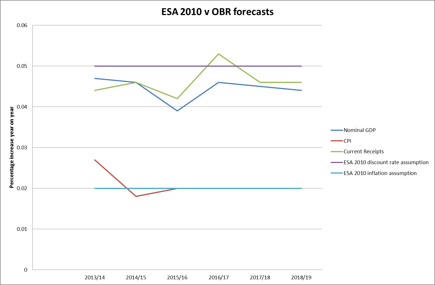
The second point concerned the ESA 2010 assumptions themselves. There was a previous consultation on the best discount rate used for these valuations, ie the percentage by which a payment required in one year’s time is more affordable than one required now, with GDP growth coming out as the preferred option. Leaving aside the many criticisms of GDP as an economic measure, one option which was not considered apparently was the growth in current Government receipts, although this would seem in many ways to be a better guide to the element of economic growth relevant to the affordability of public sector provision. Taking the Office for Budget Responsibility (OBR) forecasts from 2013-14 to 2018-19 with the fixed ESA 2010 assumptions for discount rate and inflation of 5% pa and 2% pa respectively gives us an interesting comparison.

ESA v OBR
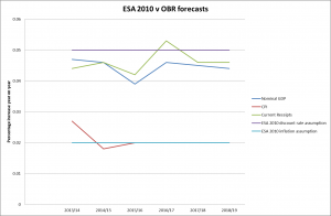
The CPI assumption appears to be fairly much in line with forecasts, but the average nominal GDP and current receipt year on year increase over the next 6 years of forecasts are 4.47% pa and 4.61% pa (4.72% pa if National Accounts taxes are used rather than all current receipts) respectively. A 0.5% reduction in the discount rate to 4.5% pa would be expected to increase the liability by over 10%.

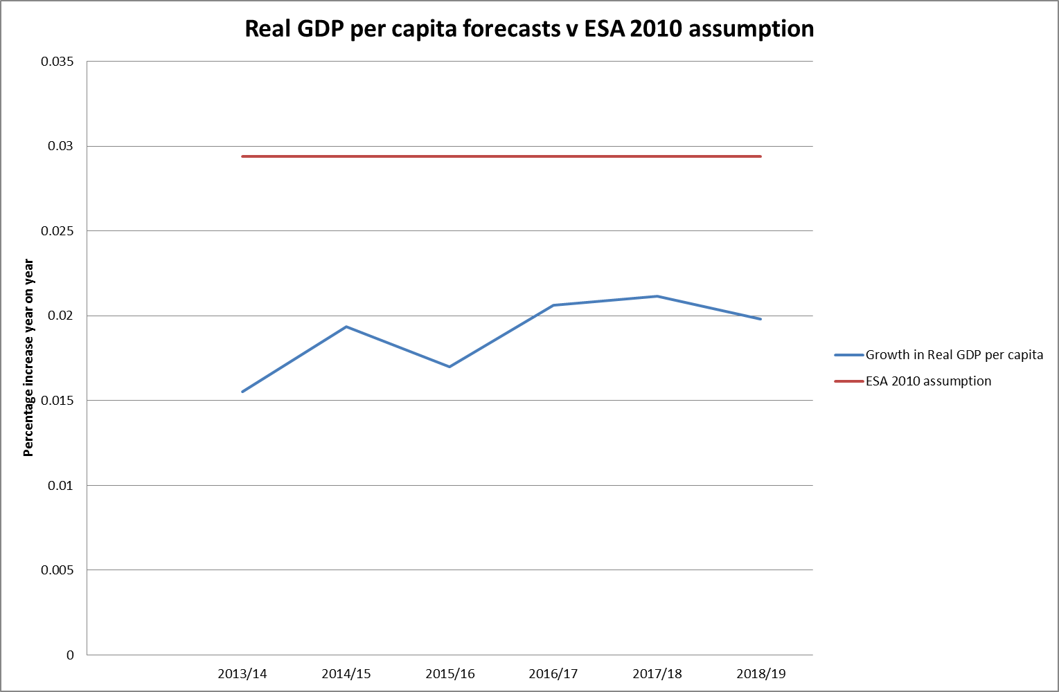
Another, possibly purer, measure of economic growth, removing as it does the distortions caused by net migration, would be the growth of GDP per capita. If we take the OBR forecasts for real GDP growth per capita and set it against the long term ESA 2010 assumption of 1.05/1.02 – 1 = 2.94% the comparison is even more interesting:

Real GDP v ESAIn this case the ESA assumption is around 1% pa greater than the forecasts would suggest, making the liability less than 80% of where it would be using the average forecast value.

The ESA 2010 assumptions are intended to be fixed so that figures for different years can easily be compared. It would clearly be easy to argue for tougher assumptions from the OBR forecasts (although the accuracy of these has of course not got a great track record), but perhaps more difficult to find an argument for relaxing them further.

Whether the consensus holds over keeping them fixed when and if the liability figures start to get more prominence and a lower liability becomes an important economic target for some of the larger EU member states remains to be seen. However if the assumptions cannot be changed, since public sector benefits now have a 25 year guarantee in the UK (other than the normal pension age now equal to the state pension age being subject to review every 5 years), then the cost cap mechanism (ie higher member contributions) becomes the only available safety valve. So we can perhaps expect nurses’ and teachers’ pension contributions to become the battleground when public sector pension affordability becomes a hot political issue once more.

We can poke fun at the Government’s enthusiasm to take on the Royal Mail Pension Plan and its focus on annual cashflows which made it look beneficial for their finances over the short term, but we may also look back wistfully to the days before public sector pensions stopped being viewed as a necessary expense of delivering services and became instead a liability to be minimised.

Towers watson surveyAs a quick illustration of the differences between how businesses in the UK and Germany approach change this chart from the recent Economist Intelligence Unit research carried out for Towers Watson takes some beating. To UK eyes, an insane proportion (45%) of German businesses are proposing to make physical changes to their workplaces by 2020 to accommodate a greying workforce. There is an even more dramatic contrast when the issue of flexible working hours is raised. Less than half of UK businesses intend to offer more flexible working hours by 2020, compared to over three quarters of German businesses.

Neither are we interested in training our older workers apparently. Only 28% of UK businesses intend to ensure that the skills of their older employees remain up to date, compared to 48% of German businesses.

So where are UK businesses preparing to manage change then? Giving employees more choice over their benefits is cited by 60% of UK businesses, compared to 45% in Germany and the European average of 48%.

But is this the positive step it is presented as? It seems unlikely to me that these UK businesses that don’t want to invest in older workers’ working environments or give them flexibility over hours or location or train them is interested in providing any choice over benefits that doesn’t also cut their costs. There are going to be some battles ahead over exactly how the pensions changes in the Budget are to be implemented. Judging from this survey, they are going to be hard fought.

Unemployment

We are only six months into the Bank of England’s new regime of giving forward guidance about what circumstances might lead them to adjust the Base Rate and they are already in a bit of a mess with it. Whether forward guidance is abandoned or not is still in the balance, amid much confusion. However, much of this confusion seems to be due to the challenge that events have provided to the assumption that the Bank of England could make reasonably accurate economic predictions.

It turns out that not only did the Bank not know how fast unemployment would fall (not a surprise: the Monetary Policy Committee (MPC) minutes from August make clear that they suspected this might be the case), but neither did they know, when it did fall, what a 7% unemployed economy would look like. The Bank has been very surprised by how fragile it still is.

Back in August 2013, when unemployment was still at 7.7%, the MPC voted to embrace the forward guidance which has now fallen on its face. This said that: In particular, the MPC intends not to raise Bank Rate from its current level of 0.5% at least until the Labour Force Survey headline measure of the unemployment rate has fallen to a threshold of 7%, subject to the conditions below.

The “conditions below” were that all bets would be off if any of three “knockouts” were breached:

1. that it would be more likely than not that CPI 18 to 24 months ahead would be at 2.5% or above (in fact it has just fallen to 2%);

2. medium-term inflation expectations no longer remained “sufficiently well anchored” (the gently sloping graph below would suggest it hasn’t slipped that anchor yet); or

3. the Financial Policy Committee (FPC) judged monetary policy posed “a significant threat to financial stability”. More difficult to give an opinion on that one but, looking beyond the incipient housing market bubble, it is difficult to see that monetary policy is causing any other instability currently. Certainly not compared to the instability which would be caused by jacking up interest rates and sending mortgage defaults through the roof.

Source: Bank of England implied spot inflation curve

Source: Bank of England implied spot inflation curve

So it seems that there has been no clear knock out on any of these three counts, but that the “threshold” (it was never a target after all) of 7% is no longer seen as significant a sign of economic recovery as it had been believed it would only last August.

Fun as it is to watch the illusion of mastery of the economy by the very serious people flounder yet again, as what is an intrinsically good piece of economic news is turned into a fiasco of indecision, I think the Bank is right to believe that it is far too early to raise interest rates. I say so because of two further graphs from the Office of National Statistics (ONS) latest labour market statistics, which were not included in their infographic on the left.

The first is the graph of regional unemployment, which shows very clearly that large areas of the UK are still nowhere near the magic 7% threshold: the variations are so wide and, in austerian times, the resources to address them are so limited that it makes sense not to be overly dazzled by the overall UK number.

Regional unemployment

The second is the graph of those not looking or not available for work in the 16-64 age group since the 1970s. As you can see, it has recently shown a very different pattern to that of the unemployment graph. In the past (and borne out by the data from 1973 to around 1993) the number not available to work has tended to mirror the unemployment rate as people who could manage without work withdrew from the job market when times got tough and came back in when things picked up. However in the early 90s something new started to happen: people withdrawing from the job market even when unemployment was falling. There has been a steady increase in their number until it finally started to fall only last year. So what is happening?

Not in labour force

One of the factors has been a big increase in the number of people registered as self employed, rising from 4.2 million in 1999 to 5.1 million in 2011. However, many of these people are earning very little and I suspect that at least some of them would have been categorised as unemployed in previous decades. There must therefore be some doubt about whether 7% unemployed means what it used to mean.

The Bank of England have shown with their difficulties over forward guidance that it is very hard to look forward with any degree of precision. It should be applauded for admitting that it doesn’t know enough at the moment to start pushing up interest rates.

There has been the usual flurry of misleading headlines around the Prime Minister’s pledge to maintain the so-called triple lock in place for the 2015-20 Parliament. The Daily Mail described it as a “bumper £1,000 a year rise”. Section 150A of the Social Security Administration Act 1992, as amended in 2010, already requires the Secretary of State to uprate the amount of the Basic State Pension (and the Standard Minimum Guarantee in Pension Credit) at least in line with the increase in the general level of earnings every year, so the “bumper” rise would only be as a result of earnings growth continuing to grind along at its current negative real rate.

However, the Office for Budget Responsibility (OBR) is currently predicting the various elements of the triple lock to develop up until 2018 as follows:

Triple lock

The OBR have of course not got a great track record on predicting such things, but all the same I was curious about where the Daily Mail’s number could have come from.

The Pensions Policy Institute’s (PPI’s) report on the impact of abandoning the triple lock in favour of just a link to earnings growth estimates the difference in pension in today’s money could be £20 per week, which might be the source of the Daily Mail figure, but not until 2065! I think if we maintain a consistent State Pensions policy for over 50 years into the future a rise of £20 per week in its level will be the least remarkable thing about it.

The PPI’s assumption is that the triple lock, as opposed to what is statutorily required, would make a difference to the State Pension increase of 0.26% a year on average. It is a measure of how small our politics has become that this should be headline news for several days.

It’s a relatively new science, and one which binds together many different academic disciplines: mathematical modelling, economics, sociology and history. In economic terms, it is to what economists in financial institutions spend most of their time focusing on – the short to medium term – as climate science is to weather forecasting. Cliodynamics (from Clio, the Ancient Greek muse or goddess of history (or, sometimes, lyre playing) and dynamics, the study of processes of change with time) looks at the functioning and dynamics of historical societies, ie societies for which the historical data exists to allow analysis. And that includes our own.

Peter Turchin, professor of ecology and mathematics at the University of Connecticut and Editor-in-Chief of Cliodynamics: The Journal of Theoretical and Mathematical History, wrote a book with Sergey Nefedev in 2009 called Secular Cycles. In it they took the ratio of the net wealth of the median US household to the largest fortune in the US (the Phillips Curve) to get a rough estimate of wealth inequality in the US from 1800 to the present. The graph of this analysis shows that the level of inequality in the US measured in this way peaked in World War 1 before falling steadily until 1980 when Reagan became US President, after which it has been rising equally steadily. By 2000,inequality was at levels last seen in the mid 50s, and it has continued to increase markedly since then.

The other side of Turchin’s and Nefedev’s analysis combines four measures of wellbeing: economic (the fraction of economic growth that is paid to workers as wages), health (life expectancy and the average height of native-born population) and social optimism (average age of first marriage). This seems to me to be a slightly flaky way of measuring this, particularly if using this measure to draw conclusions about recent history: the link between average heights in the US and other health indicators are not fully understood, and there are a lot of possible explanations for later marriages (eg greater economic opportunities for women) which would not support it as a measure of reduced optimism. However, it does give a curve which looks remarkably like a mirror image of the Phillips Curve.

The Office of National Statistics (ONS) are currently developing their own measure of national well-being for the UK, which has dropped both height and late marriage as indicators, but unfortunately has expanded to cover 40 indicators organised into 10 areas. The interactive graphic is embedded below.

Graphic by Office for National Statistics (ONS)

I don’t think many would argue with many of these constituents except that any model should only be as complicated as it needs to be. The weightings will be very important.

Putting all of this together, Turchin argues that societies can only tolerate a certain level of inequality before they start finding more cooperative ways of governing and cites examples from the end of the Roman civil wars (first century BC) onwards. He believes the current patterns in the US point towards such a turning point around 2020, with extreme social upheaval a strong possibility.

I am unconvinced that time is that short based solely on societal inequality: in my view further aggravating factors will be required, which resource depletion in several key areas may provide later in the century. But Turchin’s analysis of 20th century change in the US is certainly coherent, with many connections I had not made before. What is clear is that social change can happen very quickly at times and an economic-political system that cannot adapt equally quickly is likely to end up in trouble.

And in the UK? Inequality is certainly increasing, by pretty much any measure. And, as Richard Murphy points out, our tax system appears to encourage this more than is often realised. Cliodynamics seems to me to be an important area for further research in the UK.

And a perfect one for actuaries to get involved in.


When I started writing this blog in April, one of its main purposes was to highlight how poor we are at forecasting things, and suggest that our decision-making would improve if we acknowledged this fact. The best example I could find at the time to illustrate this point were the Office of Budget Responsibility (OBR) Gross Domestic Product (GDP) growth forecasts over the previous 3 years.

Eight months on it therefore feels like we have come full circle with the publication of the December 2013 OBR forecasts in conjunction with the Chancellor’s Autumn Statement. Little appears to have changed in the interim, the coloured lines on the chart below of their various forecasts now joined by the latest one all display similar shapes steadily moving to the right, advising extreme caution in framing any decision based on what the current crop of forecasts suggest.

OBR update

However, the worse the forecasts are revealed to be, the keener it seems politicians of all the three main parties are to base policy upon them. The Autumn Statement ran to 7,000 words, of which 18 were references to the OBR, with details of their forecasts taking up at least a quarter of the speech. In every area of economic policy, from economic growth to employment to government debt, it seemed that the starting point was what the OBR predicted on the subject. The Shadow Chancellor appears equally convinced that the OBR lends credibility to forecasting, pleading for Labour’s own tax and spending plans to be assessed by them in the run up to the next election.

I am a little mystified by all of this. The updated graph of the OBR’s performance since 2010 does not look any better than it did in April, the lines always go up in the future and so far they have always been wrong. If they turn out to be right (or, more likely, a bit less wrong) this time, then that does not seem to me to tell us anything much about their predictive skill. It takes great skill, as Les Dawson showed, to unerringly hit the wrong notes every time. It just takes average luck to hit them occasionally.

For another bit of crystal ball gazing in his Statement, the Chancellor abandoned the OBR to talk about state pension ages. These were going to go up to 68 by 2046. Now they are going to go up to 68 by the mid 2030s and then to 69 by the late 2040s. There will still be people alive now who were born when the state retirement age (for the “Old Age Pension” as it was then called) was 70. It looks like we are heading back in that direction again.

The State Pension Age (SPA) was introduced in 1908 as 70 years for men and women, when life expectancy at birth was below 55 for both. In 1925 it was reduced to 65, at which time life expectancy at birth had increased to 60.4 for women and 56.5 for men. In 1940, a SPA below life expectancy at birth was introduced for the first time, with women allowed to retire from age 60 despite a life expectancy of 63.5. Men, with a life expectancy of 58.2 years were still expected to continue working until they were 65. Male life expectancy at birth did not exceed SPA until 1948 (source: Human Mortality Database).

In 1995 the transition arrangements to put the SPA for women back up to 65 began, at which stage male life expectancy was 73.9 and female 79.2 years. In 2007 we all started the transition to a new SPA of 68. In 2011 this was speeded up and last week the destination was extended to 69.

SPAs

Where might it go next? If the OBR had a SPA modeller anything like their GDP modeller it would probably say up, in about another 2 years (just look again at the forecasts in the first graph to see what I mean). Ministers have hit the airwaves to say that the increasing SPA is a good news story, reflecting our increasingly long lives. And the life expectancies bear this out, with the 2011 figures showing life expectancy at birth for males at 78.8 and for females at 82.7, with all pension schemes and insurers building in further big increases to those life expectancies into their assumptions over the decades ahead.

And yet. The ONS statistical bulletin in September on healthy life expectancy at birth tells a different story which is not good news at all. Healthy life expectancies for men and women (ie the maximum age at which respondents would be expected to regard themselves as in good or very good health) at birth are only 63.2 and 64.2 years respectively. If people are going to have to drag themselves to work for 5 or 6 years on average in poor health before reaching SPA under current plans, how much further do we really expect SPA to increase?

Some have questioned the one size fits all nature of SPA, suggesting regional differences be introduced. If that ever happened, would we expect to see the mobile better off becoming SPA tourists, pushing up house prices in currently unfashionable corners of the country just as they have with their second homes in Devon and Cornwall? Perhaps. I certainly find it hard to imagine any state pension system which could keep up with the constantly mutating socioeconomics of the UK’s regions.

Perhaps a better approach would be a SPA calculated by HMRC with your tax code. Or some form of ill health early retirement option might be introduced to the state pension. What seems likely to me is that the pressures on the Government to mitigate the impact of a steadily increasing SPA will become one of the key intergenerational battlegrounds in the years ahead. In the meantime, those lines on the chart are going to get harder and harder for some.

scan0005


A man is sentenced to 7 years in prison for selling bomb detectors which had no hope of detecting bombs. The contrast with the fate of those who have continued to sell complex mathematical models to both large financial institutions and their regulators over 20 years, which have no hope of protecting them from massive losses at the precise point when they are required, is illuminating.

The devices made by Gary Bolton were simply boxes with handles and antennae. The “black boxes” used by banks and insurers to determine their worst loss in a 1 in 200 probability scenario (the Value at Risk or “VaR” approach) are instead filled with mathematical models primed with rather a lot of assumptions.

The prosecution said Gary Bolton sold his boxes for up to £10,000 each, claiming they could detect explosives. Towers Watson’s RiskAgility (the dominant model in the UK insurance market) by contrast is difficult to price, as it is “bespoke” for each client. However, according to Insurance ERM magazine in October 2011, for Igloo, their other financial modelling platform, “software solutions range from £50,000 to £500,000 but there is no upper limit as you can keep adding to your solution”.

Gary Bolton’s prosecutors claimed that “soldiers, police officers, customs officers and many others put their trust in a device which worked no better than random chance”. Similar things could be said about bankers during 2008 about a device which worked worse the further the financial variables being modelled strayed from the normal distribution.

As he passed sentence, Judge Richard Hone QC described the equipment as “useless” and “dross” and said Bolton had damaged the reputation of British trade abroad. By contrast, despite a brief consideration of alternatives to the VaR approach by the Basel Committee on Banking Supervision in 2012, it remains firmly in place as the statutory measure of solvency for both banks and insurers.

The court was told Bolton knew the devices – which were also alleged to be able to detect drugs, tobacco, ivory and cash – did not work, but continued to supply them to be sold to overseas businesses. In Value at Risk: Any Lessons from the Crash of Long-Term Capital Management (LTCM)? Mete Feridun of Loughborough University in Spring 2005 set out to analyse the failure of the Long Term Capital Management (LTCM) hedge fund in 1998 from a risk management perspective, aiming at deriving implications for the managers of financial institutions and for the regulating authorities. This study concluded that the LTCM’s failure could be attributed primarily to its VaR system, which failed to estimate the fund’s potential risk exposure correctly. Many other studies agreed.

“You were determined to bolster the illusion that the devices worked and you knew there was a spurious science to produce that end,” Judge Hone said to Bolton. This brings to mind the actions of Philippe Jorion, Professor of Finance at the Graduate School of Management at the University of California at Irvine, who, by the winter of 2009 was already proclaiming that “VaR itself was not the culprit, however. Rather it was the way this risk management tool was employed.” He also helpfully pointed out that LTCM were very profitable in 2005 and 2006. He and others have been muddying the waters ever since.

“They had a random detection rate. They were useless.” concluded Judge Hone. Whereas VaR had a protective effect only within what were regarded as “possible” market environments, ie something similar to what had been seen before during relatively calm market conditions. In fact, VaR became less helpful the more people adopted it, as everyone using it ended up with similar trading positions, which they then attempted to exit at the same time. This meant that buyers could not be found when they were needed and the positions of the hapless VaR customers tanked even further.

Gary Bolton’s jurors concluded that, if you sell people a box that tells them they are safe when they are not, it is morally reprehensible. I think I agree with them.

Plotting the frequency of earthquakes higher than a given magnitude on a logarithmic scale gives a straightish line that suggests we might expect a 9.2 earthquake every 100 years or so somewhere in the world and a 9.3 or 9.4 every 200 years or so (the Tohoku earthquake which led to the Fukushima disaster was 9.0). Such a distribution is known as a power-law distribution, which gives more room for action at the extreme ends than the more familiar bell-shaped normal distribution, which gives much lower probabilities for extreme events.

earthquakes

Similarly, plotting the annual frequency of one day falls in the FTSE All Share index higher than a given percentage on a logarithmic scale also (as you can see below) gives a straightish line, indicating that equity movements may also follow a power-law distribution, rather than the normal distribution (or log normal, where the logarithms are assumed to have a normal distribution) they are often modelled with.
However the similarity ends there, because of course earthquakes normally do most of their damage in one place and on the one day, rather than in the subsequent aftershocks (although there have been exceptions to this: in The Signal and the Noise, Nate Silver cites a series of earthquakes on the Missouri-Tennessee border between December 1811 and February 1812 of magnitude 8.2, 8.2, 8.1 and 8.3 respectively). On the other hand, large equity market falls often form part of a sustained trend (eg the FTSE All Share lost 49% of its value between 11 June 2007 and 2 March 2009) with regional if not global impacts, which is why insurers and other financial institutions which regularly carry out stress testing on their financial positions tend to concern themselves with longer term falls in markets, often focusing on annual movements.

equities

How you measure it obviously depends on the data you have. My dataset on earthquakes spans nearly 50 years, whereas my dataset for one day equity falls only starts on 31 December 1984, which was the earliest date from which I could easily get daily closing prices. However, as the Institute of Actuaries’ Benchmarking Stochastic Models Working Party report on Modelling Extreme Market Events pointed out in 2008, the worst one-year stock market loss in UK recorded history was from the end of November 1973 to the end of November 1974, when the UK market (measured on a total return basis) fell by 54%. So, if you were using 50 years of one year falls rather than 28.5 years of one day falls, a fall of 54% then became a 1 in 50 year event, but it would become a 1 in 1,000 year event if you had the whole millennium of data.

On the other hand, if your dataset is 38 years or less (like mine) it doesn’t include a 54% annual fall at all. Does this mean that you should try and get the largest dataset you can when deciding on where your risks are? After all, Big Data is what you need. The more data you base your assumptions on the better, right?

Well not necessarily. As we can already see from the November 1973 example, a lot of data where nothing very much happens may swamp the data from the important moments in a dataset. For instance, if I exclude the 12 biggest one day movements (positive and negative) from my 28.5 year dataset, I get a FTSE All Share closing price on the 18 July 2013 of 4,494 rather than 3,513, ie 28% higher.

Also, using more data only makes sense if that data is all describing the same thing. But what if the market has fundamentally changed in the last 5 years? What if the market is changing all the time and no two time periods are really comparable? If you believe this you should probably only use the most recent data, because the annual frequency of one day falls of all percentages appears to be on the rise. For one day falls of at least 2%, the annual frequency from the last 5 years is over twice that for the whole 28.5 year dataset (see graph above). For one day falls of at least 5%, the last 5 years have three times the annual frequency of the whole dataset. The number of instances of one day falls over 5.3% drop off sharply so it becomes more difficult to draw comparisons at the extreme end, but the slope of the 5 year data does appear to be significantly less steep than for the other datasets, ie expected frequencies of one day falls at the higher levels would also be considerably higher based on the most recent data.

Do the last 5 years represent a permanent change to markets or are they an anomaly? There are continual changes to the ways markets operate which might suggest that the markets we have now may be different in some fundamental way. One such change is the growth of the use of models that take an average return figure and an assumption about volatility and from there construct a whole probability distribution (disturbingly frequently the normal or log normal distribution) of returns to guide decisions. Use of these models has led to much more confidence in predictions than in past times (after all, the print outs from these models don’t look like the fingers in the air they actually are) and much riskier behaviour as a result (particularly, as Pablo Triana shows in his book Lecturing Birds on Flying, when traders are not using the models institutional investors assume they are in determining asset prices). Riskier behaviour with respect to how much capital to set aside and how much can be safely borrowed for instance, all due to too much confidence in our models and the Big Data they work off.

Because that is what has really changed. Ultimately markets are just places where we human beings buy and sell things, and we probably haven’t evolved all that much since the first piece of flint or obsidian was traded in the stone age. But our misplaced confidence in our ability to model and predict the behaviour of markets is very much a modern phenomenon.

Just turning the handle on your Big Data will not tell you how big the risks you know about are. And of course it will tell you nothing at all about the risks you don’t yet know about. So venture carefully in the financial landscape. A lot of that map you have in front of you is make-believe.

spikes colour