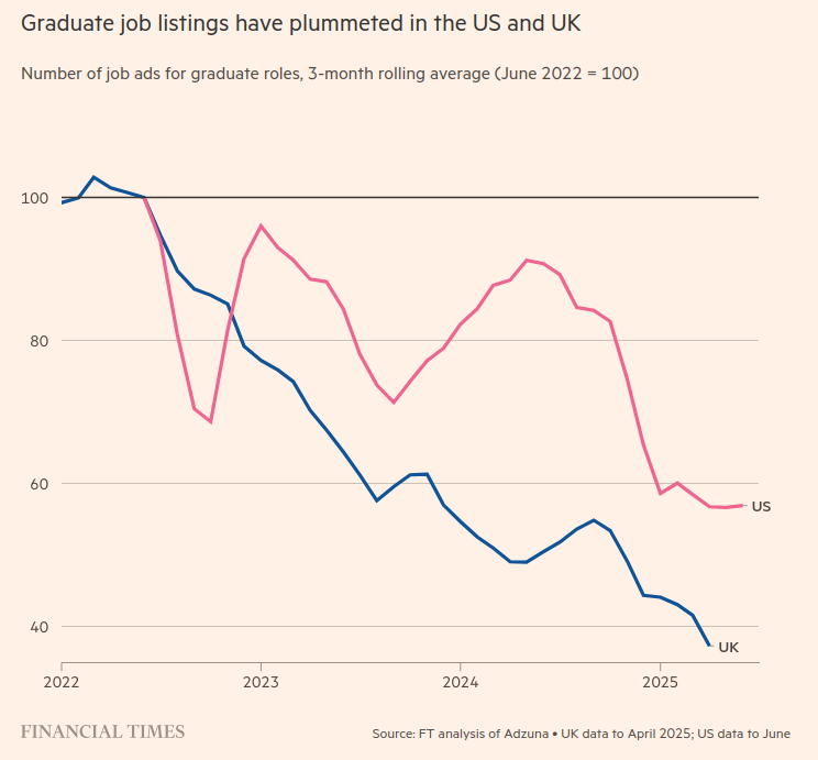
Last time I suggested that the changes to graduate recruitment patterns, due at least in part to technological change, appeared to be to the disadvantage of current graduates, both in terms of number of vacancies and in what they were being asked to do.
This immediately reminds me of the old Woody Allen joke from the opening monologue to Annie Hall:
Two elderly women are at a Catskills mountain resort, and one of ’em says: “Boy, the food at this place is really terrible.” The other one says, “Yeah, I know, and such … small portions.”
This would clearly be an uncomfortable position for Corporate Britain if it were accepted. So a push back is to be expected. The drop in graduate vacancies is hard to challenge so the next candidate is obviously the candidates themselves.
So hot on the heels of “Kids today need more discipline”, “Nobody wants to work”, “Students today aren’t prepared for college”, “Kids today are lazy”, “We are raising a generation of wimps” and “Kids today have too much freedom” (I refer you to Paul Fairie’s excellent collections of newspaper reports through history detailing these findings at regular intervals), we now have the FT, newspaper of choice for Corporate Britain, weighing in on “The Troubling Decline in Conscientiousness“, this time backed up by a whole series of graphs:
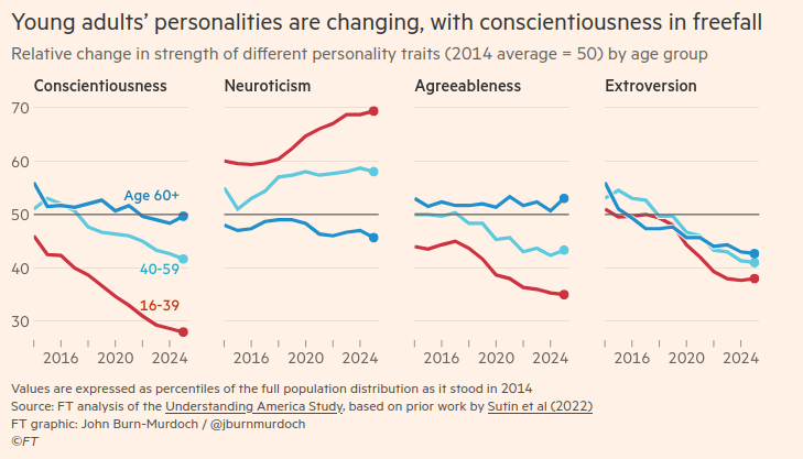
John Burn-Murdoch does a lot of great data work on a huge array of subjects which I have referred to often, but I find the quoted studies problematic for a number of reasons. First of all, there is the suspicion that young people have already been found guilty before looking for evidence to back this up. For instance, which came first here the “factors at work” or the “shifts”?
While a full explanation of these shifts requires thorough investigation, and there will be many factors at work, smartphones and streaming services seem likely culprits.
At one point John feels compelled to say:
While the terminology of personality can feel vague, the science is solid.
At which point he links to this study, defending the five-factor model of personality as a “biologically based human universal” which terrifies me a little. Now of course there are always studies pointing in lots of different directions for any piece of social science research and this is no exception. In this critique of the five-factor model (FFM), for instance, we find that:
While the two largest factors (Anxiety/Neuroticism and Extraversion) appear to have been universally accepted (e.g., in the pioneering factor-analytic work of R. B. Cattell, H. J. Eysenck, J. P. Guilford, and A. L. Comrey), the present critique suggests, nevertheless, that the FFM provides a less than optimal account of human personality structure.
I first saw the FT article via a post on LinkedIn, where there was one mild push back sitting alone amongst crowds of pile ons from people of my generation. After all it feels right, doesn’t it? But Chris Wagstaff, Senior Visiting Fellow at Bayes Business School, was spot on I feel, when he pointed out four potential behavioural biases at play here within the organisations where these young people are working:
- The decline in conscientiousness and some of the other traits identified could be a consequence of more senior colleagues not inviting or taking on board constructive challenge from younger colleagues, the calamity of conformity, i.e. groupthink, so demotivating the latter.
- Related to this is the tendency for many organisations to get their employees to live and breathe an often meaningless set of values and adhere to a blinkered way of doing things. Again, hugely frustrating and demotivating.
- Or perhaps we’re seeing way too many meetings being populated by way too many participants, meaning social loafing (ie when individual performance isn’t visible they simply hide behind others) is on the increase.
- Finally, remuneration structures might discourage entrepreneurial thinking and an element of risk taking (younger folk are less risk averse than older folk). Again, very demotivating.
These sound much more convincing “factors at play” to me than smart phones or streaming services, neither of which of course are the preserve of the young. But demonising the young is an essential prelude to feeling better about denying them work or forcing them into some kind of reverse centaur position.
Corporate Britain needs to do better than pseudo-scientific victim blaming. There are real issues here around the next generation’s relationship with work and much else which need to be met head on. Your future pension income may depend upon it.