For those of you totally immersed in the daily to and fro of the finance industry, this post about Stuart Kirk will probably seem a little late in the day. For those of you who are not, let me explain briefly what I am talking about today!
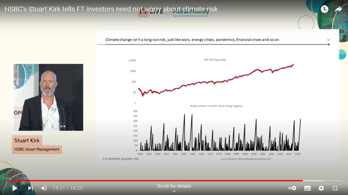
Stuart Kirk was Global Head of Responsible Investments at HSBC Asset Management. On 19 May 2022 he gave a talk at the FT Live Moral Money Summit Europe conference with the provocative title of Why investors need not worry about climate risk. Stuart’s talk was a real crowd splitter. Many called for his dismissal (HSBC subsequently suspended him), others regarded his talk as a missed opportunity and full of things which were not true, while others have regarded his stance as speaking truth to power.
However what interests me most about all of the column inches devoted to the affair is what he has not been criticised for and what this tells us about financial markets.
What Stuart said was structured around the following 12 statements:
- Unsubstantiated, shrill, partisan, self-serving, apocalyptic warnings are ALWAYS wrong.
- As the warnings became ever graver, the more asset prices INCREASED in value.
- One of only three explanations can explain the impending end of the world and higher risk asset prices:
- Climate risk is negligible.
- Climate risk is already in the price.
- All investors are wrong.
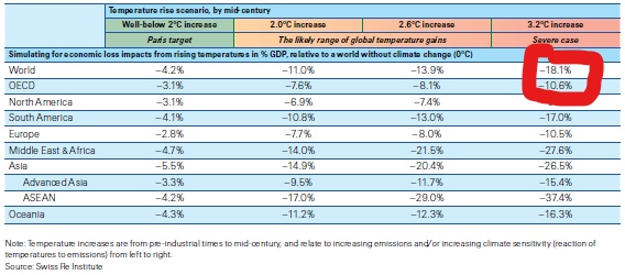
- Even by the UN IPCC own numbers, climate change will have a negligible effect on the world economy – A (large) temperature rise of 3.6 degrees by 2100 means a loss of 2.6 per cent o global GDP. Let’s assume 5%.
- Adaption is cheap and effective: climate related costs relative to GDP and mortality rates are down.
- Perhaps the biggest error of thinking with climate risk is confusing volumes and values – Plenty of things happen between a volume disruption and a move in asset values.
- Climate “winners” and losers” can create value. Climate “winners” and “losers” can destroy value.
- The difference between volumes and value is regularly made clear in markets.
- Even if climate risk isn’t negligible, it’s too far into the future to matter for most companies.
- To make climate change appear like a significant threat, scaremongers are torturing their models.
- It’s easy to show that climate change is an investment risk if you engineer a bond market collapse.
- Climate change isn’t a long-run risk just like wars, energy crises, pandemics, financial crises and so on (with the graphs shown above to supposedly prove this point).
Can you spot the pattern here? All of these statements are about the map that Stuart is standing in (think of Joey standing in his map to orientate himself in Friends). It is a complicated map of asset prices and charts and reports written by lots of other people standing in the map with Stuart, but it is still just a map. And the map is the territory as far as Stuart is concerned. If something does not appear in his map, it is not worth worrying about. And climate risk is struggling to make it into his map. In Stuart’s view, this is a problem for climate risk, and the people “torturing” their models to make climate risk appear significant and piling him up with regulatory reporting responsibilities are very annoying.
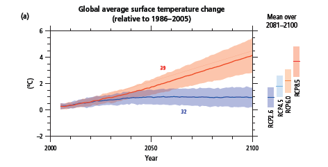
But of course this take is completely upside down. This is not a problem for climate risk. Rather climate risk is a problem for us and the fact that it does not appear in our models unless we torture them (which I am sure is true) means that we have the wrong models. Because the scientific consensus about the consequences of climate change on our current trajectory of between 3 and 4 degrees warming are (amongst others from Mark Lynas’ Six Degrees: Our Future on a Hotter Planet):
Africa […] split between the north which will see a recovery of rainfall and the south which becomes drier […] beyond human adaptation.
Indian monsoon rains will fail. The Himalayan glaciers providing the waters of the Indus, Ganges and Brahmaputra, the Mekong, Yangtze and Yellow rivers [will decrease] by up to 90%.
The Amazonian rain forest basin will dry out completely. In Brazil, Venezuela, Columbia, East Peru and Bolivia life will become increasingly difficult due to wild fires which will cause intense air pollution and searing heat. The smoke will blot out the sun. Drought will be permanent in the sub-tropics and Central America.
Australia will become the world’s driest nation.
In the US Gulf of Mexico high sea temperatures will drive 180+ mph winds. Houston will be vulnerable to flooding by 2045. Galveston will be inundated. Many plant species will become extinct as they will be unable to adapt to such a sudden change in climate.
The [IPCC] in its 2007 report concluded that all major planetary granaries will require adaptive measures at 2.5° temperature rise regardless of precipitation rates.[and] food prices [will] soar. Population transfers will be bigger than anything ever seen in the history of mankind. [The feedback effects from the] Amazon rain forests dry[ing] out and wild fires develop[ing] [will lead] to those fires [releasing] more CO2, global warming [intensifying] as a result, vegetation and soil begin[ning] to release CO2 rather than absorb[ing] it, all of which could push the 3° scenario to a 4°-5.5° [one].
Much of the discussion about the talk was that Stuart was speaking out bravely and that HSBC had only suspended him to silence inconvenient truths, that he had been silenced by “extreme environmental ideology“. I have no idea about all of the reasons why HSBC suspended Stuart other than their official statements, but it seems clear to me that many people in the finance industry agree with what he said. This suggests to me an extreme ideology of its own of resolutely refusing to look out of the window.
In Kim Stanley Robinson’s excellent New York 2140, global sea levels have risen by 50 feet. Everyone lives in tower blocks connected by sky bridges which occasionally topple into the canals which were once streets. I used to think that money markets would not survive events like this, but Robinson posits what I believe is a more likely future scenario. The Intertidal Property Pricing Index is developed instead, carefully constructed to be reasonably stable despite the instability of the actual real estate being valued, and people bet on it. And soon everyone is fixated on what this index is saying daily rather than the buildings collapsing around them.
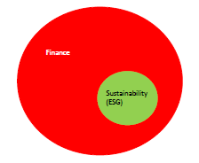
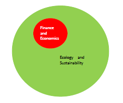
This is exactly what our finance sector will do of course, there will be money to be made out of such activities after all. And so expectations that they will, in any way, be a leader out of the climate emergency are, in my view, unrealistic.
We will however need the finance industry to facilitate aspects of how we transform our economies over the next 10 to 20 years. And this will involve much more of the regulation which annoys Stuart and others so much.