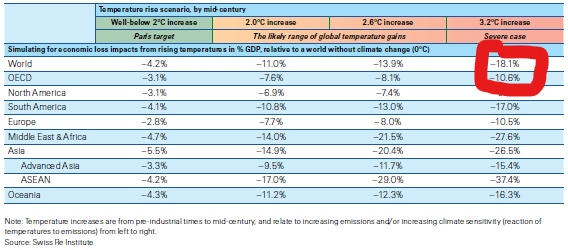
Last week, the news from the Actuary magazine was that climate change could slash global GDP by 18%. This was based on a Swiss Re report, the economics of climate change, from which the analysis above is taken.
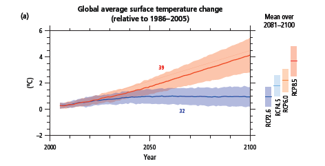
According to the report, “The current trajectory of temperature increases, assuming action with respect to climate change mitigation pledges, points to global warming of 2.0–2.6°C by mid-century.” It was unclear why they had decided to stop at 2050, when current commitments continue to push temperatures up until 2100. And the scenarios from the IPCC’s AR5 Synthesis Report (see below) show that the path we are currently on diverges far more considerably from the Paris agreements after 2050. Climate effects are very long-term and many of the impacts of a 2-3°C warming would be irreversible ones, ensuring continuing losses at similar or greater levels for decades to come, and that is before we even consider the much higher probabilities of feedback effects: from the melting of the permafrost, additional methane releases, loss of Amazonian carbon and the loss of the albedo reflectivity of Arctic ice. The Swiss Re report makes clear that is has not considered these.
You might notice that there is a separate column to the left, in a different colour, with the title “Well-below 2°C increases” and sub-title of “Paris target”. It is actually an agreement which 189 countries have signed up to, including the UK. As the Paris Agreement says (Article 2 Point 1):
This Agreement, in enhancing the implementation of the Convention, including its objective, aims to strengthen the global response to the threat of climate change, in the context of sustainable development and efforts to eradicate poverty, including by:
(a) Holding the increase in the global average temperature to well below 2°C above pre-industrial levels and pursuing efforts to limit the temperature
increase to 1.5°C above pre-industrial levels, recognizing that this would significantly reduce the risks and impacts of climate change;
There has been some debate over whether the Agreement is aiming for 1.5°C warming with a 50% chance of staying below it, or for “well below” 1.5°C similar to the 2°C goal with a 66% chance of avoiding more than 1.5°C warming, but the modelling used for the next IPCC report has adopted the latter definition. Either way, I cannot see why Swiss Re has decided to put the Paris Agreement targets in a different column from what it calls the “likely range of temperature gains” as if those we have committed to are no longer feasible to aim at.
In saying this, I do not underestimate the massive challenge of keeping to the Paris target. As Mark Lynas says in Our Final Warning, at the end of 2018 over 1,000 GW of additional fossil-fuelled electrical power generation capacity was planned, permitted or already under construction around the world, equivalent to adding an additional 188 Gt CO2 into the atmosphere to the 658 Gt already baked in from existing infrastructure, which gives a total of 846 Gt of CO2 not including impacts from deforestation, agriculture and future land-use change. This compares to a future carbon budget as estimated at the end of 2018 by the IPCC (although estimates of this vary considerably) of 420 Gt of CO2 (or 1,170 Gt of CO2 for 2°C warming). So an extraordinary change of direction is required and we should be very cautious of getting anywhere near these limits when we do not know precisely where they are.
Which brings me onto the modelling of economic impacts. The first thing to say is that modelling in terms of impact on GDP, while guaranteed to get the attention of the financial community, is perhaps not the best way of communicating the devastation of runaway climate change.
In the summary of Mark Lynas’ excellent book Six Degrees: Our Future on A Hotter Planet , which summarised the scientific consensus already arrived at by 2007, the three degree increase for which damages are being estimated is expected to lead to Africa […] split between the north which will see a recovery of rainfall and the south which becomes drier […] beyond human adaptation. Indian monsoon rains will fail. The Himalayan glaciers providing the waters of the Indus, Ganges and Brahmaputra, the Mekong, Yangtze and Yellow rivers [will decrease] by up to 90%. The [IPCC] in its 2007 report concluded that all major planetary granaries will require adaptive measures at 2.5° temperature rise regardless of precipitation rates.[and] food prices [will] soar. Population transfers will be bigger than anything ever seen in the history of mankind. [The feedback effects from the] Amazon rain forests dry[ing] out and wild fires develop[ing] [will lead] to those fires [releasing] more CO2, global warming [intensifying] as a result, vegetation and soil begin[ning] to release CO2 rather than absorb[ing] it, all of which could push the 3° scenario to a 4°-5.5° [one]. The recent update to this: Our Final Warning, describes “entering the three-degree world means we are now living in a hotter climate than any experienced on Earth throughout the entire history of our species”. These impacts, which are likely to pose existential risks for many, appear totally inconsistent with the economic loss modelling shown above.
In his 2020 paper, The appallingly bad neoclassical economics of climate change (apologies, Journal access required), Steve Keen says in the abstract:
Forecasts by economists of the economic damage from climate change have been notably sanguine, compared to warnings by scientists about damage to the biosphere. This is because economists made their own predictions of damages, using three spurious methods: assuming that about 90% of GDP
will be unaffected by climate change, because it happens indoors; using the relationship between temperature and GDP today as a proxy for the impact
of global warming over time; and using surveys that diluted extreme warnings from scientists with optimistic expectations from economists. Nordhaus has misrepresented the scientific literature to justify using a smooth function to describe the damage to GDP from climate change. Correcting for these errors makes it feasible that the economic damages from climate change are at least an order of magnitude worse than forecast by economists, and may be so great as to threaten the survival of human civilization.
There follows a demolition of the methodologies employed by Nordhaus and others in this field. To be fair to the Swiss Re report, some of the criticisms in Keen’s paper appear to have been borne in mind when constructing their model, eg:
A shortcoming of our model build so far is that some economic impacts are linearly estimated: non-linearities are not adequately captured. We use multiplicative factors of 5 and 10 to simulate the increasing severity of outcomes from nonlinearities… Importantly, the framework does not consider
tipping points, events such as the partial disintegration of ice sheets, biosphere collapses or permafrost loss, that pose a threat of abrupt and irreversible climate change. This is because it is thought that tipping points will materialise well after our model horizon of mid-century only.
And as the Swiss Re report also acknowledges:
It is likely that the estimated impacts of GDP damages from climate change will rise as existing modelling develops to incorporate economic linkages in trade, migration and other channels, and to generalise the results to multiple countries.
And they are getting criticisms from the usual suspects of climate denial, eg Bjorn Lomberg on Twitter here, that even their attempts to date to quantify the uncertainties caused by non-linearity are a step too far.
And yet there remains a problem with these analyses in that they fail to capture existential risk. One of the things Steve Keen points out in his paper is the different attitude Nordhaus found towards estimating damages from climate change in natural scientists as opposed to economists. Natural scientists typically estimated the damage at 20-30 times higher than economists and some refused to cooperate with the exercise at all:
I must tell you that I marvel that economists are willing to make quantitative estimates of economic consequences of climate change where the only measures available are estimates of global surface average increases in temperature. As [one] who has spent his career worrying about the vagaries of the dynamics of the atmosphere, I marvel that they can translate a single global number, an extremely poor surrogate for a description of the climatic conditions, into quantitative estimates of impacts of global economic conditions.
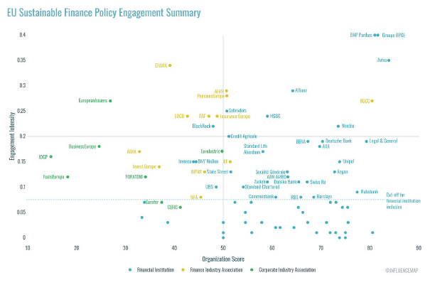
But how do you calibrate what is clearly a complicated model that Swiss Re and Moody’s have constructed for this analysis? Obviously we all have a very recent GDP fall in our minds at the moment – here is a summary from the UK Commons Library of Economic Indicators as at 30 April 2021 (themselves sourced from OECDstat and Eurostat):
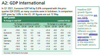
This shows an almost identical GDP fall of 10.5% year on year in Q2 2020 for the OECD as predicted in the event of a 3.2°C warming, although it has bounced back pretty quickly since. For a longer term view of the global data, Our World In Data have an Annual growth in GDP per capita graph which runs from 1961 to 2017 (see below).
One very large GDP fall which stands out in the data here is the 26.5% fall in China in 1961. This was towards the end of the China’s Great Famine, in which approximately 3 million people died of starvation over a 3 year period. This certainly qualifies as an existential event and Swiss Re’s modelling suggest something of similar proportions in Asia and Africa at 3.2°C warming.
The biggest danger in all of this is that rich countries will look at a 10.6% reduction in GDP (at 3.2°C warming) and think this liveable with and adaptable to for their populations. After all, Simon Wren Lewis calculates that the austerity policies between 2010 and 2018 in the UK reduced GDP by nearly half of this amount every year for at least the second half of this period, compared to where it would have been without these policies, with an estimated cumulative loss of 15.9% of GDP. An 18.1% overall world average loss, however, effectively means more than a 25% loss for the rest of the world outside the OECD, as the OECD accounts for around half of the world’s total GDP which, even if we did not allow for the acknowledged likelihood that these are underestimates, is still in the Chinese Famine category of disaster and neither liveable with nor adaptable to.
We are already seeing vaccine nationalism carve up the world between rich and poor countries, with up until last month only 0.3% of the vaccines administered around the world having gone to people in low-income countries. This is likely to reduce the ability of poorer countries to be represented properly at this year’s COP26 when it frames a global response to the climate change which will affect them so disproportionately. And the losses if we do not act will be measured in far more frequent floods and sea level rise, extreme storms and heatwaves, crop failures, water and food shortages and mass migration on a scale we have never seen before, not GDP.
Could climate change slash global GDP by 18%? It’s much worse than that.


