
I have seen two very different pictures of the future of professional life over the last year or so. The first, which I wrote about over a year ago, was presented in The Future of the Professions by Richard and Daniel Susskind, and has been much debated since within the actuarial profession for what the implications might be for the future. In summary, the Susskinds set out two possible futures for the professions. Either:
• They carry on much as they have since the mid 19th century, but with the use of technology to streamline and optimise the way they work;
• Increasingly capable machines will displace the work of current professionals.
Their research suggests that, while these two futures will exist in parallel for some time, in the long run the second future will dominate. Indeed Richard Susskind has gone further in setting out what that future might look like for the legal profession, where he sets out future strategies for surviving in a world of increasingly capable machines as:
- providing more for less (ie charging less (in particular the end of time cost fees), alternative billing arrangements such as “value billing”, making efficiencies and collaboration strategies where clients come together to share costs);
- liberalising services (ie allowing a wider range of people to provide legal services); and
- technology (ie online services in all of their forms to make the delivery of these cheaper, increasing use of data scraping, text mining, etc to replace what was previously done through expert judgement).
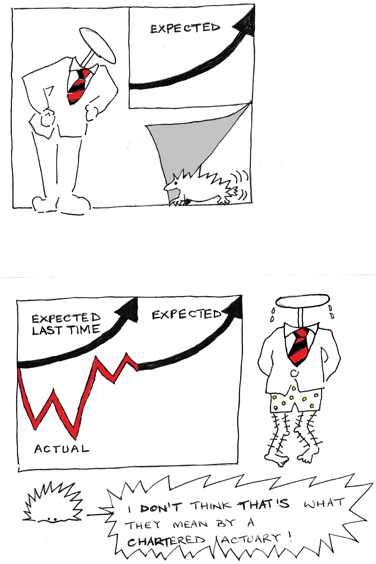
So far, so expected. The relentless increase in technological capability is bound to demand increased efficiency and leaner organisations competing ruthlessly in a pitiless market, right?
Enter an alternative vision for the future. Pointing out that we have been here before and that Keynes had speculated in 1930 that
In quite a few years – in our own lifetimes I mean – we may be able to perform all the operations of agriculture, mining, and manufacture with a quarter of the human effort to which we have been accustomed.
David Graeber, in his latest book Bullshit Jobs, points out that this never happened, despite pretty much all of the technological developments and income increases which Keynes predicted. He suggests that this future which the Susskinds are predicting is already happening in terms of needing fewer people to fill the meaningful roles within organisations but that, rather than employing fewer people, we are either creating “bullshit” jobs which even the people doing them can see no point to or bullshitizing existing roles for which the meaningful need has passed. It is as if the organisations themselves have attempted to maintain the outward appearance of the same structures by disguising the hollowing out of so many of their functions with simulated business.
It is an intriguing alternative vision of how the professional world might develop which has come in for some criticism, the most serious of which Graeber attempts to address in his book. One of the reasons he thinks the situation has been allowed to develop is that noone believed that capitalism could produce such an outcome. But that is only if you accept the rational profit maximising principle, which many economists have now abandoned as an explanation for corporate or individual behaviour. Graeber gives one particularly important example of this in the creation of Obamacare, where Barack Obama “bucked the preferences of the electorate and insisted on maintaining a private, for-profit health insurance system in America”, quoting him as follows:
“I don’t think in ideological terms. I never have,” Obama said, continuing on the health care theme. “Everybody who supports single-payer health care says, ‘Look at all this money we would be saving from insurance and paperwork.’ That represents one million, two million, three million jobs [filled by] people who are working at Blue Cross, Blue Shield or Kaiser or other places. What are we doing with them? Where are we employing them?”
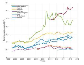
So which vision of the future is more likely? I think, at the moment, there is probably more evidence for the Susskind vision, mainly because he has been working in this area for 30 years and therefore many of his predictions, such as the use of email to provide legal advice, have had time to emerge. Many of the stories in Graeber’s book ring true for me and are similar to experiences I have had at times myself, but he has only obtained 300 of them. The YouGov poll which highlighted that 37% of working adults say their job is making no meaningful contribution to the world – but most of them aren’t looking for another one, was based on a sample size of 849. There was also a similar result (in this case 40%) from a survey in the Netherlands, for which I couldn’t easily find the sample size. However this does also lend some weight to one of Graeber’s other contentions in the book that the financial industry might be considered a paradigm for bullshit job creation, as the following graph (from a working paper on this issue by Stolbova et al) shows that the Netherlands and the UK are by far the most financialised economies in the EU.
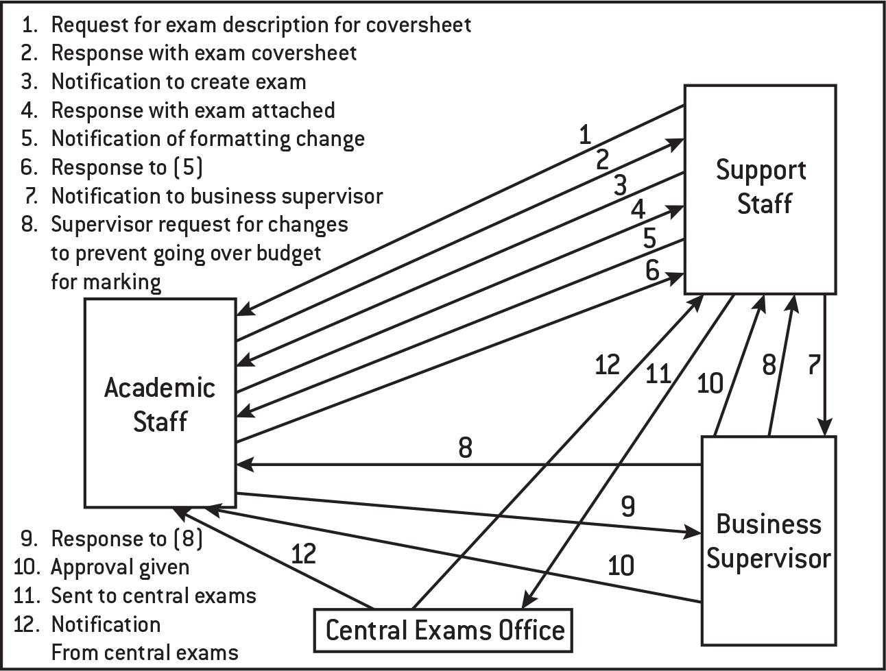
There are other parts which ring less true for me. For instance, I do not recognise the alternative “non-managerial” university exam paper production process to that shown below (which is just the academic staff sending the exam to a teaching assistant to print and the teaching assistant confirming that he/she has done so) as ever having been remotely acceptable, but this may just reflect the fact that I have been working in academia for a far shorter time than Graeber. However there is no doubt that this is an interesting and useful field of enquiry and potentially concerning for all of us trying to support our graduates in negotiating a meaningful and rewarding entry into the workplace.
There is likely to be significant disruption over the next couple of decades in how we do things and it seems likely to me that there will be many seeking to protect familiar organisational and power structures along the way, as our assumptions about what we want and how we are prepared to have it provided to us are seriously challenged in sometimes unnerving ways. Of the sustainability of these protections ultimately, I am less sure.

