It’s a relatively new science, and one which binds together many different academic disciplines: mathematical modelling, economics, sociology and history. In economic terms, it is to what economists in financial institutions spend most of their time focusing on – the short to medium term – as climate science is to weather forecasting. Cliodynamics (from Clio, the Ancient Greek muse or goddess of history (or, sometimes, lyre playing) and dynamics, the study of processes of change with time) looks at the functioning and dynamics of historical societies, ie societies for which the historical data exists to allow analysis. And that includes our own.

Peter Turchin, professor of ecology and mathematics at the University of Connecticut and Editor-in-Chief of Cliodynamics: The Journal of Theoretical and Mathematical History, wrote a book with Sergey Nefedev in 2009 called Secular Cycles. In it they took the ratio of the net wealth of the median US household to the largest fortune in the US (the Phillips Curve) to get a rough estimate of wealth inequality in the US from 1800 to the present. The graph of this analysis shows that the level of inequality in the US measured in this way peaked in World War 1 before falling steadily until 1980 when Reagan became US President, after which it has been rising equally steadily. By 2000,inequality was at levels last seen in the mid 50s, and it has continued to increase markedly since then.

The other side of Turchin’s and Nefedev’s analysis combines four measures of wellbeing: economic (the fraction of economic growth that is paid to workers as wages), health (life expectancy and the average height of native-born population) and social optimism (average age of first marriage). This seems to me to be a slightly flaky way of measuring this, particularly if using this measure to draw conclusions about recent history: the link between average heights in the US and other health indicators are not fully understood, and there are a lot of possible explanations for later marriages (eg greater economic opportunities for women) which would not support it as a measure of reduced optimism. However, it does give a curve which looks remarkably like a mirror image of the Phillips Curve.

The Office of National Statistics (ONS) are currently developing their own measure of national well-being for the UK, which has dropped both height and late marriage as indicators, but unfortunately has expanded to cover 40 indicators organised into 10 areas. The interactive graphic is embedded below.

Graphic by Office for National Statistics (ONS)

I don’t think many would argue with many of these constituents except that any model should only be as complicated as it needs to be. The weightings will be very important.

Putting all of this together, Turchin argues that societies can only tolerate a certain level of inequality before they start finding more cooperative ways of governing and cites examples from the end of the Roman civil wars (first century BC) onwards. He believes the current patterns in the US point towards such a turning point around 2020, with extreme social upheaval a strong possibility.

I am unconvinced that time is that short based solely on societal inequality: in my view further aggravating factors will be required, which resource depletion in several key areas may provide later in the century. But Turchin’s analysis of 20th century change in the US is certainly coherent, with many connections I had not made before. What is clear is that social change can happen very quickly at times and an economic-political system that cannot adapt equally quickly is likely to end up in trouble.

And in the UK? Inequality is certainly increasing, by pretty much any measure. And, as Richard Murphy points out, our tax system appears to encourage this more than is often realised. Cliodynamics seems to me to be an important area for further research in the UK.

And a perfect one for actuaries to get involved in.


Pirates colourImagine a ship tossed around in a rough sea. The waves throw the vessel in all directions, before the sea level plummets sharply. Whirlpools have formed to the south of them and there are fears these will spread north and swallow the ship. The only means of escape is a rope ladder dangled above the ship, from an airship desperately being inflated above their heads. However the only place on the ship where this can be reached is the ship’s bridge, which is reserved for the ship’s officers.

Strangely the crew do not attempt to storm the bridge but seem resigned to their fate. Instead the captain orders the airship to dump several tons of ballast into the ship, pulling it even further down into the water. To all pleas for mercy from the crew his reply is the same: row harder. The captain has had the sail removed and passed up to the airship crew, on the understanding that the material will be made into a tow rope that will pull the ship to safety. But that seems like a long time ago. The crew have been left with no choice but to row, their daily rations gradually dwindling.

Question: if the sea level rises again, as of course it will eventually, so that the rope ladder moves into reach for everyone on the ship not too weak to take advantage of it, despite everything the ship’s officers have done to make the crew’s lives more hopeless, should we congratulate the ship’s captain on his stewardship? I and many others think not.

Meanwhile the head of a pin is drawing perilously close to the fabric of the airship as the crew pile heedlessly up the rope ladder…..

Druids_celebrating_at_Stonehenge_(1)

Source: Creative Commons

An interesting article on solar cycles in this month’s Actuary magazine was spoilt for me by the attempt to smuggle in man made climate change denialist assertions within it. Brent Walker says that understanding the sun-climate connection requires a broadly similar skill set to that needed to become an actuary. Unfortunately, basic statistical literacy, the minimum which might be expected of an actuary, appears to be absent from his claim that there has been a pause in global warming despite soaring carbon dioxide levels in the atmosphere.

It is very difficult to construct downward trend curves from the average surface temperature data, but that does not seem to stop people, many of them funded by energy companies with much to gain if the need for green taxes could be successfully questioned, from trying.

It is rather like looking at the FTSE 100 graph and concluding that economic growth ended on 1 December 1999. Indeed the performance of equity markets provides more evidence to support this assertion than average temperature data does for the idea that global warming ended in 1997. And yet we don’t see people queuing up to say that economic growth doesn’t exist. Could it be because there would be no profits to be made from doing so?

This is not a good platform from which to make grandiose statements like “the profession should also be seriously questioning the outcomes of unreliable climate models that have been produced by scientists who, by and large, do not have an actuary’s ability to see the bigger risk picture”. I think, on the contrary, actuaries generally take their data sets from a much narrower range of sources than climate scientists (another summary of the evidence on solar cycles in global climate change, as discussed by Brent Walker but this time drawing opposite conclusions can be found here). This is usually because we are working to tight timescales to deliver advice.

Brent Walker is right when he says that actuaries need to consider the implications of climate science in their work, but the current scientific consensus is that solar cycles are not the main driver of climate change. A better place to start in my view would be the Institute and Faculty of Actuaries report Resource constraints: sharing a finite world which points out that, either through natural depletion or the need to ration resources to mitigate climate change in the future, the primary challenge of climate change will be to manage within much stricter limits both in terms of the resources we can use and the level of economic growth we can expect. That really is something actuaries can contribute to.


When I started writing this blog in April, one of its main purposes was to highlight how poor we are at forecasting things, and suggest that our decision-making would improve if we acknowledged this fact. The best example I could find at the time to illustrate this point were the Office of Budget Responsibility (OBR) Gross Domestic Product (GDP) growth forecasts over the previous 3 years.

Eight months on it therefore feels like we have come full circle with the publication of the December 2013 OBR forecasts in conjunction with the Chancellor’s Autumn Statement. Little appears to have changed in the interim, the coloured lines on the chart below of their various forecasts now joined by the latest one all display similar shapes steadily moving to the right, advising extreme caution in framing any decision based on what the current crop of forecasts suggest.

OBR update

However, the worse the forecasts are revealed to be, the keener it seems politicians of all the three main parties are to base policy upon them. The Autumn Statement ran to 7,000 words, of which 18 were references to the OBR, with details of their forecasts taking up at least a quarter of the speech. In every area of economic policy, from economic growth to employment to government debt, it seemed that the starting point was what the OBR predicted on the subject. The Shadow Chancellor appears equally convinced that the OBR lends credibility to forecasting, pleading for Labour’s own tax and spending plans to be assessed by them in the run up to the next election.

I am a little mystified by all of this. The updated graph of the OBR’s performance since 2010 does not look any better than it did in April, the lines always go up in the future and so far they have always been wrong. If they turn out to be right (or, more likely, a bit less wrong) this time, then that does not seem to me to tell us anything much about their predictive skill. It takes great skill, as Les Dawson showed, to unerringly hit the wrong notes every time. It just takes average luck to hit them occasionally.

For another bit of crystal ball gazing in his Statement, the Chancellor abandoned the OBR to talk about state pension ages. These were going to go up to 68 by 2046. Now they are going to go up to 68 by the mid 2030s and then to 69 by the late 2040s. There will still be people alive now who were born when the state retirement age (for the “Old Age Pension” as it was then called) was 70. It looks like we are heading back in that direction again.

The State Pension Age (SPA) was introduced in 1908 as 70 years for men and women, when life expectancy at birth was below 55 for both. In 1925 it was reduced to 65, at which time life expectancy at birth had increased to 60.4 for women and 56.5 for men. In 1940, a SPA below life expectancy at birth was introduced for the first time, with women allowed to retire from age 60 despite a life expectancy of 63.5. Men, with a life expectancy of 58.2 years were still expected to continue working until they were 65. Male life expectancy at birth did not exceed SPA until 1948 (source: Human Mortality Database).

In 1995 the transition arrangements to put the SPA for women back up to 65 began, at which stage male life expectancy was 73.9 and female 79.2 years. In 2007 we all started the transition to a new SPA of 68. In 2011 this was speeded up and last week the destination was extended to 69.

SPAs

Where might it go next? If the OBR had a SPA modeller anything like their GDP modeller it would probably say up, in about another 2 years (just look again at the forecasts in the first graph to see what I mean). Ministers have hit the airwaves to say that the increasing SPA is a good news story, reflecting our increasingly long lives. And the life expectancies bear this out, with the 2011 figures showing life expectancy at birth for males at 78.8 and for females at 82.7, with all pension schemes and insurers building in further big increases to those life expectancies into their assumptions over the decades ahead.

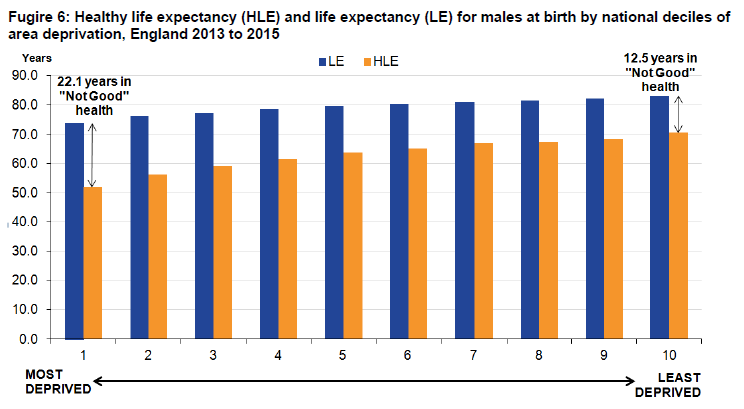
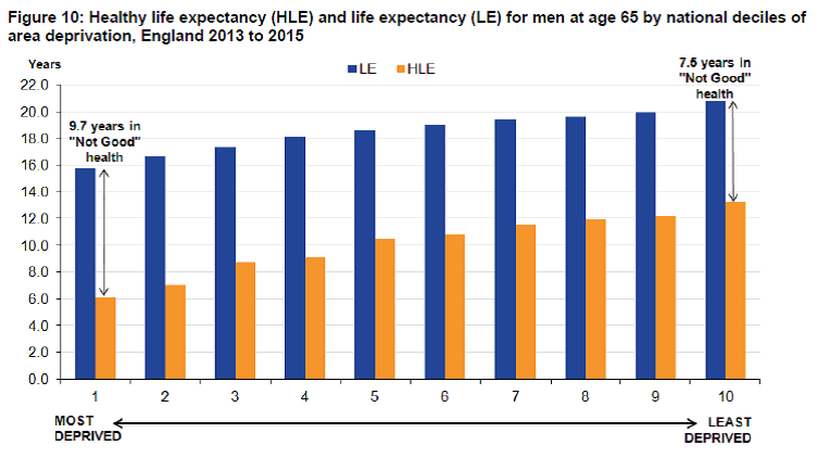
And yet. The ONS statistical bulletin in September on healthy life expectancy at birth tells a different story which is not good news at all. Healthy life expectancies for men and women (ie the maximum age at which respondents would be expected to regard themselves as in good or very good health) at birth are only 63.2 and 64.2 years respectively. If people are going to have to drag themselves to work for 5 or 6 years on average in poor health before reaching SPA under current plans, how much further do we really expect SPA to increase?

Some have questioned the one size fits all nature of SPA, suggesting regional differences be introduced. If that ever happened, would we expect to see the mobile better off becoming SPA tourists, pushing up house prices in currently unfashionable corners of the country just as they have with their second homes in Devon and Cornwall? Perhaps. I certainly find it hard to imagine any state pension system which could keep up with the constantly mutating socioeconomics of the UK’s regions.

Perhaps a better approach would be a SPA calculated by HMRC with your tax code. Or some form of ill health early retirement option might be introduced to the state pension. What seems likely to me is that the pressures on the Government to mitigate the impact of a steadily increasing SPA will become one of the key intergenerational battlegrounds in the years ahead. In the meantime, those lines on the chart are going to get harder and harder for some.

The consultation on the future shape of workplace pensions has been going on for nearly a month now and ends two weeks on Friday. It is littered with errors, from completely repeated questions (Q52 = Q54) to ones which are so similar as makes no difference (Qs 41 and 44 for example) and the thrust of a lot of the questions are quite hard to answer if you do not share some of the underlying assumptions of the DWP about the process, but come on! This is our chance to put a bit of definition into the rather blurry outline of a straw man which some of the newspapers have been tilting at so vigorously!

You don’t have to answer all of the questions, but just to goad you a bit I have done so here. Agree, disagree, I would love to hear from you. But not until you have responded to one of the following addresses:

How to respond to this consultation

Pleasesendyourconsultationresponses,preferablybye-mail,to:definedambition.pensionsconsultation@dwp.gsi.gov.uk

Or by post to:

Defined Ambition Team

Private Pensions Policy and Analysis

1st Floor, Caxton House

6-12 Tothill Street

London

SW1H 9NA


Feedback on the consultation process

There have only been 24 posts on the blog. I think the main reason for this was identified early in the process from a contributor referring to herself only as Hannah:

Hannah

I applaud the use of an open blog but it’s obvious that there’s a bit of a problem here! Perhaps, to avoid this becoming sidetracked, you could introduce a drop-down in the comment section so that people could select what aspect of DA reform or the consultation their comment relates to – and if their comment relates instead to concerns about their accrued benefits, you could redirect them to a separate specialised member queries page?

Reply

Sam Gilbert

Thanks for this Hannah, we will look into this once the blog picks up pace.

DA Team, DWP

Of course the blog never did pick up pace because people soon realised that there comments would be lost in a stream of pension benefit queries. Not the way to encourage a consultation. If you want to comment on this or anything else about the process of the consultation, the contact details are as follows:

Elias Koufou

DWP Consultation Coordinator

2nd Floor

Caxton House

Tothill Street

London

SW1H 9NA

Phone: 020 7449 7439

Email:elias.koufou@dwp.gsi.gov.uk

20131126_122758I received a set of nontransitive dice in the post this week. Transitive is an interesting word. As we all know in grammar it refers to verbs which do things to something. What I didn’t learn at school was that if they do things to one thing they are called monotransitive, and ditransitive if they have both a direct and indirect object. A verb like to trade is categorised as tritransitive. If a verb does not play with others it is called intransitive, eg an example appropriate to this story, to die. If a verb swings both ways it is called ambitransitive.

In the mathematical world transitive is a description of a relation on a set. For example, if A = B and B = C, then A = C. So = is transitive. Similarly, if A > B  and  B > C  then  A > C.

Or does it? Let’s return to the dice (singular die: cemented in my memory on the occasion a teacher responded to a boy coming into his class and asking to borrow a dice by shouting “die, die, die!” at the startled youngster). Mathematicians do not use the word intransitive, preferring perhaps to avoid the ambiguity of words like flammable and inflammable, but instead use nontransitive. Nontransitive dice have the property that if die A tends to beat die B on average, and die B tends to beat die C on average, then rather counter-intuitively die C tends to beat die A on average. How does this work?

There are many different arrangements of the numbers on the faces of the dice which would achieve this effect. My red die has 4 on all its faces except one, which has a 6. My blue die has half its faces with 2s and the other half with 6s. My green die has 5 on all its faces except one, which is unnumbered (or, in fact, undotted).

If we take the average number we expect to get when throwing each die (the concept of expected value, first introduced by Blaise Pascal of triangle fame, also known as the mean, is the first thing that tends to get calculated in any statistical analysis), then red gives us 4⅓, blue gives us 4 and  green     4 1/6. So we would expect from that to see red beat blue, green beat blue and red beat green.

When we pitch red against blue, if we throw a 2 with the blue die (probability of a ½), then we will always lose to red, since all of its faces are greater than 2. If we throw a 6 with blue, we have a 5/6 chance of beating red (since 5 of its 6 faces are 4s) and a 1/6 chance of drawing. So we have for blue a probability of ½ of losing, a probability of ½ x 5/6 = 5/12 of winning and a probability of ½ x 1/6 = 1/12 of drawing. So, in the long run, red beats blue on average, as we would expect it to.

When we pitch blue against green, blue will always win if we throw a 6 with it, with a probability ½. If we throw a 2, also with a probability ½, we have a 1/6 chance of winning against green (if green’s single blank face comes up) otherwise we will lose to a 5. So we have for blue a probability of losing of ½ x 5/6 = 5/12. And the probability of winning as blue (since no draws are possible this time) of 1 – 5/12 = 7/12. So, in the long run, blue beats green, exactly the opposite of what we would expect just going on the expected values.

Finally, when we pitch red against green, the only time green will beat red is when red has a 4 (with probability 5/6) and green has a 5 (also with probability 5/6). So we have a probability of green beating red of 5/6 x 5/6 = 25/36. And the probability of winning as red (since again no draws are possible as the two dice have no numbers in common) is therefore 1 – 25/36 = 11/36. So, in the long run (when as Keynes once helpfully pointed out, we are all dead) green beats red, again exactly the opposite of what we would expect just going on the expected values.

We only had to mess around a little with the 6 faces of the dice to get this counter-intuitive result. Nearly all financial instruments and products are obviously much more complicated than this, with the probabilities of certain outcomes being largely unknown, and even more so when in combination with each other, and therefore counter-intuitive results turn up almost too frequently to be called counter-intuitive any more. In fact the habit of trying to treat financial markets as if they were games obeying rules as fixed and obvious as those you can play with dice is what Nassim Nicholas Taleb refers to as the Ludic Fallacy.

If we double them up we get another surprise. Red still has the highest expected value (8⅔), followed by green again (8⅓) and then blue (8). But this time each pairing has three possible outcomes. Red and green both beat blue as expected from the expected values, but then green unexpectedly beats red.

This kind of behaviour is called nonlinearity, when adding quantities of things together does not just increase their effects, but instead changes them. Nonlinearity in this case means that blue beats green when we use one die each, but that green beats blue when we use two. Nonlinearity is also the single biggest threat to the financial system.

Anyone for darts instead?

November 2013 003The latest revelations from Edward Snowden that the US and UK agreed in 2007 to relax the rules governing the mobile phone and fax numbers, emails and IP addresses that the US National Security Agency (NSA) could hold onto (and extending the net to people not the original targets of their surveillance) has increased the pressure on the Government to tighten controls on the activities of the security services. This extension apparently allowed the NSA to venture up to three “hops” away from a person of interest, eg a friend of a friend of a friend on Facebook.

I have an issue with the Guardian analysis here. They say that three hops from a typical Facebook user would rope in 5 million people. However, using actual ratios from the network in their source (43 friends have 3,975 friends of friends have 1,328,361 friends of friends of friends) and the median number of friends of 99 from the original study, would lead to a number closer to 3 million. Still, it is clearly altogether too many people to be treated as guilty by association.

So it might seem like a strange time for me to be advocating that we give the Government more of our data.

The Office for National Statistics (ONS) is currently consulting on the form of the next census and the future of population statistics generally. The two options they have come down to are:

1. Keep the 2021 census pretty much as it was for 2011, although with perhaps slight changes to the questions and a greater push for people to complete them online; or
2. Using administrative data already held by the Government in its various departments to produce an annual estimate of the population in local areas. In addition there would be separate compulsory surveys of 1% and 4% of the population for checking the overall population figures and some of the sub-grouping respectively, and the ‘residents of “communal establishments” such as university halls of residence and military bases’ which are difficult to reach by other means.

In my response to the survey, I suggested that they do both, increase the compulsory surveys each year to 10% of the population and reduce the time between full censuses to 5 years. This is why.

First of all, everybody needs this data to be available. If the Government does not provide it, someone else will. Not by asking you overt questions, but by buying information about your buying preferences or search engine activities or any number of other transactions without your informed consent (eg you ticked agreement to their terms and conditions on their website) and without your knowledge. I would prefer to give my data to the ONS.

The ONS is part of the UK Statistics Authority, which is an independent body at arm’s length from government. It reports directly to Parliament rather than to Government Ministers and has a strong track record of challenging the Government’s misuse of statistics. With the exception of requests received for personal information (which are filtered off to become Subject Access Requests under the Data Protection Act), they have provided copies of all information disclosed by the ONS under the Freedom of Information Act on their website. In my view the ONS has demonstrated that it is a safe custodian of our data. They are everything the NSA is not: overt, apolitical and committed to the appropriate use of statistics.

But there are problems with the current data, which brings me onto my second point. Ten years is too long to wait for updated information. As the ONS points out in its consultation document, because of the ten year gap between censuses, the population growth resulting from expansion of the European Union in 2004 was not fully understood until 2012. There were other problems with the population data everyone had been working with before 2011, 30,000 fewer people in their 90s than expected for instance, which had serious implications for all involved in services to the elderly and those constructing mortality tables too.

So we do need more frequent census information. Five years seems about right to me, provided the annual updates can be made more rigorous. I think the ONS are right to suggest that they need to be compulsory to achieve this, but 5% of the population does not seem a large enough sample to be confident about this to me. I would prefer to see 10% completing annual surveys. This would allow 50% of the population to be covered over every 5 year census period, or 40% if the requirement was dropped in census year. There are many recent examples (see Schonberger and Cukier below) to suggest that the gains in accuracy due to increased coverage would be far greater than the losses due to the ‘messiness’ of incomplete responses.

There is a lot in the consultation document about the relative costs of the different options, but nothing about the commercial value of the data being collected. Indeed the reduction of the consultation to these two, to my mind, inadequate options seems to be very greatly influenced by the question of costs and the current cuts in budgets seen throughout the public sector. This seems to me to be very short-sighted.

However, I think this displays a failure of imagination. According to Viktor Mayer-Schonberger and Kenneth Cukier in their book Big Data, data is set to be the greatest source of wealth and economic growth looking forward. Many others agree. By taking a fully accountable and carefully controlled approach to licensing the data in its care, the ONS should be able to finance its own activities, even at the level I am suggesting, at the very least.

The ONS is very nervous about becoming more intrusive in its collection methods, citing the 35% increase in cost of the 2011 census in achieving the same level of response. It also refers to the response rates to its voluntary surveys which have dropped from around 80% 30 years ago to around 60% today. The main reasons for this in my view are the incessant requests from companies’ marketing departments masquerading as surveys on everything from phone usage to our views on banking to the relentless demands for feedback on every online purchase making us all subject to survey fatigue. This makes it all the more necessary that an organisation which is not trying to sell you anything and which is scrupulous about the protection of your data should be attempting to increase its scope and maintaining its position as the go to place for statistical data rather than falling behind its commercial rivals.

So let’s not fall into the trap of conflating all official data with the mountains of bitty fragments collected by our intelligence agencies from their shady sources. That has nothing to do with the proper, accountable collection of information to allow government and governed alike access to what they need to make better decisions.

So take part in the consultation, it matters. And when the time comes give the ONS your data. You know it makes census.

Germany has surprised the European Commission (EC) by suddenly insisting that stiffer data protection controls are incorporated into the negotiations for the Transatlantic Trade and Investment Partnership (TTIP), which began earlier this year, and for which the second round has started this week. For those of you who have not heard of it before (understandable, as the negotiations so far have had a deliberately low profile), the purpose of the TTIP is to create a single transatlantic market, in which all regulatory differences between the United States US and the EU are gradually removed. The EC calls it “the biggest trade deal in the world”.

As the EC goes on to say:

On top of cutting tariffs across all sectors, the EU and the US want to tackle barriers behind the customs border – such as differences in technical regulations, standards and approval procedures. The TTIP negotiations will also look at opening both markets for services, investment, and public procurement. They could also shape global rules on trade.

Concerns have started to emerge about the massive transfer of power from governments to corporations that the final deal might allow. However Germany’s intervention on data protection is just the latest of a list of reasons that have been advanced for why the TTIP talks are unlikely to go anywhere. From the legislative schlerosis of the US, to protectionist instincts on both sides recently strengthened by austerity, to French paternalism towards their film industry, to European fears about an influx of GM foods, the TTIPing point will never be reached, they say. So nothing to worry about then.

Or is there? A document published last year by the US Chamber of Commerce and BusinessEurope explains how it would be able to overturn existing legislation which got in its way. And if the long tortuous progress of Solvency 2’s implementation date, the bureaucratic equivalent of the man with the end is nigh sandwich board on his back, endisnighhas taught us anything, it is that unimplemented regulatory frameworks can still have massive impacts. Just this month it was revealed that the best funded pension schemes in the FTSE 100 are insurers, precisely because of the impact of those schemes on insurers’ solvency capital requirements under Pillar 1 of Solvency 2. And the clear rebuff to EIOPA from exporting these requirements to occupational pension schemes has not prevented the work to develop a framework for imposing them from continuing.

So what would TTIP mean for defined benefit (DB) pension schemes? Well, at first sight, not very much. US DB schemes tend to have funding targets equivalent to FRS17 levels, which would be seen as at the weak end of UK funding targets. However, as we have seen with the process of market harmonisation in the EU, horse trading may lead to the US being stuck with stiffer requirements imported from the EU on pensions in order to maintain subsidies for US farmers, say.

And there are two features of the US DB landscape which would be an issue for many UK DB schemes.

The first is the recovery plan length, which typically does not exceed 7 years in the US. Possibly not too onerous in many cases, if coupled with a FRS17-type funding target, but the EIOPA caravan has surely travelled too far for any dilution of funding target to be allowed at this stage. A 7 year recovery plan would however represent a considerable increase in contribution requirements for many schemes within the UK’s current funding environment.

The second is the restrictions placed on US pension schemes which fall below prescribed funding levels. If the funding level falls below 80%, no scheme amendments are allowed which would increase benefits until the funding level has first been restored to 80% or above, and certain types of benefit payments are restricted. These restrictions become much more stringent below 60% funding, when benefit accrual must cease and the range of benefits which cannot be paid out is extended to cover “unpredictable” contingent events.

We may not be out of the woods of Solvency 2 yet as far as DB pension schemes are concerned. But even if we do manage to break out of EIOPA’s grip, it may be only to find ourselves surrounded by a larger forest.

Illustration by Emma J Hardy

Illustration by Emma J Hardy

mobile pics Nov 2013 010Now that the Great and Good of the actuarial profession and pensions industry have launched their joint consultation with the DWP on defined ambition (DA) options, it is interesting to look at the initial response in the print media.

The first thing to note is how little of it there is. The Daily Mail, Daily Express and Daily Telegraph have it on the front page. The Financial Times, Guardian and Times do not. Nor do the red tops. All three headlines sit alongside photographs of the Duchess of Cambridge.

And the response varies. The Express have written what looks like a positive piece (“Bigger Better Pensions For All”) until you discover it has decided to present the launch of the consultation as an “industry shake-up” which will “spell the end of annuities”. I was a little puzzled about this at first, as the consultation is not really about annuities at all, until I realised that Steve Webb had made a speech the previous day and mentioned the FCA review of annuities. This clearly fed into the default Express editorial line better than the actual topic of the consultation. This became clearer on page 4, with the headline “’Poor value’ annuity payouts are axed in pensions shake-up” next to a big picture of a smiling Ros Altmann. There appears to be only one story possible in the Express on pensions, whatever the actual news event.

The Mail does at least focus on things that are in the consultation, concentrating on the proposals to allow final salary pensions to drop some currently guaranteed elements of benefits such as indexation and spouses’ pensions. “The Death Knell for Widows’ Pensions” is their headline, but the article beneath is fairly balanced on flexible defined benefit (DB), quoting both those highlighting the reductions to benefits the proposal would allow on the one hand, and the danger that all the remaining horses would bolt from the DB stable if changes were not made on the other.

Finally, the Telegraph. “Pensions face new blow from ministers” is their headline. The article is similarly balanced, and is the only one to make the important point that benefits already accrued would be unaffected.

The coverage of the alternatives put up for consultation is patchy. Strangely the Express does best here, despite its desperation to make it a story about the death of the annuity, it does mention in passing collective defined contribution (DC) and guaranteed DC. Otherwise the focus is exclusively on flexible DB in both the Mail and Telegraph, and what members currently accruing non-flexible DB might lose as a result. The comparison with public sector pensions is made several times, with the Telegraph pointing out that the recent settlement on public sector pensions, which would not be removing the requirement to provide indexation and spouses’ pensions, was promised by ministers to be the last for 25 years.

So what kind of start does this represent for engaging the UK public in the debate on the future on pension provision? Mixed, I think. There will clearly be much more scrutiny on any legislative easing to current benefit guarantees than there will be to any addition of guarantees on pensions which currently have none. Perhaps this is to be expected. I do worry that cash balance may get squashed out as an option between the two camps of flexible DB and guaranteed DC – it is barely mentioned in the consultation, and can work well when coupled with a strong commitment to employee education like Morrisons have attempted.

But these are early days and the first thing everybody needs to do is respond to the consultation. Most pensions actuaries and many others will have strong views on many elements of it. So don’t leave it to your firm to do it on your behalf. The deadline is 19 December.

I recently attended a lecture given by Professor Raymond Hill on Mathematics and the Law. It focused on a number of cases where a misunderstanding of probability and statistics in particular had led jurors to acquit or convict in the teeth of the evidence presented, to prosecutors to construct cases which made no logical sense, to expert witnesses to mislead and for judges to misdirect juries.

One particular case he mentioned concerned the tragic death of two babies born to Sally Clark, a solicitor from Cheshire, within 2 years of each other. Sally was charged with the murder of both babies once the second had died. At her trial in November 1999, Professor Meadow, a paediatrician but clearly not a mathematician, claimed that, in this case, the chance of two babies dying from sudden infant death syndrome or cot death was 1 in 73 million. This figure came from a study of the deaths of all babies in five regions of England between 1993 and 1996, which estimated that the chance of a randomly chosen baby dying a cot death fell, if the child was from an affluent non-smoking family with the mother aged over 26 like Sally Clarke’s, from 1 in 1303 to 1 in 8543. Piling travesty upon travesty, the chance of Sally Clark suffering two cot deaths was then calculated as 1 in 8543 times 1 in 8543, which is where the 73 million figure comes from. Sally Clarke was convicted on the basis of this ludicrous kangaroo statistical “evidence” and spent over 3 years in jail and needed two appeals before she was finally cleared. A full account of the case, and how Professor Hill went about presenting the absurdity of it, can be found here.

As Blaise Pascal wrote: “You always admire what you really don’t understand.”

Mathematics and law can come into conflict for a number of reasons, but one thing that doesn’t help is that they share a lot of the same words. Proof, for instance. But where this means an immutable truth in mathematics, as true today as it was thousands of years ago and as it will be thousands hence, proof in law will depend on the time in which the trial takes place and the burden of proof required. When there was the threat that Syria would be bombed by the UK and US, some opponents used the idea that you shouldn’t pass a death sentence on whoever would be standing under the bombs unless the Syrian regime had used chemical weapons “beyond reasonable doubt”. I saw one estimate of this as an 80% probability, however I have since seen 99% probability presented as a definition. So proof in law is a more elastic concept.

As a pensions actuary, I have had my own, rather different, problems with the interaction of mathematics and law. Defined benefit pension schemes are mathematical constructs as well as legal constructs. If you do A and B and earn C, then the pension scheme to which you belong should deliver benefits to you of D. However a pensions lawyer would see it rather differently, in terms of obligations of certain parties towards other parties under the legal construct of a trust.

When drafting pension scheme rules, lawyers often have to set up quite complex conditional relationships between possible events and outcomes. It is quite possible for some of these to be left out (in which case we hear that “the trust deed and rules are silent”), and also for them to be included but in a way which displays a certain amount of ignorance of mathematical logic, meaning either that the rules are very difficult to implement or have unintended consequences. This generally then creates work for a different set of lawyers down the track.

As a result, actuaries have long accepted that trying to interpret the rules of any pension scheme without legal advice is just asking for trouble. And the list of legal disclaimers actuaries populate their reports with grows year on year as a new threat of future second guessing emerges. There is therefore certainly considerable respect for the importance of the legal elements of the construct of a pension scheme by actuaries, if not always full understanding. Unfortunately, the same does not always hold in reverse. I have seen numerous examples of rules drafted without the mathematical elements of the construct fully taken into account by the drafters:

  • benefits either too ambiguous to value or in contradiction with each other;
  • double revaluation of benefits built into the rules in one instance;
  • elements of scheme design which would obviously need to be reviewed in the future, like commutation factors of 9 to 1 for instance, hard coded into rules so that they can only be changed by a deed of amendment.

Actuarial input into any issue around a pension scheme is frequently dismissed by lawyers as “crunching the numbers”. I think most of them would be mortally offended if an actuary turned to them and asked them to crunch the words.

Pensions lawyers and actuaries need each other if pension schemes are going to work properly. And they need to understand each other rather better too.