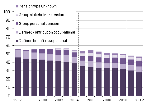
The Institute and Faculty of Actuaries (IFoA), through its Actuarial Research Centre, is inviting research teams and organisations to submit proposals for a research project on modelling pension funds under climate change. The research is intended to address the need for pensions actuaries to understand the potential magnitude of climate change impacts, and hence if and when climate change might be relevant to the funding advice they give. What areas in particular might be useful to look at through the lens of a pension actuary?
The current concentration of carbon dioxide in the Earth’s atmosphere is around 400 parts per million by volume (ppmv), or a little over 140% of the generally accepted pre-industrial level of 280 ppmv. What level we can cap this at depends on how we respond in every country in the world. There are therefore many opinions about it:
Source: IPCC AR5: Fig 2.08-01
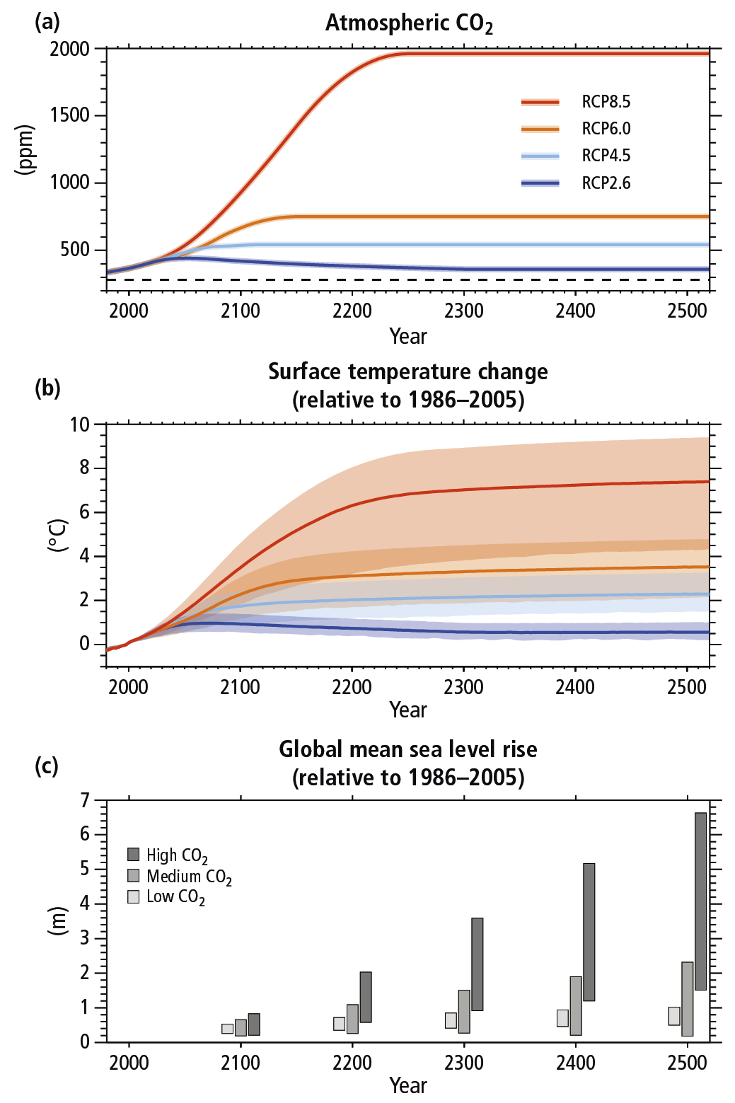
Here RCPs stand for Representative Concentration Pathways, and are meant to be consistent with a wide range of possible changes in future anthropogenic (i.e. human) greenhouse gas emissions. RCP 2.6 assumes that emissions peak between 2010-2020, with emissions declining substantially thereafter. Emissions in RCP 4.5 peak around 2040, then decline. In RCP 6.0, emissions peak around 2080, then decline. In RCP 8.5, emissions continue to rise throughout the 21st century. What this means is that the best we can hope for now is a scenario somewhere between RCP 2.6 and RCP 4.5, with the US Government’s Environmental Protection Agency appearing to believe that RCP 6.0 is the most realistic scenario. As you can see, RCP 4.5 assumes an eventual equilibrium at around 500 ppm, or about 180% of pre-industrial levels and RCP 6.0 an equilibrium at around 700 ppmv, or about 250% ppmv.
Equilibrium climate sensitivity is defined as the change in global mean near-surface air temperature that would result from a doubling of carbon dioxide concentration. A doubling of the pre-industrial level to 560 ppmv (ie between the RCP 4.5 and RCP 6.0 assumption) has been projected to result in a range of possible outcomes:
Source: IPCC 2007 4th Assessment Report, Working Group 1 (Figure 9-20-1)
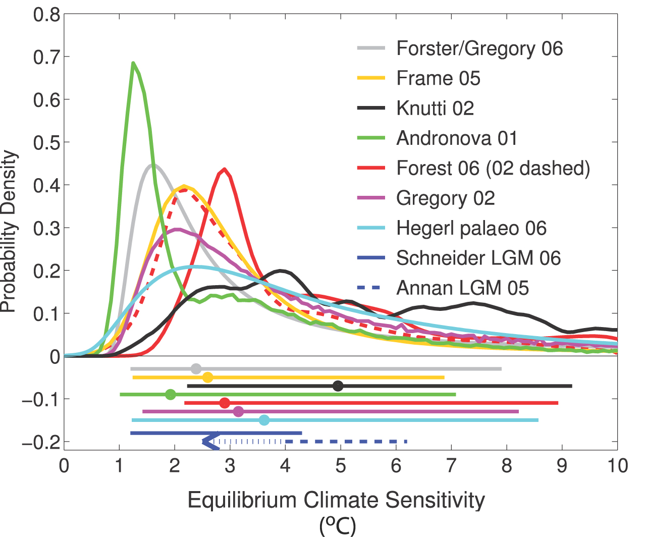
This is certainly a bit of a we know zero kind of graph, but has worryingly fat tails indicating reasonable chances of 10 degrees plus added to average global temperatures. To put this in context, let’s use the approach taken in Mark Lynas’ excellent “Six Degrees“, where the combined research into the effects of each additional degree above pre-industrial global temperatures is collated to allow us to view them as distinct possible futures. Some examples are as follows:
One degree
We are nearly here (around 0.8ᵒ so far):
- Return of the “Mid-west American dust bowl” but with greater vengeance
- Increase in hurricane activity
- Loss of low lying islands, eg Tuvalu
Two degrees
The “safe” level we are trying to limit increases to:
- Release of greenhouse gases begin to alter the oceans. May render some parts of southern oceans toxic to Ca CO3 and thus to one of life’s essential building blocks, plankton.
- Heatwaves like 2003 which killed 35,000 people in Europe and led to crop losses of $12 billion and forest fires costing $1.5 billion will occur almost every other summer.
- Crippling droughts can be anticipated in Los Angeles and California
- From Nebraska to Texas the anticipated drought would be many times worse than the 1930s “dust bowl” phenomenon.
- Polar bears would probably become rapidly extinct.
- Mediterranean countries will become drier and hotter with significant water shortages.
- IPCC estimate sea level rise of 18 to 59 cms.
- Monsoons would increase in India and Bangladesh leading to mass migration of its populations.
- International food price stability will have to be agreed to prevent widespread starvation.
Three degrees
- Africa will be split between the north which will see a recovery of rainfall and the south which becomes drier. This drier southern phase will be beyond human adaptation. Wind speeds will double leading to serious erosion of the Kalahari desert.
- Indian monsoon rains will fail. ·
- The Himalayan glaciers provide the waters of the Indus, Ganges and Brahmaputra, the Mekong, Yangtze and Yellow rivers. In the early stages of global warming these glaciers will release more water but eventually decreasing by up to 90%. Pakistan will suffer most, as will China’s hydro-electric industry.
- Amazonian rain forest basin will dry our completely with consequent bio-diversity disasters
- Australia will become the world’s driest nation.
- New York will be subject to storm surges. At 3° sea levels will rise to up to 1 metre above present levels.
- In London, a 1 in 150 year storm will occur every 7 or 8 years by 2080.
- Hurricanes will devastate places as far removed as Texas, the Caribbean and Shanghai.
- A 3° rise will see more extreme cyclones tracking across the Atlantic and striking the UK, Spain, France and Germany. Holland will become very vulnerable.
- By 2070 northern Europe will have 20% more rainfall and at the same time the Mediterranean will be slowly turning to a desert.
- More than half Europe’s plant species will be on the “red list”
- The IPCC in its 2007 report concluded that all major planetary granaries will require adaptive measures at 2.5° temperature rise regardless of precipitation rates. US southern states worst affected, Canada may benefit. The IPCC reckons that a 2.5° temperature rise will see food prices soar.
- Population transfers will be bigger than anything ever seen in the history of mankind.
Three degrees obviously needs to be avoided, let alone ten, but the problem is that business as usual for the finance industry may not be the way to get there. As some recent research has suggested, financial market solutions to environmental problems, such as carbon trading, may be ineffective. As the authors state: By highlighting the tenuous and conflicting relation between finance and production that shaped the early history of the photovoltaics industry, the article raises doubts about the prevailing approach to mitigate climate change through carbon pricing. Given the uncertainty of innovation and the ease of speculation, it will do little to spur low-carbon technology development without financial structures supporting patient capital.
Patient capital is something developed economies have been seeking for some time, whether it is for infrastructure investment, development projects or new energy sources, and no good way to create it within the UK private sector has been found yet, including various initiatives to try and get an increase in pension scheme investment in infrastructure projects. It therefore seems to me to be the wrong question to ask what impacts climate change are likely to have on the assumptions used for pension scheme funding, when it is the impact of the speculation which pension scheme funding encourages which is one of the main drivers of our economies towards the worst possible climate change outcomes.
A more productive research question in my view would be to bring in legislators and pensions lawyers as well as environmental scientists and others researching and thinking in this area alongside actuaries to look at how we could change the regulatory framework within which pension scheme funding and investment within other financial institutions where actuaries are central takes place. There is already research into what changes may be necessary to international law to reflect the new Anthropocene era the planet has entered, where the dominant feature is the impact of human activity on the environment. In my view this should be extended to the UK legislative and regulatory landscape too.