The Pensions Regulator has finally released its response to its consultation on regulating defined benefit pension schemes along with the simultaneous release of the final new code on funding defined benefits, its latest annual funding statement and two new documents: the defined benefit regulatory strategy and the defined benefit funding, regulatory and enforcement policy. It’s a bit of a mixed bag.
I set out a critique of the draft proposals back in January. These boiled down to two main criticisms:
- That the new system proposed was effectively a return to the one-size-fits all approach of the Minimum Funding Requirement, which had done so much to undermine responsible scheme funding by employers; and
- That the focus on governance, reverse stress testing, covenant advice, etc, effectively smuggled in from EIOPA’s latest IORP Directive, was likely to be a problem for small schemes.
BFO RIP
So what has the Regulator’s response been to these criticisms? Well, on the one-size-fits-all approach which was proposed as the Balance Funding Objective (BFO), the response is comical:
- They have changed the name of their funding objective. The BFO is now called the Funding Risk Indicator (FRI). It is otherwise unchanged. This is reminiscent of the Lenny Henry sketch at the time that Windscale was renamed as Sellafield: “In future, radiation will be referred to as magic moonbeams”.
- They are going to keep all their risk indicators secret. I have set out below their response in full on this point.
We believe that there may be potentially significant benefits to be gained in using the FRI and publishing more detail on our risk indicators in terms of providing clarity around standards, especially for small schemes, driving consistency and providing a useful framework for evaluating impact. However, after careful consideration of the risks and benefits highlighted in consultation responses, we have concluded that we should develop further our approach to risk assessment over the next year, including our risk indicators, to make sure it is sufficiently robust to support our intended uses beyond using it, alongside our other risk indicators, to prioritise our engagement. We have decided, for the time being, not to publish in detail where we set our risk indicators (beyond a high level description) in the funding policy document or in the annual funding statement.
So how will this work? Will the Regulator display charts like this one each year?
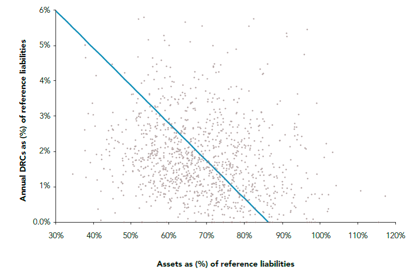 Will they then berate the schemes and their advisers who were so bad at guessing where their secret line was? Because be in no doubt, with the speed of the revolving door operating between the Regulator and the industry it regulates, these indicators will get out and then gradually get disseminated through the pensions industry, from the biggest consultancies (who can easily fund having their consultants on secondment to Brighton) downwards, just as the Regulator’s previous “secret” link between assessment of covenant strength and “expected” discount rate assumptions did.
And what about the problem with small schemes? This is, in my view, considerably better handled by the Regulator. However, it does all comes down to its idea of proportionality.
Proportionality
The response to the consultation states:
Many respondents were concerned that proportionality did not follow through consistently in the consultation code or it was not explained clearly how it could be applied in practice. In particular, some thought our expectations around the extent of the analysis required to assess the covenant seemed disproportionate. The concern was that it would be difficult and costly for small schemes to apply the code’s principles.
I was one of those respondents. It continues:
We have reviewed the drafting to ensure that proportionality is properly referenced and emphasised throughout. We are looking to develop additional guidance to support the final code and will consider whether the proportionality principle can be explained further through illustrative examples.
On covenant assessment, we had already made clear (under the ‘Working with advisers’ section) that trustees may chose not to commission independent covenant advice as long as they can satisfy
themselves that they are sufficiently equipped, independent and experienced to undertake the work to the appropriate standard. In the section on ‘Employer covenant considerations’, we have emphasised the need for a proportionate approach (for instance, in-depth analysis may not be necessary if the scheme is relatively small or there has been no material change in the covenant since the last review). We also stress that assessment should focus on the knowledge gaps and where value can be added. Finally, we have made clear that the scope of any covenant review will depend on the circumstances of the scheme and it is, therefore, not always necessary for trustees to consider all the factors listed in the code.
In addition the Regulator has dropped the size of employer and strength of covenant as factors for trustees to consider in deciding on what is proportionate for their schemes, realising, rightly in my view, that the absolute size of employer and strength of covenant are much less important than the relative size of employer to scheme and risks to the scheme from failures of covenant which are already mentioned.
This all seems sensible. I do, however, think they will struggle to go further in setting out what proportionality means, since the problem of defining it has bedevilled the Solvency 2 project from the beginning and has still not been fully resolved. The IORP Directive is no clearer in this respect. What the Regulator could do is make a clear distinction between schemes with less than 100 members and the rest in terms of their responsibilities under the Code, reflecting the fact that the IORP Directive does not apply to these schemes.
Small schemes and risk-based prioritisation
But perhaps they have. Concerns were raised in the consultation about considering the size of the scheme in deciding whether to subject that scheme to greater scrutiny. It was argued that smaller schemes tended to be less well administered and advised (presumably by advisers and administrators of larger schemes!), more risky than larger schemes and should receive greater regulatory scrutiny. Some also questioned the usefulness of education without what they felt was the same prospect of regulatory scrutiny. I admit that I was one of those expressing concern about a lack of scrutiny coupled with a much increased regulatory burden for small schemes before the Regulator’s latest concessions on proportionality.
In their response the Regulator defended its actions by stating that large schemes all other things being equal, are of greater concern to us as they have the greatest impact on members and risk to the system (90% of members and liabilities are concentrated in the 1,210 largest schemes). However they expect the same standards of the small schemes that they aren’t scrutinising so hard. Bearing in mind that the Regulator regulates scheme managers rather than members (and many of those small schemes have just as many trustees as the larger ones) I don’t think this is a very convincing defence, but it seems to be preferable to admitting that they are just regulating schemes that fall under the IORP Directive.
Next steps
So a big raspberry for the secret FRI and a qualified welcome for the changes on proportionality. The final code has now been laid in Parliament and is expected to come into force in the next few months, subject to the parliamentary process. So if you think that there is more than a little tweaking left to do to this legislation, you need to start lobbying now.